Do you know some of the world's best-known brands have minimalist logos? Think like Apple, Nike, and Adidas straightforward yet unforgettable. The second leading reason is the shift to the digital world, where minimalist logo designs work most effectively. As a branding expert, I'm here to explain how and why less is more when designing logos. This article will teach you the art of utilizing simple logos that follow the art of making great logos that get stuck in your clients' minds, whether you're a designer or a business owner.
This guide will examine minimalist logo design's history, principles, tools, and best practices. Let’s get started.
The Meaning Behind Minimalist Logo Design
Alright, let’s break it down. Minimalist logo design is about returning to basics no frills, no extra details, just pure simplicity. It’s like a spring clean of your house, only for brands. The goal? There, you have the goal of your logo to make it instantly recognizable and memorable without presenting the viewer with so much information that they have trouble digesting what they’re looking at. It’s like whispering instead of shouting but still ensuring everyone hears you.
When I heard about minimalist logos for the first time, I thought, How difficult can it be? Just draw something simple. It is more complicated than it looks. There’s this excellent philosophy behind it, less is truly more. With a minimalist logo, all the attention goes to what matters. Everything, line, shape, and color have a function. There’s nowhere to lead the eye (or to hide behind fancy effects or intricate patterns).
Just look at Nike’s swoosh, for instance. It’s just a curve, but it shouts motion, energy, and speed. Or Apple’s apple (duh). No bite, no leaf, it’s still undeniably Apple. These logos show that minimalism doesn’t mean boring; it means intentional. I mean, isn’t that what good design is supposed to do?
This is where I messed up back when I started creating minimalist logos. When I made music in the early days, I crammed it into one tiny box. If I were designing for a coffee shop, I’d have a cup, beans, steam, and maybe a barista smiling in the back. Overkill much? Kid, you’re not designing a mural, my mentor at the time deadpanned while looking at me as if I’d lost my marbles. Harsh but true.
What, then, constitutes a good minimalist logo? First of all, it must be scalable. It should look crisp on a business card, and it should look crisp on a billboard. Second, you must use negative space in the empty areas around the design to add depth and meaning. Third, stay within a limited color palette. Limit yourself to two or three colors at most unless you have something truly special to justify your wild side. Lastly, typography matters. If you add any text, opt for a clean, modern font matching the overall vibe.
Here’s an interesting tidbit, research indicates that people remember impactful minimalist designs longer because they are easier to digest visually. Our brains crave simplicity, which is why we’re drawn to brands with simple logos. But don’t believe me? Test it yourself. Take a pen and paper, doodle a few things, and see how far you can get with simplicity before you lose clarity.
Oh, and (does everyone quote me here?) mistakes are typical, quote me. Even great designers stumbled on the first try. So, if the first drafts you write are clunky or uninspired, don’t fret. Refine, learn, and eventually land on something that feels perfect. Or as close to perfect as anything gets in a design life.
A Brief History of Minimalist Logos

Do jump on the time machine with me because this is a trip worth taking. The history of minimalist logos is mesmerizing. It hasn’t always been about clean lines and negative space. In the old days, logos were grand, flourish-y things like Victorian-era finery, elaborate crests. They screamed, Look at me. But somehow, somewhere, designers discovered that less really is sometimes more.
The trend of minimalist logo design started to pick up in the mid-20th century with the rise of Modernism. This was an age when people embraced simplicity and functionality in art, architecture, and design. Early brands that got on board included IBM and Shell, which simplified their logos to make them more modern and versatile. It was as though they said, Let’s ease up on trying to impress with complexity and focus on what matters.
The Coca-Cola logo is one of my favorite examples from this period. Okay, it’s not technically minimalist by today’s standards, but it was the foundation of simplicity in branding. The sweeping script and red-white color scheme spread around the world. Few bells and whistles it just worked. That’s when companies began to understand that less decoration could pack a bigger punch.
Skip ahead to the late 1980s and early ’90s, when minimalism started to evolve again. Tech companies notably seized on the trend because their products were about efficiency and innovation. The move that changed everything was Apple’s evolution from its rainbow-hued apple to the black-and-white version in 1998. It indicated a turn toward clean, timeless aesthetics that struck a chord with consumers.
And here’s where I stumbled when examining the evolution of minimalist logos; for a while, I thought minimalism was just a trend, another thing brands did to seem cool. But then I started digging and discovered it’s so much more than that. Minimalist logos stand the test of time because they evolve. Take Google, for instance. If their logo looks very familiar, it’s probably because it hasn’t changed much since 1999, but it still feels fresh and relevant today. Why? Simplicity gives space for growth without losing yourself.
Naturally, there have been bumps in the road. Some companies overreached, cutting away so much detail that their logos lost recognition. Cast your minds back to Pepsi’s controversial rebrand in 2008. Folks were upset because the new logo was the opposite of the classic.
Lesson learned: Minimalism is nice, but don’t forget what makes you a brand.
This led to the creation of simple logos, which are today found everywhere in every industry. Even niche markets like eco-friendly startups or high-end fashion houses embrace simplicity because it expresses trust, sophistication, and clarity. And guess what? Consumers love it. In the age of short attention spans, you need a logo that speaks instantly.
Here's a fun fact: According to research, minimalist logos tend to do better in a digital environment. That makes sense. Whether on big screens or small ones, simple designs pop, and complex ones can get lost. So, of course, less is more if you're creating for print or pixels.
It has been an incredible journey for minimalist logos. We have come a long way from those old-school intricate emblems to those sleek, modern designs we see today, and each step reflects how society's values and technology shaped branding. And who knows, honestly, where we'll go next? Maybe holographic logos? Who am I kidding, minimalism will be around, no matter what. And as they say, good design never ages.
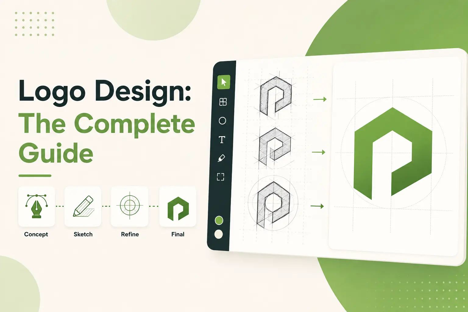
Basic Concepts of Minimalist Logo Design

Okay, let's jump into the fundamentals of minimalist logo design. These aren't the rules, they're more avenues of approaching a significant impact without overengineering. Trust me, I've made copious beginner mistakes trying to figure this out myself, so I will share everything I've learned.
First of all, keep it simple, stupid. Minimal logos remove all extra bits and pieces and keep the essentials only. This does not mean lackluster, it means deliberate. Everything from the line weight to the shape to the color should all have meaning. For example, we could say that when I began designing logos, I could add random curves or extra details that, in my opinion, were characterful. They didn't. It just added unnecessary clutter to the design. The simplicity forces you to focus on the heart of the matter and that's where this magic happens.
Next is negative space, which may sound complex but is very simple. Negative space the empty area around or within the logo can be used creatively to make your logo stand out. The FedEx arrow or the hidden panda in the WWF's logo. Those witty uses of negative space linger in people's minds because they're surprising and clever. Learning how to use negative space changed everything. It's as if you are discovering hidden treasure in your artwork.
Another significant principle is color restraint. Minimalist logos often use small palettes no more than two or three colors. Why? Because too many colors can distract the viewer and weaken the message. Many beginners (myself included) believe more colors mean more dynamic logos, but it usually looks like chaos. Choose colors that are consistent with your brand’s personality and values. If you’re going professional, go neutral. Want to convey energy? Brighter tones work better. Just remember, less is more.
Typography is also a considerable factor. Simple, clean fonts pair well with minimalist logos since they do not overload the overall simplicity. Sans-serif fonts are typically a good choice, as their clean lines align with the aesthetic perfectly. But here’s the thing, you can step outside the stock fonts. Using the letters as is or slightly modified from the traditional form or selecting a distinctive typeface will personalize your logo closely. Just don’t go too far. Oversaturation of customization can quickly slip into gimmicky territory.
Another principle is scalability. Your logo must be crisp, sharp, and compelling, whether blown up and stretching the side of a mounted billboard or on a single business card. And that’s where vector graphics come in; they scale to any size without losing quality. In the early days, I created a logo that looked amazing at full size but completely imploded at any more diminutive size. Before finalizing your design, test your logo in different contexts. It can be printed, viewed on various screens, and reduced to thumbnail size. And if it does, you’re golden.
Finally, minimalism isn't only aesthetic; it's functional. A good minimalist logo can convey the feel of a brand quickly and powerfully. It narrates a story, elicits feelings, and makes an impression. Try not to fit every aspect of your brand into a little image. Instead, boil it down to the main idea. What does your brand represent? What do you want people to feel when they view your logo? If you can answer those questions, you'll be well on your way to creating something memorable.
Quick Tip Recap: Keep it simple, with negative space, limited color, typography selection, scalability, and functionality. Stick to these guidelines, and your minimalist logo will strike a blow without suffocating anyone. And if you screw it up along the way, don't worry we all do. That's the goal, to learn and grow as a designer.
How to Design Minimalistic Logos Using Tools and Software

So, let’s talk about the tools and software to create minimalist logos. Now, I won’t lie to you, when I first started designing logos, I was willy-nilly with the tools I used. I’d hop from one program to the next, attempting to discover the best solution. There's no one perfect tool. It depends on your skill level, budget, and what you feel comfortable using. But don’t worry, I have some great recommendations to put you on the right path.
We start with Adobe Illustrator. If you’re serious about logo design, this is your gold standard. Why? Because it works in vectors, your designs will scale beautifully no matter what size. From business cards to billboards, Illustrator will keep everything clean and crisp. It has many features for aligning objects, adjusting paths, and adding all the little touches that count. Yes, it is often starting off the task and thinking, This is a lot, but once you do it once, it’s like you just got a new design superpower.
If it now feels too expensive or complex for Adobe Illustrator, don’t freak out. There are, as I say, other options. Canva Pro is one of my favorites for beginners. If you’re used to Illustrator, Canva may seem basic, but it’s surprisingly powerful for simple projects. It features customizable templates, drag-and-drop functionality, and lots of intuitive interfaces. And it’s free to start, making it great for freelancers or small businesses on a tight budget. Just know it doesn’t have the same kind of control you have over Illustrator. If you plan on doing detailed customizations, this isn’t very helpful without quickly hitting its limits.
For teams and collaboration, Figma is transformative. It’s cloud-based, so everyone can work on the same file in real-time. That one thing saves hours spent on back-and-forth emails and file sharing. Figma also has tons of plugins and extensions that smoothen your workflow, such as all sorts of grids and alignment tools and even AI-generated suggestions. And guess what? You don’t need to break the bank to try it out, as the free version is quite powerful.
For something more niche, try Affinity Designer. It’s sometimes labeled the cheaper alternative to Illustrator, but don’t let that put you off; it's a full-blown, feature-rich design tool. Affinity Designer offers a lot of bang for your buck, offering everything from vector editing to advanced typography controls. And unlike some programs, it works seamlessly on both Mac and PC machines. I switched to Affinity for a spell when I needed something professional-quality but not too expensive.
And let’s not forget Inkscape, a completely free and open-source design tool. If you’re working with a shoestring budget or want to see if something works for you before committing to paid software, Inkscape is worth looking into. It’s not quite as slick as some others, but it does the trick for quick logo-making. Just be ready to spend time figuring out its idiosyncrasies; they're not exactly obvious.
Here’s the pro tip, no matter what tool you choose, permanently save your files in SVG and EPS formats that preserve vector quality. This helps your logo always be sharp and able to scale. And if you’re doing a lot of detailed work, invest in a good mouse or tablet. Believe me, it’s a surefire way to sculpt yourself into a little carpal tunnel by clicking around constantly with a trackpad.
Finally, don’t underestimate the usefulness of traditional sketching before going digital. Writing things down on paper first is, at times, where the best ideas emerge. I know it sounds old-school, but it works. Sketching allows you to iterate quickly without worrying about technical limitations. Once you have a firm idea about how to design, you can translate it into pixels.
So, that was an overview of the best tools for designing minimal logos. Whether you use industry-standard software like Illustrator or make do with more budget-friendly software such as Canva is entirely up to you; the point is to find what works for you. Experiment, learn, and above all else, enjoy it. But design is supposed to be fun.
Minimalist Logo Design Trends
So, let’s look at what’s gearing up to be the hottest minimalist logo design trend for 2025. If you’ve been following branding and design, you’ll realize minimalism isn’t going anywhere of course, it’s evolving. Brands are getting savvier about how using simplicity can help them cut through an overcrowded digital landscape. Here’s what I’ve observed so far.
First of all, geometric shapes are a thing. Think round, pointy, square you name it. These crisp, pointy shapes yield logos that seem sleek and also classic. Why? And that is because geometric designs are versatile. They operate across platforms, from social media avatars to packaging. A trend I’ve noticed is using simple shapes with negative space to create hidden elements much like that dastardly arrow hiding in the FedEx logo. It’s sly, it’s subtle, it’s so very effective.
Monochrome palettes are also very much a thing at the moment. Yes, color is still important, but many brands choose monochrome or grayscale designs. This method itself lends logos a clean, refined appearance that feels super-serious. Additionally, monochrome logos often behave better in digital environments, where colors may skew in overly saturated screens. Many eco-conscious brands also lean into this trend, with muted colors that signal sustainability and calmness.
It’s interesting to note that flat illustrations make a lot of noise. Instead of using abstract shapes, some designers are turning to simple figures of two-dimensional beings in their logos. These images have a playful or whimsical feel but adhere to minimalist rules. For example, a coffee shop could use a flat icon of a steaming cup instead of text, etc. It gives character without throwing the viewer off.
And then there’s the integration of augmented reality (AR). AR isn’t something new, yet its impact on logo design is also increasing. However, one can only imagine the first time they scan the logo of their favorite product with their phone and see it jump to life in 3D. But it’s happening. A handful of forward-thinking brands focus on creating logos specifically for AR instances, attaching new interactive layers unimaginable. While these trends may not be universal, they’re worth watching if you’re into the latest and greatest tech.
Another trend worth mentioning is sustainable branding. As consumers become more environmentally minded, brands have echoed those beliefs in their logos. Visit earthy tones, leaf motifs, and typography that imitates hand-written or natural textures. These elements convey authenticity and concern for the planet while keeping to a minimalist aesthetic.
Here’s where I tripped up in predicting trends when I was early in my career, I assumed that minimalism would one day give way, that at some point, we would all crave complexity again. What I didn’t know is that minimalism evolves. It adapts because needs and technologies evolve while remaining grounded in the same philosophy, simplicity works.
So what does all this mean for you? If you’re creating a logo in 2025, think about these trends but don’t force them. Your logo must represent your brand personality instead of surfing the trends. Use geometric shapes if they make sense, monochrome if they’re your jam, and AR if they can bring your thoughts to life. After all, the very best logos connect meaningfully with their audience.
And finally, make sure to test, test, and test again. While trends may come and go, a good logo design stays forever. So play around, iterate, and polish until you have something special. That’s the secret sauce, people.
Best Practices for Creating a Minimalist Logo

Let’s shake off the dust and dive into the nuts and bolts of minimalist logo design best practices. These aren’t just tips, they’re the golden rules to help you avoid the mistakes and create something truly memorable. Believe me, I’ve been there, done that, and learned the hard way. So, fasten your seatbelt because these lessons are gold.
Have a clear concept. Before you even fire up your design software, determine what your logo should say. Is it about professionalism? Innovation? Playfulness? Minimalist logos defund all the fluff so all elements must have a reason for being. Your design will feel unguided if you do not have a firm idea. For instance, I dove straight into shapes when I made my first logo without thinking through the brand story which, believe it or not, showed.
On each of those days, we focus on function over form. Many of you are doing logos (like me) and are obsessed with making it beautiful and neglect how utilitarian the logo is. But here’s the thing, a strong logo isn’t just attractive; it’s functional in multiple environments. Try it in different sizes, against various backgrounds, and in color and black and white. If it doesn’t pass muster everywhere, reconsider it. Scalability is crucial in minimalism because simplicity leads to lucidity throughout the media.
Next, let's discuss negative space, your best friend in minimalist design. However, make sure to leave some space empty in your logo, as they can improve the impact of your logo. Consider the FedEx arrow or the secret panda in WWF's logo. Clever use of negative space keeps it rich and interesting without being busy. In the early days, I shied away from using negative space because I felt it made my designs appear unfinished. As soon as I accepted that, my logos became better overnight.
When it comes to color, less is more. Stick to a maximum of two or three colors unless you have a great reason to mix and match. Using too many colors will drown the observer and the message. Pick colors that reflect your brand's identity and ideology. Neutral tones like black, white, and gray are perfect for professional brands, while brighter shades like blue or green are better suited for tech or eco-focused organizations. One thing to keep in mind, consistency is key. Choose a palette and stick with it.
Typography is also a big part of that. Choose sans-serif fonts that are clean and modern and will match your hip-minimalist aesthetic. Sans-serif fonts generally look best; their clean lines complement the overall feel. But if the goal is to add a personal touch, keep letters slightly interesting and choose different typefaces. Just don't go overboard; excessive customization can quickly become gimmicky.
Another big one is to test different versions before you finalize it. Do not stick with the first draft you write. Play with various shapes, alignments, and compositions until you find the right balance. Feeling inspired, I tried experimenting and thought I had hit the ball out of the park after the second iteration while designing a logo for a client. Well, it turns out the fourth was much more potent. What is the moral of the story? Iterate until you are pleased.
Finally, steer clear of common missteps. Overcomplication is one of the most common offenses when creating designs. Keep in mind that minimalism carries away all the unnecessary. Try not to fit your full story into one little image. Strip it down to naked purity. Another pitfall is failing to listen to feedback. Ask others clients, colleagues, friends because new eyes may see problems you cannot.
So, in summary, begin with a solid idea, focus on usability, use negative space, reduce your color palette, pick typography carefully, test multiple designs, and avoid common pitfalls. If you follow these best practices, your minimalist logo will significantly impact without anyone feeling overwhelmed. And if you trip through the process, there is no pressure we all do. Most have great learning points that help you develop and grow as a designer.
Examples of Well-Designed Minimalist Logos

Let's look at some practical, real-world examples of compelling minimalist logos. These aren't random selections, they're name brands that figured out how to keep things simple, and that simplicity became a power play in their identity. I have researched these case studies thoroughly, and believe me, there's a lot we can learn from them.
First up is Apple. Need I say more? Their logo is one of the most famous examples of minimalism done right. An uncomplicated silhouette of an apple with one bite taken out it's instantly recognizable across the globe. Its versatility is what makes it brilliant. Be it on a MacBook, an iPhone, or even black-and-white, the logo is powerful. And Apple didn't stop at design; they created an entire lifestyle brand based on simplicity, coherence, and innovation. The moral of the story is that sometimes less is more.
Next, take a look at Nike. That little swoosh might seem simple, but it represents the key values of the brand, motion, speed, and energy. The genius of it is how Nike makes negative space and flow but doesn't even need to use any words. The early designs incorporated the word Nike, but they dropped that when they found the swoosh alone came to represent the brand. Talk about confidence. That tells you right there, if your logo is strong enough, you don't need additional elements to explain it.
Then there's FedEx, whose legendary use of negative space you probably know about. Have you ever seen the arrow that goes between the "E" and the "x"? It represents forward momentum and precision, two things FedEx is very proud of. The logo appears simple at first, but it bears layers of meaning. That's the beauty of minimalist design, it allows for discovery while keeping it simple. This is the kind of subtlety brands should strive for. It lodges in minds long after people have seen it.
WWF (World Wildlife Fund) is another excellent example. A deceptively simple yet super-effective panda logo. WWF created globally appealing, bold black-and-white tonal contrasts and clean lines. In addition, the panda itself inspires feelings of conservation and preservation that beautifully resonate with the organization's mission. It may be an interesting story, but until it gets to the point where it teaches us to choose the correct symbols to create an emotional connection with our audience.
Now, let's discuss Airbnb. When they rebranded in 2014, they incorporated the "Bélo," a mark influenced by the letter "A," along with a heart, a location pin, and a human figure. Some critics initially dismissed it as too abstract, but the Bélo won over people over time. Its simplicity also lent itself to Airbnb's ability to deploy it across different mediums from app icons to physical signage. Such is the utility of designing flexible yet distinct logos, and that's what this case study covers.
Finally, consider Tostitos. Yes, Tostitos. Their simple logo shows three ovals in a triangular shape, representing chips and salsa. It’s fun, sticks in your mind, and relates to their product. Though it’s about food, the lesson hopefully, what this whole rant has come around to has broader applications, is to root your logo in your brand’s core identity in an organic and logical way.
This is where I went wrong when analyzing case studies early on, I paid too much attention to what made each logo individual and didn’t look for what was familiar. Over the years of creating logos, I discovered that all minimalist logos share a few characteristics: simplicity, scalability, emotional connection, versatility, etc. They also evolve thoughtfully, embracing the times without compromising their essence.
So, what do we learn from these examples? First, simplicity shouldn’t play it safe, it should be intentional. Second, excellent minimalist logos often disguise complexity beneath their seeming simplicity. Finally, always consider your logo in your overall brand narrative context. Because a logo is not just a mark it’s a promise to your audience.
Final Take
And that’s a deep dive into minimalist logo design in 2025. Logos that walk the line between simplicity while staying ahead of trends and functional graphics based around these three elements. Remember, great logo design isn’t about pizzazz but rather a statement. So try it, play around, and have fun. If you have a larger project in mind, contact a professional designer with experience in minimalism. Your brand needs this only.
.svg)
.svg)
.svg)
.svg)