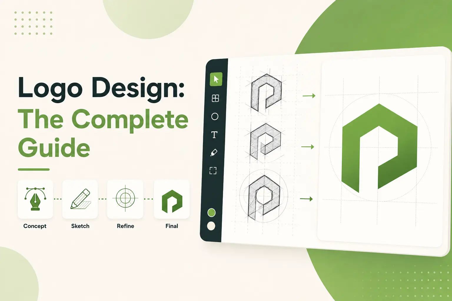
Are you aware that more than 70% of users decide a website's credibility on the basis of its design? In the modern digital-first world, it has become crucial to develop visually appealing and functional websites. Enter Figma, an easy yet powerful tool reshaping the web design experience.
As someone who has been immersed in design tools for years, I can confirm that Figma is a titan. This post is a comprehensive guide to using Figma for web design for beginners and seasoned professionals. Whether you need to set up your workspace, collaborate with teams, or otherwise organize your work, we've got you covered. Let's dive in.
Understanding Figma and Its Role in Modern Web Design
Let’s rewind this to my early days as a web designer ya know, back when I had no idea what I was doing. There, we used tools like Photoshop to design websites. Yeah, you heard that right, Photoshop. And it was clunky, frustrating, and frankly? An absolute mess in terms of collaboration. And if someone wanted to change something, they’d have to email me the file, and I’d spend several hours trying to figure out what layer did what. Enter Figma, did that change everything.
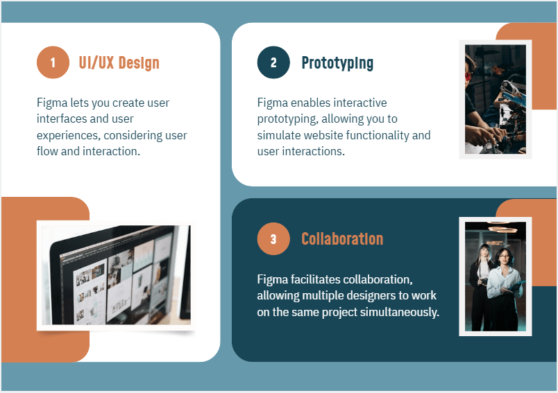
So, what exactly is Figma? To put it plainly, it’s a cloud-based design tool custom-made for designing interfaces, prototypes, and even more sophisticated design systems. But here’s the catch, it’s not just another design app; it’s like this magical playground where designers, developers, and stakeholders can all chill without stepping on each other’s toes. Imagine working on your designs wherever you are, being able to share them with your stakeholders instantly to get real-time feedback. Sounds dreamy, right? That’s Figma in a nutshell.
So, let me explain how it became a must-have part of web design. For starters, it’s wild with collaboration features. You know, those hellish situations where clients would bombard you with ten rounds of revisions through email? They can comment right on your design using Figma. Gone are the emails that say, Could you move this button a smidge over there? You see their note, make the change, and boom. Honestly, it makes you feel like you have superpowers.
The other thing I love about Figma is how many responsive web design features it has out of the box. When I began using it, I messed up a couple of projects because I didn’t fully understand the constraints. But my life was modified after I mastered configuring up frames with the right resize choices. Seriously, there will be no more guesswork on how this will appear on mobile or tablet. You configure it once, and the rest is up to Figma. Think of it as an assistant that’s great at math.
And don’t even get me started on prototyping. Without Figma, prototyping could seem like an airless ascent of Mount Everest in flip-flops. Now, it’s so seamless. You can connect buttons, add hover effects, and even create the illusion of transitions all in one platform. I once had a client look at a slick prototype they thought was a real-life website. Now, that’s what you call scoring brownie points.
But here’s the thing, Figma is not perfect. If you are switching from standard tooling like Sketch or Adobe XD, There is a bit of a learning curve. I had spent a whole weekend just watching YouTube tutorials, trying to get on the auto-layout game. Was it really worth it? Absolutely. But yes, there were some times that I felt like throwing my laptop out the window.
But if web design is a serious pursuit for you, Figma is non-negotiable. Not only does it streamline the process, but it also reduces the stress of the whole thing a hundredfold. And it is friendly to developers. They can view your designs, grab CSS snippets, and export assets without having to bug you every five minutes. Trust me, they’ll thank you.
Bottom line, Figma has raised the bar for web designers everywhere. It's got your back from landing pages to e-commerce sites to complex dashboards. So, if you haven't tried it yet, do yourself a favor and dive right in.
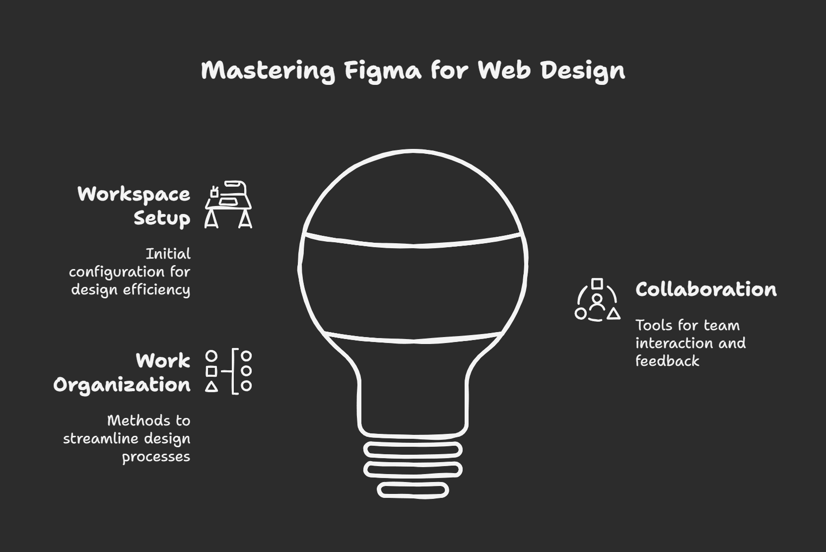
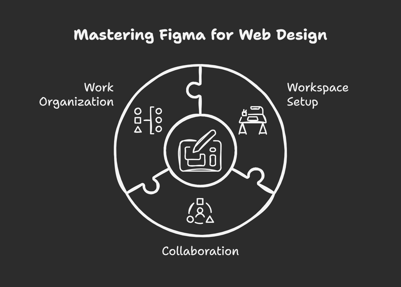
Organizing Your Figma Workspace for Successful Web Design

Fun fact, Setting up your Figma workspace is like doing prep work before cooking a special meal. If you're not properly prepared, you might find yourself wondering, What do all these libraries do? or worse, Did I just lose everything? It can feel overwhelming before you even realize what’s going wrong, especially if everything isn’t set up properly from the start.
Figma’s first project, it was a disaster. Layers everywhere, artboards that looked like a tornado hit them, and naming conventions? Forget about it. But hey, you live and you learn, right?
Well, I’ve got the cure and I’m here to share it with you.
First things first, create a new project. It sounds obvious, but trust me, I’ve opened someone else’s file before, thinking it’ll save time, only later to realize I should have just started fresh. Give your project a descriptive name not, Website Stuff or Project 1. Get Specific, like, EcoStore Landing Page 2025. It will save you headaches down the road when looking through old files.
Once you’ve got in, create artboards (or frames, as the Figma peeps call them). Consider all the devices your design needs to function on desktops, tablets, phones, and even smartwatches. When working with web design, I typically start with a few simple sizes, which include 1920px wide (desktop), 1024px (tablet), and 375px (mobile). That way, you’re hitting most bases right from the beginning. And a pro tip, Gotta use those grids. Grids are life savers that keep everything in line. Navigate to Layout Settings and adjust the columns and gutters until they align with your design goals. The truth is, after I started visually using grids consistently, my designs transformed from meh to wow.
Now, onto layers. Oh, layers, they're both savior and demon. In the early days, I didn’t name anything. It was all rectangles and ellipses moving around. Then, one day, I had to pass a file along to a developer and let’s say that some choice words were exchanged. These days, I label every layer. Buttons turn into Primary CTA Button, images are marked Hero Image, and so forth. It may sound tedious, but it makes collaboration smoother than butter.
Another game-changer, Keyboard shortcuts. I resisted the urge to learn them at first because who has time for that? As it turns out, not using shortcuts was slowing me down at least twice as much. Copy-pasting styles, duplicating elements, and zooming in and out come second nature once you memorize a few key combos. Holding shift keeps proportions locked while resizing. Has saved me hours over the years.
Lastly, organize your assets. Make folders for icons, illustrations, fonts, and whatever you use regularly. Figma also allows you to create libraries, which is clutch if you work on multiple projects with close branding. Once, I didn't change an icon library in all the designs; inconsistencies were everywhere.
Setting up your workspace may seem like busy work, but it's worth it. You'll work faster, partner better, and feel less stressed. So, take the time to get it right.
How to Master Figma Web Design Basics
When I started using Figma for web design, I had no idea where the fantasies came from. Did you know there were so many buttons and tools to click on? It was like trying to fly a space shuttle when you don’t even know how to turn on the windshield wipers. But here’s the thing, after the initial oh crap moment, Figma is one of the most intuitive tools. Trust me, I’ve been once and done, and so all my hard-won wisdom is what I’m passing on to you.
Once, I spent three hours troubleshooting why my text boxes weren’t resizing correctly. I haven’t defined the constraints yet (we’ll get to that). Yeah, I could’ve screamed into a pillow, but instead, I laughed it off because, let’s face it, we’re all beginners at some point, right? So, don’t fret if your new ways feel clunky at the start. You’re not alone.
So now let’s lay out the fundamentals so you can steer clear of my first-timer mishaps. First up, vector networks, what they are and how they work. These little beasts are the magic that makes shapes editable in some ways that Photoshop users only dream of. Rather than forcing you into rigid paths, Figma’s vectors give you free rein over points and lines. If you’re working on a button, you can experiment with how its corners look, how stretched out it is, and how curved it is. Playing around with this feature for some time made it much easier for me to create custom icons.
Typography is another biggie. Only when I started, I'd throw any old font onto my designs without a second thought. It's a big mistake. The typeface that you choose will dictate the tone of your whole website. A neat sans-serif trumps well for tech startups, but something classier suits luxury brands better.
Pro tip: Use two fonts max, one for headlines and one for body text. And do your readability every time. Nothing is worse than straining your eyes to read small text on a mobile screen.
Color palettes should also get a shoutout. Initially, I went a little nuts with all the colors I thought I might use, throwing in every hue I could think of. It didn't look perfect. Now, I use a more cohesive palette, usually about five core colors and shades or tints for variety. Colors or even Figma's built-in color picker have saved my life more than I can count.
Adding images and UI components? That part is fun but also challenging. Optimize the size of images before you import them, this is a lesson learned the hard way. Big files will slow your project down, and that's not great when working with a team. And on the team note, remember to name your layers correctly. Rectangle 127, does no one any favors.
Once you get the hang of it, constraints are kind of magical. They ensure that your elements behave nicely on different screen sizes. Without constraints, your gorgeous layout will be reduced to a Picasso painting nightmare on the phone, not ideal.
The bottom line is that it takes practice to get the basics down. Start small, experiment frequently, and don't fear getting it wrong. You learn from each wrong step you take. You'll be churning out slick, responsive designs like an old pro in no time. And honestly, that feeling when someone recognizes your work.
Professional Designs Using Advanced Techniques
And let me tell you one thing, I used to think that design was just about making things look pretty. You slap on some colors, throw in a few killer fonts, and just like that, you've got a smash hit. Years (and several cringe designs) in this space taught me that professional-looking designs are not about pretty but intentionality. And all the excuses for not leveling up your game go out the window with tools such as Figma. So, I will share with you a few advanced techniques that I picked up along the way, the good stuff that will make your work shine in 2025.
Leveraging reusable components was one of the most significant lightbulb moments for me. Imagine I was doing a website redesign project, and every button had different padding or font sizes. I was foaming at the mouth, trying to keep it all consistent. Then, I discovered Figma's component system. Holy moly, life-changing. You'll save hours, not to mention maintain consistency in your designs by creating reusable components for headers, buttons, and even entire sections. And if you need to adjust something down the line, you only have to do it once.
Now, let's talk about auto-layout. Sorry for re-recording, but I could not stand to have a good deal on the platform without me. Auto-layout allows you to make responsive designs that adjust to alternative content lengths like champions. For example, if you're designing cards for an e-commerce site. Some product names are short; others are long AF. With auto-layout, those cards auto-resize according to the text inside them. These features eliminate the need for manual tweaks and awkward spacing issues. It's one of those things you wonder how you ever lived without once you started using it.
Here's another trick I swear by. Designing transitions and animations prototyping static designs are lovely, but adding motion gives life to your projects. A few months ago, I was selling a concept to a client, and they weren't convinced until I showed them a prototype with silky-smooth hover effects and page transitions. All at once, you can start to feel what the end product will be like. It was the little extra that made a difference. Don't go overboard, you don't want your design to look like a disco ball from the '70s.
Usability testing is another aspect I've learned the hard way. I devoted weeks tweaking a dashboard layout, only for user testing to reveal that people didn't know how to use it. Talk about humbling. Now, I test my designs early and often. I collect direct feedback from stakeholders or potential users using Fima's integrated commenting tools. As soon as you discover issues, it's easier to correct them.
And finally, do not neglect accessibility. Yes, I know it sounds boring, but hear me out. Building accessibility into your design doesn't only benefit disabled people; it improves your design for everybody. Think established color contrast, legible fonts, and discernable navigation paths. These minor adjustments can make a real difference to the quality of your overall work.
So there you go some tried-and-true tricks for elevating your designs from meh to wow. Reusable components, auto-layout, animations, usability testing, and accessibility are not just vocabulary words. They're weapons that'll raise your craft and help you to stand out as a pro. Go ahead, give 'em a shot. Your portfolio will be grateful.
Tips for Working Together on Web Projects in Figma
I tell you, this is where Figma is a real power collaboration. I remember the first time I attempted to collaborate on a web design project with a remote team it was an absolute cluster. We were running some old software, files were constantly overwriting one another, and god forbid I talk about version control here. We were all using different languages but attempting to build the same house. Then someone got me started on Figma, and to be honest.
Here's the thing, Figma is not just about sharing links, giving comments (as good as they are), and collaborating. It's about enabling real collaboration between everyone involved: designers, developers, and stakeholders. Trust me, though; I had to try a few times before I learned how to do that smoothly.
One of my early mistakes was not creating organizational guidelines for files. Here's how it is, you have five designers doing the same project, and suddenly, there are 20 artboards called Homepage_v1, Homepage_final, Homepage_reallyfinal etc. Yeah, it's not fun. What helped us was setting naming conventions from the beginning. For example, we found prefixing frames with their status, i.e., WIP_Homepage, and Approved_AboutPage, which made everything 100% easier to track.
Another lesson I learned the hard way. Real-time collaboration is excellent until someone inadvertently shifts an element while you're showcasing your masterpiece to the client. Awkward, right? To prevent that, Figma allows you to lock layers. Lockdown anything that doesn't need to be touched in the meeting. Problem solved. It also keeps things neat when multiple people edit simultaneously.
Now, let's address feedback because this drove me nuts back in the day. Historically, clients would write emails like, Could you raise the button a little? But how much is a bit? Fortunately, Figma's commenting feature comes to the rescue here. You can tag teammates directly, leave, have precise notes pinned to different elements, and reply with emojis if you want to be sassy.
Pro tip: Try to get your team to be particular in their comments. Instead of saying, This looks off, challenge them to say, The padding between these buttons feels too tight.
And then there's the developer handoff, lest we forget the manual, PDF-wire export days. Figma allows developers to inspect designs, copy CSS code snippets, and download assets themselves. But here's the kicker, they must learn how to do it. So, guide your dev team through Figma's tools. Believe me, they'll be grateful later.
Oh, one more thing. Don't sleep on plugins. There are plenty designed for precisely that. My personal favorite. The Project Timeline plugin lets you visualize deadlines and tasks directly inside Figma. It's so helpful in keeping everyone in sync without leaving the app.
Ultimately, successful teamwork in Figma comes down to communication, organization, and patience. Once you master these, you'll wonder how you did your work any other way.
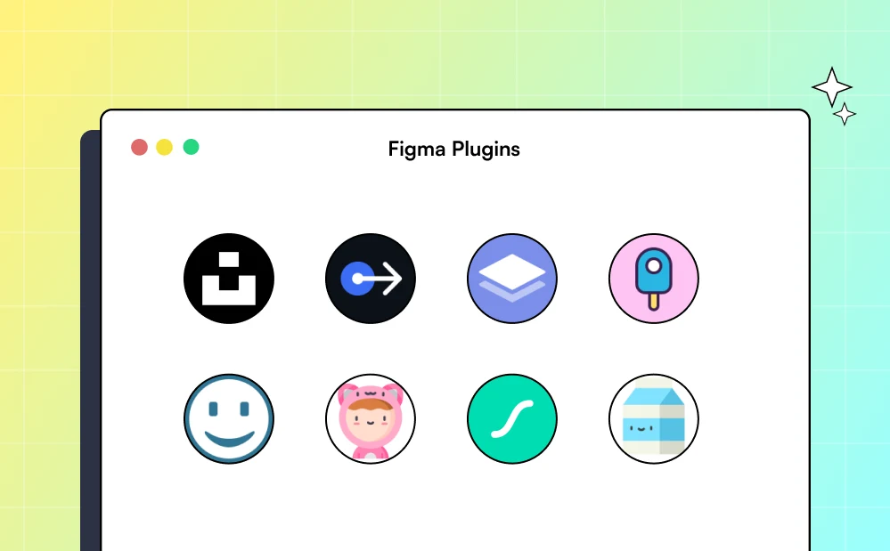
Supercharge Your Web Design Workflow with These Figma Plugins
When I first started using Figma, I felt like a total wizard. You know, pulling shapes around and making things look all polished and put together it felt unstoppable. But then reality hit. It was clunky as heck. Copy-pasting that same button style again and again? Painful. What is it trying to solve for designers? Nearly impossible. It was at this time that I discovered plugins.
Once, I was working on this massive e-commerce project. Imagine you have dozens of product pages, each requiring its layout, but the branding must remain consistent. Initially, I attempted to do it all by hand. At the end of day two, my brain was mush, and I'd only completed three pages. Next, a friend casually dropped a line, Hey, have you tried out Figma plugins? Honestly, I wasn't even sure what he meant at first. But once I got into it, I saw how much time (and sanity) these tiny tools could save me.
For example, take Content Reel. This plugin allows you to fill your designs with dummy text and images on the fly. I wasted hours culling stock images or typing nonsense into text fields to make mockups look real before I found it. With Content Reel, boom from there, it's done in seconds. Just choose a frame, choose from preloaded assets, and voilà! Instant progress. Trust me, there's a lifesaver. If you are tired of dummy content, it's this.
Also, the Unsplash plugin is a game-changer. If you've ever struggled to find high-quality free images that suit your vibe, this will become your new bestie. For one project, I required lifestyle shots for a wellness app. Usually, though, I'd be switching tabs, downloading pics, and resizing them. Instead, with Unsplash built directly into Figma, I could drag and drop what I needed from the canvas. Talk about smooth sailing.
Now, this is where it gets wild automation plugins. Have you heard of Autoflow? Oh, it’s magic. Connecting screens while prototyping user flows used to feel like solving a Rubik’s Cube blindfolded. Autoflow makes the entire process easier by automatically generating flow diagrams based on the interactions. Excited to save me hours of twiddling with arrows and labels. And clients were thrilled to see those glossy presentations.
But hey, not every plugin is perfect from the get-go. I found this one called Iconify, which promised thousands of icons. Sounds impressive, right? Well, it turns out that half the icons weren’t rendering correctly due to some weird caching issue. Frustrating AF. It took me a long time to wait for their support team, but eventually, I figured it out. Time to take this lesson, always check reviews before diving headfirst into a new tool.
Pro tip: Keep plugins to a minimum. Yes, there are hundreds, but stocking your workspace with many things you don’t need will only make things slower. Try to keep a few essentials that fit into your workflow. For my use case, other than those I spoke of, Remove BG (for editing images) and Stark (for accessibility) fit very nicely in my toolbox.
Figma plugins are the best-kept secrets. They won’t do the legwork for you, but they will give you a leg up. Whether you want to accelerate repetitive tasks, enhance collaboration, or add polish to your designs, there’s likely a plugin. So why not explore a bit? You never know you might discover something that revolutionizes your workflow for good.
Case Study: Figma Web Design in Real Life
Here’s one thing I know for someone who has been covering design tools for years now, I’ve seen it all. I’ve tried them all, from Sketch to Adobe XD, but nothing seems to quite have the same vibes as Figma. And believe me, I’ve come across phenomenal things made with Figma that amaze me beyond belief. So today I want to lay out a couple of real-life examples of when Figma web design really came through. These aren’t random success stories, but lessons I’ve learned.
One project that stood out was for this small e-commerce startup called GlowGear. They were selling sustainable outdoor gear, and their website. Well, let’s just say it appeared to have been designed in 2005. I was hired by the team (okay, not hired, I got dragged into the thing by a friend), and we went with Figma, because none of us had ever used it. Rookie move, right? But guess what? That decision turned out to be one of the best we ever made.
We began with reusable components for buttons, cards, and navigation bars. Not only such a time saver, I mean seriously, so much time. Rather than redesigning the entire plan, we could change one button name, and bam, it updated everywhere. Three months later, GlowGear’s site launched, and sales increased 40% over the span of six weeks. Yeah, you heard that right, Forty percent. I can’t take all the credit, to be fair Figma was a huge part in helping me make this more efficient.
I want to discuss the following case study based on a not-for-profit organization I worked with, BooksForAll. Their mission was straightforward, to place books in the hands of children who need 'em most. However, their old website had fewer Word documents and was a more solid website. Using Figma, we designed a clean, modern, storytelling-focused prototype. One element that we incorporated was an interactive map displaying where donations were making a difference. With Figma's prototyping tools, we connected animations and transitions so seamlessly that users didn't even notice they were clicking through dozens of page states. Long story short, sign-ups from new donors soared by 65% post-launch. Crazy, huh?
Here's the catch, things don't all go exactly as planned. Oh no, not at all. I made a huge mistake once while redesigning a blog platform. I neglected to test the responsiveness in Figma correctly. You get there, but how often do you think, OK this is good enough, and then BAM, your client calls you an hour later and says half of the layout is breaking on mobile? Yeah, that happened.
Note: Always double-check constraints and frames for different screen sizes. It seems obvious now, but well, live and learn.
One lesson from these case studies is that Figma isn't a tool, it's a game-changer. Whether you're creating an e-commerce store, a nonprofit site, or a personal portfolio, its collaborative features and easy-to-use interface provide an easy way out. Plus, those plugins? They're absolute lifesavers.
And if you're pondering if Figmas is worth the hype, let me clear your mind. Begin small, experiment, and do not be afraid to make mistakes. Honestly, you get the best designs from trial and error. And who knows? Perhaps one day, you can share your killer case study.
Figma Web Design: Mistakes You Should Avoid

Let me tell you, I’ve been in your shoes looking at a Figma file that seems to have been struck by a tornado. It’s layers upon layers, things with mismatched fonts, buttons you can’t even interact with when you click ‘em. Those early days were a doozy, huh? But you know what they say, mistakes are how we learn. So today, I will show you some of the worst blunders I’ve made (and I have seen others make) regarding Figma web design. Trust us, steer clear of these, and you’ll save yourself hours of aggravation.
Ignoring responsive design principles was one of the first things I messed up on. I did this super slick homepage for a customer back in the day. It appeared perfect on the desktop. But then they brought it up on their phone, and let’s say, it wasn’t a pretty sight. Text that overlapped images and buttons too small to be tapped was a hot mess. That’s when I thought, mobile-first isn’t just a buzzword; it’s a lifesaver. Always begin with smaller screens, then scale up from there. Use Figma’s constraints feature to lock elements in place so they function correctly on different devices. Your users and your sanity will thank you.
Another mistake, overcomplicating designs. I twiddled with shadows and gradients on a single button for three hours. But my deadline was breathing down my neck. Turns out, simplicity sells. Clean lines and uniform spacing with little clutter can make a difference. Do away with anything that doesn’t add value to the end-user experience. And let me not even start on using too many animations on pages. A little hover effect is neat, but it’s quickly distracting if everything else moves with a scroll.
Oh, and here's one that still makes me cringe, not naming layers. When starting, I'd name layers like Rectangle 127 or Group 45. It sounds wild now, but let's be honest, who hasn't done it? That's when you're looking for that one text box buried under 50 unnamed layers. Nightmare fuel. These days, I never fail to rename everything, it's Header-Logo, CTA-Button, Footer-SocialIcons. It adds a minute to the process upfront but pays off in the long run.
More collaboration debacles. On one project, my partner accidentally deleted half our artboards because we weren't keeping track of version history. Two days' worth of work had to be done.
Takeaway: Always turn on versioning in Figma. Also, use comments wisely. Rather than asking, Fix this, ask, Can we adjust the padding here? Feels a bit cramped. Make sure everyone understands the terms that you will use.
Finally, accessibility should not be overlooked. I thought color contrast was a luxury until someone bothered to tell me that some people couldn't read the text on my designs. Now, I use tools such as Stark to check contrast ratios and font sizes. Accessibility isn't simply good practice, it's the law.
So yes, Figma is incredible, but it's easy to mess up if you are not paying attention. Be simple, be organized, and never forget, designing for humans is thinking like one. You got this.
Final Notes
Figma changed the game regarding web design, providing an intuitive interface and many features to create stunning/functional websites. Getting familiar with its features from fundamental tools to some significant stuff like the pen and shape builder will set you up for any web design challenge you may take in 2025 and beyond.
Want to become even more advanced or take your skills to the next level? Begin experimenting with Figma today, and make sure to share your creations with the community.
.svg)
.svg)
.svg)
.svg)