Nowadays, in the internet age, a contemporary logo design is no longer considered an asset but a need. According to consumer psychology, how we remember things related to our favorite brands has a lot to do with color, 64% of people associate color with a brand's logo in their recall. And this is why it's essential to get your logo right.
So, whether you're a designer or a business owner, this guide will guide you through all you need to know in designing logos that resonate with your audience. Here is how to put a stamp on it.
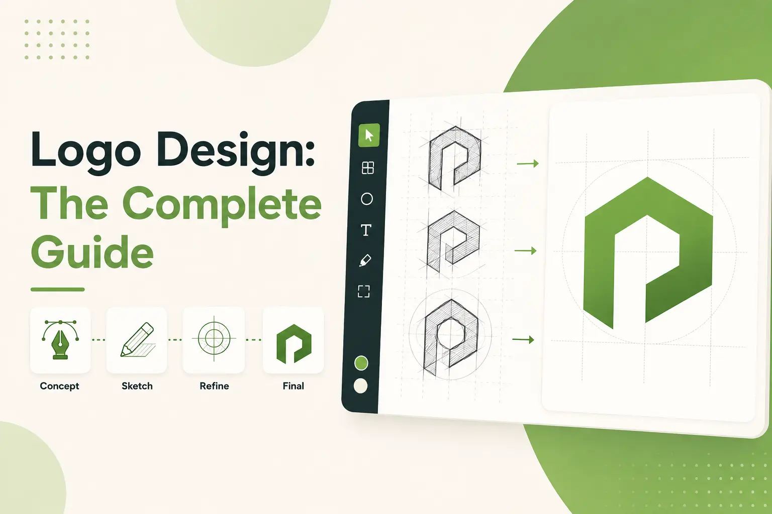
What To Know About Modern Logo Design Principles
Let’s now get to the meat of modern logo design principles. In the past, logos used bright colors and complex details. But these days, simplicity rules the roost. And believe me, I’ve learned this lesson from experience.
One gentleman I worked with a few years ago wanted to squeeze every imaginable symbol into his logo. In one design, we had flames, stars, and a little bird. It looked like a toddler had a field day with a coloring book. The client liked it, but when we ported it to other platforms, it was a disaster. You would not have been able to tell what the logo meant to represent on a smaller screen.
What does modern mean in logo design? First of all, it’s about scalability. A well-designed logo should appear as sharp on a business card as on a billboard. You need to rethink things if your logo loses its charm when shrunk. Brands like Apple or Nike you’d recognize them anywhere. That’s thanks to the clean, simple, and scalable logos.
Versatility is another critical principle. Your logo should be adaptable and used in a variety of formats and backgrounds. Think of using your logo with a white website background and then going over to a dark social media profile picture. Does it still pop? If not, a little fine-tuning may be needed. One of the tricks I apply to my designs, which have many color options, is printing them in black and white. This will ensure that the logo won't get ruined in any situation.
It's massive typography, too. Stock Graphics Fonts can make or break a logo. I once created a logo for a tech startup that required a super fancy script font. Sounds good in theory, right? Wrong. The thin lines became nearly invisible when printed on business cards. A switch to a bold, sans-serif font solved the problem immediately. Please tone down the fonts we use so that they will match our brand and be readable.
Then, there's color psychology. Months are divided into seasons, seasons are associated with colors, and colors, in turn, are linked to emotions. Blue projects a certain trustworthy vibe, which is why banks like it. Red, by contrast, conveys energy and excitement great for sports teams or food brands. But don't go overboard. There are so many colors that it can overwhelm the viewer. Limit yourself to two or three base colors, maximum.
One last thing before I finish, be mindful of negative space. Many of the best logos use negative space effectively to form shapes or messages. A good example would be FedEx; the arrow between the letters “E” and “X” denotes speed and accuracy. Genius, right?
Creating a contemporary brand identity isn’t rocket science, but it does call for consideration and strategy. With simplicity, versatility, and meaning, you’ll have a logo that can withstand the test of time. Oh, and if you screw up on the way? No big deal. The most you can do is turn every mistake into a milestone. Now go and build something amazing.
Modern Logo Design Trends That Will Dominate
Ok, let’s get into some trends. Whether you need a logo refresh or it’s time for one from scratch, here are some fascinating design concepts on the horizon 2025 offers. Well, I’ve been watching this stuff for a long time. Some of those trends are mind-blowing to me. Here are examples and personal insights to help explain.
To begin with, geometric shapes are having a moment. Think clean lines, sharp angles, and symmetrical patterns. Brands are embracing this look since it reads modern and structured yet not too rigid. One of my clients had an all-in moment around a logo full of interlocking triangles, and I’ll tell you what made some waves. The trick is to be balanced; too many shapes will make your logo look choppy. Keep it down to two or three major components, and you’ll be golden.
Moving on, we’re seeing loud colors and gradients. Gradients aren’t a new phenomenon, but they are changing significantly. Instead of the old basic two-tone fades, designers are now using multi-layered gradients to achieve depth and movement. It’s wild, but it works, with a seamless transition from neon pink to electric blue. Just keep in mind that if you’re balding, test how it looks against different backgrounds. You don’t want your gradient masterpiece to be lost in a shuffle.
And, of course, monochromatic palettes. Yup, sometimes less is more. Many monochrome logos use two slightly different shades of identical color to create contrast and interest. This trend works well for more minimalist brands or anyone looking to communicate simplicity and elegance. It’s also super versatile. Your logo will look good no matter the medium, whether it’s printed in black and white or set against a bold website.
Negative Space is another massive trend at the moment. This trend creatively uses the blank spaces in logos, making them a hidden symbol or message. Take the arrow in the FedEx logo. That’s negative. The Space was correctly done. It adds a bit of mystique and gives people pause. If you can make this work, your logo will stand out in the best way possible.
And here’s one that could throw you for loop, motion graphics and animated logos. Yeah, logos aren’t static images anymore. Many firms opt for more dynamic designs that move or change when viewed online. Think of simple animations, such as a leaf rustling in the wind or a circle that gradually blossomed outward. These logos seem alive and engaging, particularly on social media channels where video dwells.
And finally, there’s the emergence of abstract forms. Literal representations are dead, modern logos are going abstract. Suddenly, swirls, blobs, and uneven shapes are sprouting up everywhere. Why? Since you can be more powerful, have room for interpretation some room, and allow brands to showcase their personality. You have to be careful here if your logo becomes too abstract, it may be difficult for people to parse. Strike a balance between creativity and clarity.
So, what does all of this mean for you? Well, before following a trend, you should consider your audience and brand personality. Not every trend works for your vibe, and it shouldn’t. But if you know what you’re doing, you can create a logo that balances fad and timelessness. I have witnessed many businesses fail by trying to keep up with fads instead of being true to themselves. Learn from their mistakes.
It will be a decade of sleek rebellion, a healthy tension between performance and freedom. So whether you envision it as bold gradients, sleek monochrome, or flamboyant motion, steer very clear of the generic direction and instead imbue your logo with who you are as a brand. And if you need someone on your journey, do not hesitate to find me. Creating a killer logo should be fun, after all not stressful.
Elements of a Logo: How to Know Which to Make Yours

Okay, now, picking the right elements for your logo is one of the most essential steps in creating something that really embodies your brand. And believe me, I’ve made more than my fair share of mistakes, so I’m going to share what I’ve learned (the hard way).
Typography: First things first. While this might seem easy, choosing the correct font can seriously make or break your logo. A few years ago, I had a client who wanted to go with a fancy script font for a tech startup. Yes, it was pretty but try reading that on a business card or a mobile screen.
Lesson learned: Always use a font that fits your brand and what you intend to make with it. If you’re going for professionalism, stick to a clean sans-serif like Helvetica or Lato. Need something playful? Stylistically, try using a rounded, bubbly font but not too much.
Next up is color. Colors are not just a visual design; they bring emotions and narrate stories. For example, blue conveys trust and stability ideal for financial institutions or healthcare brands. Red, by contrast, radiates energy and excitement, which makes it a good pick for sports teams or food companies. But here’s the kicker, don’t go over wild with too much color. Limit yourself to at most two or three primary colors. More than that, and your logo runs the risk of looking like a rainbow throw-up. Been there, done that and it didn’t work out well.
Now, onto symbols and icons. These small things can bring so much personality to your logo, but they must be used with intention. For instance, if you're creating a logo for a green company. Instead of writing green or sustainable, why not use a leaf or tree icon? It's subtle yet powerful. But don't cram all the symbols into one design. In one of my early logos, I had a globe, a sun, and a bird all at once. Yeah, it was a mess. They should be low volume and high value.
A second thing to think about is negative space. Here, designers explore space between logo text, creating hidden shapes or messages. For example, the arrow between the "E" and "X" of the FedEx logo represents speed and precision. Genius, right? If you can create something like this, it'll add a new layer of mystery to your logo. Just keep putting words on the page. It may take several drafts to find what works.
And let's not talk about scalability. Your logo must be crisp and clear, whether printed on a billboard or seen as a tiny app icon. I once designed a logo with lots of detail that looked great at a big size but turned to mush when scaled down.
Note: You should always check your logo at different sizes and resolutions. If it strays, make it simple until it stands up everywhere.
Lastly, think about balance. Your logo must work as a whole; all elements must collate and connect. Piling on the same element can un-balance the overall design. Consider a logo that is text-based or image-based (or both). Neither of those scenarios feels entirely correct. Settle into balance, where every element works in concert with the others, but none dominates.
In closing, picking the right ingredients for your logo design takes some thought, testing, and perhaps even a few do-overs. Try different fonts, colors, symbols, and layouts until you create the right combination. And if you trip along the way? That’s okay. After all, we learn from our mistakes. So, get your creative tool kit, roll up your sleeves, and have fun making a logo that says much about your brand.
Best Modern Logo Design Tools and Software
OK, now let's talk about the tools. Choosing the right software can be the difference when diving into modern logo design. Now listen, I've run through many programs over the years, some good, some not so good. So, I will share my favorites and a few lessons I've learned. Trust me, this is gold.\51`a
The first is Adobe Illustrator. Plus, it's the holy grail of vector-based design tools. Why? Because it allows you to build logos that scale without losing quality. Whether you're designing print or digitals, they've got you covered in Illustrator. Sure, there's a bit of a learning curve, but once you master it, you'll wonder how you did without it.
Pro tip: Get good at the Pen Tool; you'll use it to create custom shapes and paths, and it's a game changer.
But what if you're a beginner or don't want to spend the big bucks on Adobe? Enter Canva. Canva is fantastic for newbies or anyone on a budget. It has an easy-to-use, cloud-based interface that boasts an array of pre-made templates to help you get started. Though it doesn't provide as much control as Illustrator, it's perfect for quickly throwing something together or collaborating with non-designers. Don't over-rely on stock elements; your logo should feel special, not off-the-shelf.
If you’d prefer something a little more collaborative, there’s Figma. Figma is amazing. It’s web-based to collaborate in real-time with your client or team member. It can also do vector editing and prototyping, making it a great all-rounder. One downside? It may not have all the bells and whistles that Illustrator has, but it works just fine for most logo jobs.
Now here’s a lesser-known but powerful tool, Gravit Designer. Another way to describe it is a free, not-so-heavyweight version of Illustrator. Gravit provides most of the same tools and functionality but at a fraction of the cost. It is ideal for freelancers or small businesses wanting to save a few bucks while still churning out quality designs. The only catch? If you are working in a larger creative ecosystem, it may not integrate as seamlessly with other Adobe products.
If you don’t have much time or want to create a logo quickly, you can turn to AI-powered platforms, such as Tailor Brands or Looka. These services use AI to create logo designs based on what you input. They won’t replace human creativity anytime soon, but they make solid brainstorming partners or can help test out different styles. Keep in mind that these tools usually churn out cookie-cutter designs, so modify them heavily so they can be truly yours.
Oh, and how about Inkscape, a freely available vector editor that is powerful once you get over the learning curve? It’s free, cross-platform, and capable of creating complex logos. The interface does feel a little clunky compared to commercial alternatives, though. Still, Inkscape is worth checking out if you’re on a shoestring.
Before you go First, always watch your file formats. Export your logo in different formats like SVG, PNG, JPEG, PDF, etc., to use it on various platforms. Export a transparent background version for the love of design gods. There is nothing more amateur than a white box around your logo.
Anyway, there you have it, a quick rundown of the very best tools for modern logo design. Each has pros and cons, so pick based on your experience, budget, and project requirements. And look, if you’re already asking yourself, where do I begin? Just pick one and get going practice makes perfect, right? So, go forth and create something great.
Common Logo Design Mistakes in Modern Times

Okay, all, let's discuss logo design danger zones. Believe me, I've been in that position where I made mistakes that made me want to throw my computer out the window. But what's an error if not a lesson, am I? So here's what NOT to do when creating a modern logo.
First and foremost, keep it simple. One of my first logos was a piece of junk because I tried to stuff every aspect of the client's business into one little graphic. The result? A cluttered hot mess that worked on a printed page but devolved into pixelated soup on digital surfaces. Simplicity is key. You have made it too complicated if you can't explain your logo in a single sentence.
Then, disregard scalability at your own risk. This is huge. A logo must appear crisp on a billboard and a business card. Early in my career, I created a detailed logo that looked great in large print only to find it was unreadable when it had to be put on other formats shrunk down. So before you commit, always test your logo at different sizes. Can you still identify it when it is thumbnail-sized? If not, it's time to go back to the drawing board.
Another big mistake is choosing the wrong font. Font choice sets the tone for your brand, so choose with care. Once, I used a lovely script font for a tech startup because I thought it would look classy. On small screens, the thin lines vanished, leaving an illegible blob. Use clear, readable fonts unless you know they’ll work everywhere. And for the love of god, don’t use Comic Sans unless you’re working on a clown-themed birthday party.
Then, there is the question of color overload. You certainly need colors, but too many may distract your audience. I recall a logo I designed in five different shades. It reminded me of a rainbow vomiting all over the page. Choose two or three colors at most. Not only does this Ensure your design is consistent, but it also makes it easier to print and brand later on.
First, let’s consider the subject of negative space. Negative space is an empty area and a chance to create interest in your logo. Like the secret arrow inside the FedEx logo or, even better, the cleverly placed “B” inside the BMW logo. When negative space is an afterthought, your design appears two-dimensional and uninspired. Play around with it and you may surprise yourself with what you create.
And don’t even get me started on following trends without a thought. But just because gradients and geometric shapes are popular, that doesn’t mean you should apply them to your logo without regard to your brand identity. Trends fade in and out; however, your logo needs to last years or even decades. Do not go after what you feel is trendy; go for the things that won’t lose value over time.
This is a big mistake, and lastly, forgetting versatility. Your logo must perform well in a variety of environments, websites, social media profiles, print materials, etc. If it pops when used over a white background but disappears against darker background tones, it is not versatile enough. Try it out against various backgrounds so it stands out no matter where it’s displayed.
In short, building a modern logo needs balance, consideration, and a dollop of patience. So, no overexposure, scalability issues, wrong font, too vivid colors, negative space, trends-copying, and general forgetfulness of uses. While these errors may seem trivial, they can sink into an otherwise great design. Study, and you’ll be halfway to creating a logo that embodies your brand.
The Best Modern Logo Design Tips and Case Studies
Okay, now let's check out some modern logos that nailed it in the real world. They aren't just pretty pictures but narrative masterpieces that create stories, arouse passions, and build lasting impressions. I've chosen a few favorites to deconstruct for you and what ingredients make them work.
First up is Airbnb. One of the best simple examples was a logo with the endearing name Bélo. At first, it appears to be a clean, minimalist icon, but scratch beneath the surface, you'll find layers of meaning. The shape embodies four elements: air (breath), water (wave), fire (heart), and earth (location pin). Genius, right? What Airbnb did in such a great way was create something very visual but also rooted the experience in their core values belonging anywhere. The sans-serif typography also keeps it feeling modern and approachable. But the lesson behind this is never underestimate storytelling's role in your design.
Next, we have Spotify. Now, Spotify's logo may look simply a green circle with three lines but there's a method to the madness. Those lines symbolize sound waves a direct reference to their music-streaming service. But here's the thing, the logo works on every platform imaginable. It is instantly recognizable on a phone app, billboard, or merchandise. And in addition to their clever use of story, don't forget about their use of color. That bright shade of green pops but doesn't overwhelm it, making it a good choice for branding. The takeaway here is that we should strive to be consistent yet adaptable.
Then there's Slack, yet another tech behemoth with a killer logo. Slack's design includes four colorful squares arranged like diamonds. At a glance, it may feel chaotic, but in fact, those colors signify collaboration, which is the essence of the service that they provide. Independent pieces that fit together, representing teamwork and flexibility plus, the bright palette is fresh and inviting, which fits their brand personality just right.
Key Point: Reinforce your brand identity with symbolism.
Let's pivot and focus on Nike. Sure, Nike was invented in ancient Rome, but its swoosh is one of the most recognized modern logos ever conceived. Why? Because it represents movement, speed, and ambition qualities associated with athleticism. And wait, this thing works in black-and-white or color, large or small. Talk about versatility. If I had guidance, I could have confidently treated design solutions like in real life.
Lastly, I'd like to mention Dribbble, a website where designers upload work samples. Their logo features a combination of a basketball-style icon and a gradient design. It has an element of playfulness and professionalism and embodies creativity and competition. Gradients were once considered poor practice by designers, but let it be known that Dribbble can make them feel pretty right.
What, then, is the commonality between these successful logos? They are simple, meaningful, and adaptable. Each one also tells a story, resonates with its audience, and withstands the test of various media. When designing a logo, be inspired by these brands, but keep to your vision. Because copying won't take you far, innovation will. Now, get out there and make something memorable.
Key Takeaways
And there you go, your definitive guide to modern logo design for 2025. With knowledge of the principles and trends, the correct elements, and some powerful tools at your disposal while being mindful of potential mistakes to avoid, you can create a logo that embodies your brand. Always remember that a good logo doesn’t have to look good; it has to tell a story. Well, get on with your creativity, and let your logo do the talking.
.svg)
.svg)
.svg)
.svg)