Did you know that 88% of business relationships are initiated by exchanging business cards? This means many people would have their first 'in-person' interaction with your brand through your business card. Thus, your business card logo design is essential. A good logo can make or break a first impression.
This guide covers everything you need to know about business card logo design. Everything from choosing the right colors to ensuring your logo aligns with your brand identity, so stay tuned. Are you prepared to turn your business cards into effective marketing instruments? Let's get started.
A Brief Yet Comprehensive Guide to Business Card Logo
And now, let me tell you something I was never aware of the logo for business cards. I’m going to level with you when I first started, I thought a business card was just a little piece of paper with my name and contact details. A card is so much more than that your ambassador, your handshake on paper. And at the heart of it all is the logo.
Let me share a little story. Many years ago, I used to pass these bland, generic business cards to potential clients. No logo, no design, just text. Guess what happened? Nothing. They would glance at them, throw them away, and forget I was alive five minutes later. Things turned around only when I added a simple but striking logo. It was also then people started to remember I existed. They even had a comment thrown in about how cool the logo looked. That’s when it dawned on me that a business card logo isn’t optional but necessary.
Now, why is the business card logo so important? To begin with, it aids in building brand awareness. Think about it. When people see your logo and name again on your website, social media, and now, a business card it seeps into their subconscious. Before long, they link that logo with your company. Huge if you want to build trust and credibility. Trust me, this works. One client once told me she chose my service over another company because she liked my logo. Crazy, right?
Another reason logos matter? They establish emotional impact. Words can describe what you do, but a well-designed logo can inspire emotion. Take coffee shops, for instance. The Starbucks logo featuring a mermaid makes you feel warm. If your logo's doing its job, it'll evoke emotions associated with your brand. Once, I created a logo for a pet grooming service, and for that one, we chose a playful paw print with swirls around it. Clients liked it because it was friendly and approachable, like the business.
But here's the catch, no old logo will cut it. Make sure that your business card logo suits your brand identity. If you're a high-end law firm, you likely don't want cartoony characters splattered on your card. For example, conservative serif fonts might feel too stuffy when planning kids' parties. See what I mean? It's just a vibe-matching game. I started making the mistake of using a super casual font for a tech company logo. Let's say it didn't punch well. The lesson learned, know your audience.
And we shouldn't ignore the scalability bit. A strong business card logo must look crisp on a small piece of cardstock and blown up on a billboard. When increasing or decreasing the size of the logos on canvas, I have seen way too many go pixelated or out of detail. Don't let that happen to you. Always use vector graphics when you can, they will keep everything sharp and clear. Trust me, nothing undermines the professionalism of your communication more than a pixelated logo.
Ultimately, your logo will serve more than just a visual purpose for your business card. That's a promise, a statement, and a representation of your business identity. Whether you're giving it to a potential client, sharing it at an event, or leaving it when you leave a meeting, that logo could be all that stands between you and the impression you want to get. So use the time to ensure you get it right, from investing in quality design to sticking to your brand and enjoying the magic.
Trust me, I've been there. I've experienced both ends of the spectrum: the strength of a good logo and the regret of a mediocre one. It doesn't have to be undertaken all at once; if you're serious about impacting, get your logo on your business card for starters. Because, at times, it is the little things that matter most.
Key Elements of an Effective Business Card Logo Design

Now, let’s review the essentials of good business card logo design. I learned this through years of trial and error and believe me, there were a lot of errors. When creating a logo for your business card, you need to consider a few key factors that make it functional and eye-catching without being too busy or confusing.
First up, color palette. Colors are the mood singers of your logo. They can alter a person’s perception of your brand. Blue, for instance, tends to represent trust and professionalism, an excellent pick for financial services or tech companies. Red, by contrast, inspires energy and excitement, which is better for a gym or entertainment business. I had once designed a bright pink logo for a construction company. The owner loved it; prospective clients felt it looked amateurish.
Takeaway: Pick colors based on your market and demographic.
Next, we have typography. Fonts are more important than you’d realize. Modern brands do well with a sleek sans-serif font, while serif fonts convey a sense of the classic and elevated. Avoid overly complicated scripts unless they fit seamlessly into your brand identity. Keep in mind that readability is king. Once, a lawyer asked me to design a business card for him, and he wanted something elegant, so I used this very elaborate calligraphy-style typeface. As it turns out, no one could read his name without squinting. Not ideal. Make it straightforward and readable; people won’t have to guess who you are.
Then there’s iconography. Include a logo graphic. If you want a stronger logo, consider adding a graphic. Just don’t overthink it. A single icon can say a lot about your business if done correctly. A tree, for example, might mean growth to a landscaping company, or gears could represent precision to an engineering firm. Avoid overcrowding your logo with multiple symbols; it will become hard to understand.
Pro tip: Aim for simplicity. Less is more, you know, some of the time.
Scalability is another key one. Your logo should also look good when shrunk to a small business card or expanded to a large billboard. Vector graphics are your friend here. They mean your logo will always be sharp and clean at any scale. When I was early on in my career, I made the rookie move of using a raster image for a client’s logo. While it sounded good in theory it looked amazing on their website it ended up being a pixelated mess on the business cards. Is it embarrassing? Yes. Is it preventable? Absolutely.
Let’s discuss balance and symmetry. A balanced logo looks attractive and feels professional. A lot happening in one corner? That’s not gonna throw off the whole design. Symmetry isn’t essential, but it does evoke harmony. For example, take Nike’s swoosh: it's balanced, simple, and instantly recognizable. When designing logos, I would stuff them with random lines and shapes to make them interesting. Instead, opt for clean lines and consider placement.
Lastly, consider brand consistency. Make sure your business card logo aligns with the rest of your branding. Picture getting a business card with a different logo than the one used on the company’s website. Confusing, right? It helps develop trust and strengthen brand identity. A tip I love is keeping the same colors and fonts across all platforms. It makes for a cohesive look that sticks in people’s minds.
In conclusion, designing a great business card logo balances key elements: color, typography, iconography, scalability, balance, and consistency. Nail these, and you’ll end up with a logo that looks amazing and represents your brand accurately, too. Okay, it requires effort, but believe me it pays off. After all, your business card logo could be the first aspect of your company that someone sees.
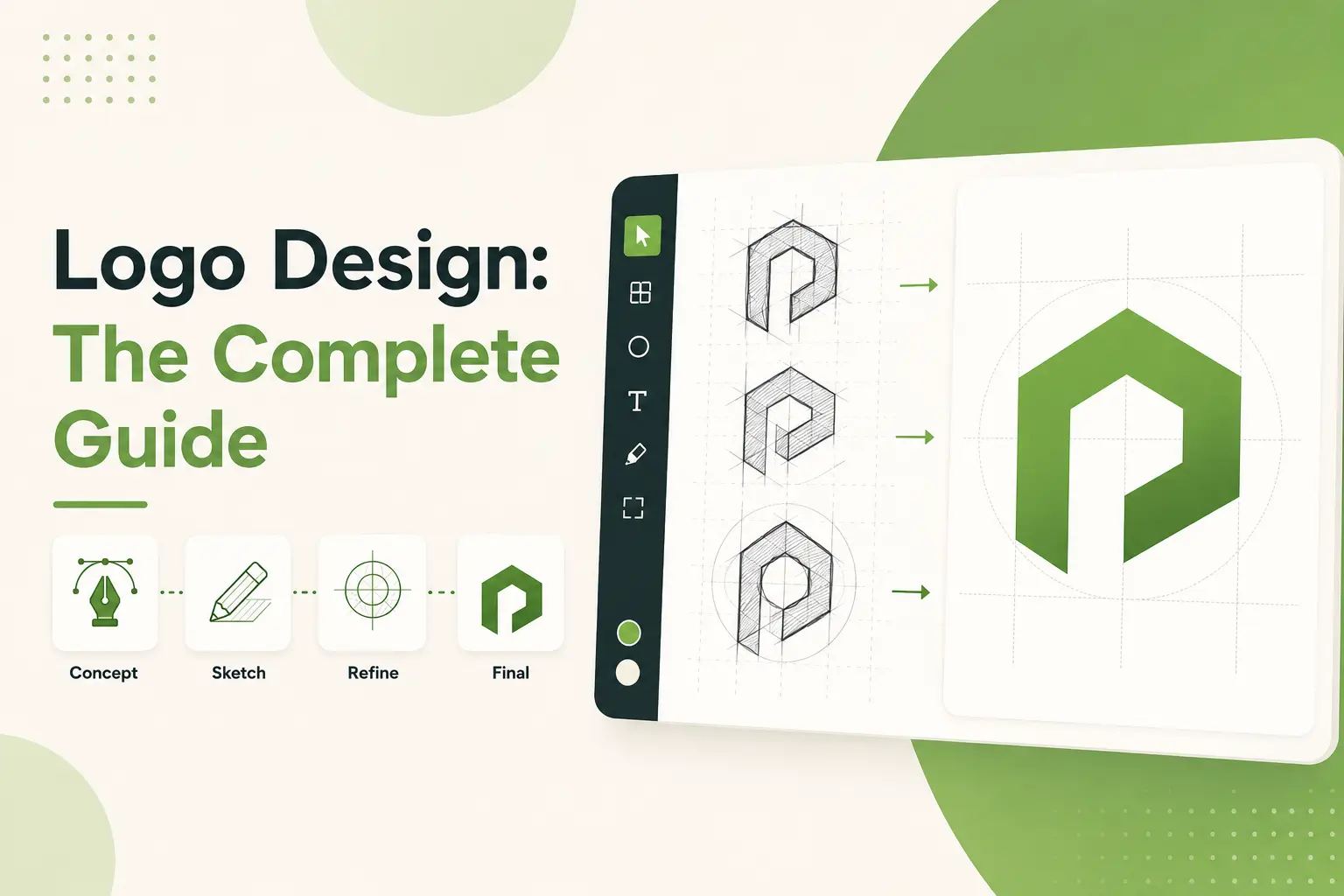
How to Design a Business Card Logo: Step-by-Step

Okay, let’s go on how to design your business card logo. This isn’t just a theoretical process. I've been through it myself and I am about to share everything that works (and doesn’t). If you’re ready to start designing a logo that reflects your brand, grab a pen and paper (or launch up Photoshop) cause we’re about to dive in.
Investigate Your Industry and Competition [Step 1]
Ida, Find the awe in the library before you even start drawing. Check out other logos within your industry. What do they have in common? What stands out? If you’re in tech, you’ll likely see no-frills styles with crisp lines, for instance. If you’re food or hospitality, maybe you only use bold colors and playful fonts. My first logo was for a coffee shop, and I spent more than hours looking through competitors cards. Some used warm browns, while others used bright greens. That gave me a baseline to work off of and inspired me to add something different.
The caveat: Don’t directly replicate it; ignore the trends at your peril. You want to fit within your industry but still be unique.
Draw some of your initial ideas [Step 2]
The next fun part is taking a pencil to paper and doodling. No pressure on you; these ideas are rough, not polished gems. Emphasize shapes, symbols, and text placement. Don’t get stuck on one idea. When I began developing a logo for a landscaping company, I illustrated everything from trees to patterns made of leaves before hitting upon a simple evergreen icon. Allow yourself some slack in the process. The best ideas come from the least likely prospects, trust me.
Bonus advice: Keep it simple. A complex design might be ostentatious, but will it shrink well to fit a business card? Probably not.
Select Your Color Palette [Step 3]
Be extra choosy because your colors set the mood for your logo. If it helps, begin with thinking about your brand personality. Do you have your serious face on? Go with blues or grays. Creative and energetic? Try reds or yellows. Single Handedly, one thing I did wrong initially was choosing colors based on what I liked as an individual, not thinking about the audience. My friend’s law firm ended up with a blinding orange logo because he liked the color, not exactly a trustworthy look.
Pro tip: Try using two or three dominant colors. More than that, and your logo may look too busy.
Select Typography [Step 4]
Typography is huge. Using the wrong font can kill a perfect logo. Sans-serif fonts appear modern and minimalist, while serif fonts are more classic and trusted. Steer clear of decorative fonts as much as you can unless they fit your brand exactly. When I was first starting out, I designed a tech startup logo in a fancy script font. It sounded great right, until no one could understand it. Readability should always come first.
Fun fact: Research shows individuals correlate specific fonts with specific sectors. For example, groovy, playful fonts are frequently seen in children’s products, and complex, angular fonts are appropriate for industrial brands.
Develop Your Design On A Pixel Level [Step 5]
After you’ve perfected the basics, it’s time to digitize your logo. Use tools like Adobe Illustrator, Canva, or free programs like Inkscape. Why digital? Vector graphics keep your logo crisp no matter where you print it on a business card or a billboard. When I used to do logo design, I used low-res images. My mistake was enormous. They pixelated badly when resized. Learn from my pain.
File: Be sure to save a copy of your files. AI (for editing) and SVG or EPS (for scalability).
Test and Get Feedback [Step 6]
Don’t skip this step. Yes, previewing it in some software is fine, but print out the logo on physical business cards and see the actual results. Does it stand out? Is it easy to read? Please share it with friends, family, or peers and solicit genuine feedback. This evening, I thought a logo I made was perfect until someone said its text was too small to read without squinting. But mistakes are better to be caught now than later.
Note: You may want to experiment with different sizes/formats. How visible is your logo at 100px height for use on letterheads and websites?
Finalize and Optimize [Step 7]
Refine Your Logo: After receiving feedback, make any necessary adjustments and finalize your logo. Make sure it is versatile and can transition to different mediums. Check alignment, spacing, symmetry etc. And keep in mind the key is simplicity. Here, less is more in terms of how logos were made. Consider Apple or Nike when you see their logos, their designs are iconic, clean, and easily remembered.
That’s it. Following these steps will give you a business card logo representing your business. Sure, it requires elbow grease, but I promise it will pay off. After all, your logo is likely the first thing a potential client sees.
Business Card Logo Design Mistakes to Avoid

Alright, let me share some of the mistakes people make when designing a business card logo. Trust me, I know; I’ve made some of these mistakes myself, and I’m here to rescue you from these headaches. If you’re serious about designing a logo that won’t have you or your brand hanging your head in embarrassment, take care to avoid these euthanasia.
Overly Complicated Design: The First Mistake [Mistake #1]
Probably the biggest beginner's mistake when designing a business logo is overdoing it. You know, too many colors, shapes, and text elements are clamoring for attention. A business card is not a canvas for artistic experimentation but a tool for first impressions. To this day, I’m still glad I created this logo with five icons and three fonts when I was starting. On paper, it seemed a little bit like a circus act. They had no idea what my business did. Could you keep it simple, folks? Your logo should be simple, not overwhelming.
Design Tip: Focus your design on one or two elements. Less is more.
Not Doing Scalability [Mistake #2]
That’s a common mistake as well. Your logo might look great on a computer screen, but that doesn’t mean it’ll render well on a small business card. I once spent hours getting a logo right, only to find out it became a blurry mess in print at smaller sizes. Test your logo at various size scales at all times. You must return to the drawing board if it loses clarity or detail. Vector graphics will be your best friend here, they will ensure your logo remains crisp, no matter the format.
Just a friendly reminder: No need to go into technicalities unless they’re entirely critical. Straightforwardness guarantees readability.
Choosing the Wrong Colors [Mistake #3]
Colors frame your brand, so choose accordingly. So many people choose colors they like, not their audience or industry. Like neon pink for a law firm? That will look edgy but unprofessional at the same time. On the other hand, dull grays and blues for a creative agency may come across as stale. Research well and know your colors in alignment with your brand identity.
Did you know that each color can be associated with a certain feeling? Blue represents trust, green reflects growth, and red brings energy. Use them strategically.
Using Bad Typography [Mistake #4]
Typography is more important than you think. The exact font can make or kill a logo, even if it is flawless. Skip fonts that are overly decorative or difficult to read unless they fit your brand perfectly. I used a script font with an attitude for a tech startup logo early in my career. It was cool, but no one could read the company name without squinting. Readability >> style.
Bonus tip: Use one or two fonts max for each logo. More than that, and it becomes cluttered.
Failing to Maintain Brand Consistency [Mistake #5]
Your business card logo should be consistent with the rest of your branding materials. Best business card for your company. Imagine getting a business card with a logo different from the company website. Confusing, right? When your branding is inconsistent, it dilutes your brand message and complicates people's ability to differentiate between you and your competitors. I remember working with one client that had three different logos across platforms. It was chaos. Choose one version and adhere to it.
Takeaway: Your marketing materials should utilize the same color palette, typography, and general aesthetic.
Skipping Feedback [Mistake #6]
Don’t skip this step. Get those logos printed on real business cards and start sharing them with people. Here are some things you can do to prepare, they may catch things you didn’t. I once thought a logo I designed was perfect until someone told me the text was too small to read without glasses. Painful lesson learned. It is always advisable to test the designs for those you come to use here before approving them.
Final tip: If you have some promising concepts, chance your arm and show it to potential clients or customers. They can be a great source of help.
Steering clear of these all-too-common pitfalls will put you light years ahead of the competition. Remember, most of the time, your business card logo is the first glimpse someone gets of your brand. Ensure it is clear, professional, and consistent with who you are. I promise you will be much happier later if you take the extra time to do it right now.
How to Create Your Business Card Logo

Okay, now let's get into the tools and resources that can help you create a business card logo that looks great and minimizes the time you spend designing one. Whether planning your logo yourself or getting it done with experts, having the right instruments in your arsenal can streamline the process while ensuring your logo is best suited for your business. I've tried (and sometimes wrestled with) many of these over the years, so I'm offering my favorites and some practical advice.
Graphic Design Software
You'll need solid graphic design software if you're committed to crafting a polished logo. Here are a few options, Adobe Illustrator is the gold standard for vector graphics. It enables you to design scalable logos that will not lose detail regardless of size. Sure, it comes with a steep initial learning curve, but once you're comfortable, there's pretty much nothing you can't accomplish.
CorelDRAW is another vector design-capable software. If Adobe isn't your thing, CorelDRAW has similar functionality but slightly different aesthetics. It is excellent for beginners wanting advanced functionality without discouragement.
Affinity Designer is an affordable substitute for Adobe Illustrator. It's quick, intuitive, and ideal for people who don't want to pay for Adobe's subscription model. In times when I needed something light and professional, I transitioned to this for a minute.
Tip: You should permanently save your file as a vector file, such as AI, SVG, or EPS. These help your logo look sharp on a business card or on a billboard.
Free Online Tools
Not everyone can afford the most premium software, and that's fine. There are a ton of free tools that can help you make good-looking logos.
Canva this is great for beginners. You can utilize pre-made templates and a user-friendly drag-and-drop interface. It's not as heavy-duty as Illustrator, but it's okay for rush jobs or beginners.
Logo Maker by Wix for a bare-bones option, Wix's Logo Maker helps you create logos based on customizable templates. Compared to full-on design software, it's restrictive, but it does the trick for simple needs.
DesignEvo is a good option for making very basic logos. With hundreds of icons and fonts, you can find the style that suits your project.
Bonus Tip: Try to use clean, professional designs, even if you are using free tools. Avoid anything too cartoonish unless it fits your brand.
Color Palette Generators
Selecting the right colors can be challenging, mainly if you don't work as a designer. Fortunately, there are tools to assist.
Coolors my favorite tool for color palettes. Hit the spacebar, and Colors will cycle through limitless combinations until you find your match. You can also pin down colors you adore and design around them.
Adobe Color is yet another fantastic resource for color schemes. It has excellent integration with other Adobe products, which is convenient if you already use their suite.
Khroma is an AI-powered app that recommends color palettes based on your taste. It's beneficial when you're stuck and looking for inspiration.
Quick Logo Tip: Limit the color palette to two or three colors. Excessive use of multiple colors can be overwhelming and muddle your message.
Font Resources
Typography fanciful fonts are a significant percentage of a logo design, so the correct fonts are essential. Here are a few sources for some high-quality fonts.
Google Fonts a variety of free, open-source fonts that could be used for almost any style. Whether you need a bold sans-serif or a beautiful serif, Google Fonts has a solution.
DaFont offers a wide variety of fun fonts. Watch out there are many gems, but some cannot be used for work. Be sure to preview before you download.
Font Squirrel provides commercially free fonts for personal and business use. They also offer webfont kits for digital uses.
Tip: Always check that they are legible and easy to read, especially at smaller text sizes. Nothing can kill a business card faster than text that can’t be read.
Professional Services
However, if you don’t feel confident in your design skills, outsourcing to professionals could be a good option.
Local Designers or Professional Design Agency: Don’t dismiss us until you try us. They may offer a more personalized service and be able to cater their efforts directly to you.
Final Takeaway: Run, do not walk, to a professional designer. Pay them to design a logo representing you if you can afford it.
Additional Resources
Here are some additional features that can elevate your logo design experience.
Pinterest and Behance are great for finding design inspiration. Look up business card logo design and scroll through thousands of examples that can inspire you.
Brand Identity Forums: Join forums like Reddit's r/logodesign or Dribbble to meet other designers and get feedback on your work.
Print Proofs: Before ordering, order printed proofs of your business cards to see how they would look. Occasionally, colors or details don't transfer from screen to paper.
With these resources and tools, you will be equipped to design a logo that represents your brand identity and captivates interest on a business card. Just focus on being human and relatable, easy, and test your pages in real environments.
In Summary
Logo design on business cards is all about a delicate balance of creativity and functionality. Remember that your logo must look good, but also say something about your brand's core values and mission. By implementing the steps discussed in this article, you can make sure that your business card leaves an impact. So, what are you waiting for? Now, create the ideal design for your business card logo and build your brand.
.svg)
.svg)
.svg)
.svg)