Did you know that 94% of first impressions are based on design? That's right, your website's UI design can make or break your online presence. Whether you're a seasoned designer or just starting, mastering website UI design is essential for creating engaging, functional, and visually stunning websites.
We will discuss the fundamentals of Website UI Design, tools to help you, industry trends in 2025, and top companies to follow. By the end, you'll have all the tools to create designs that look good and provide an excellent user experience. Let's get started!
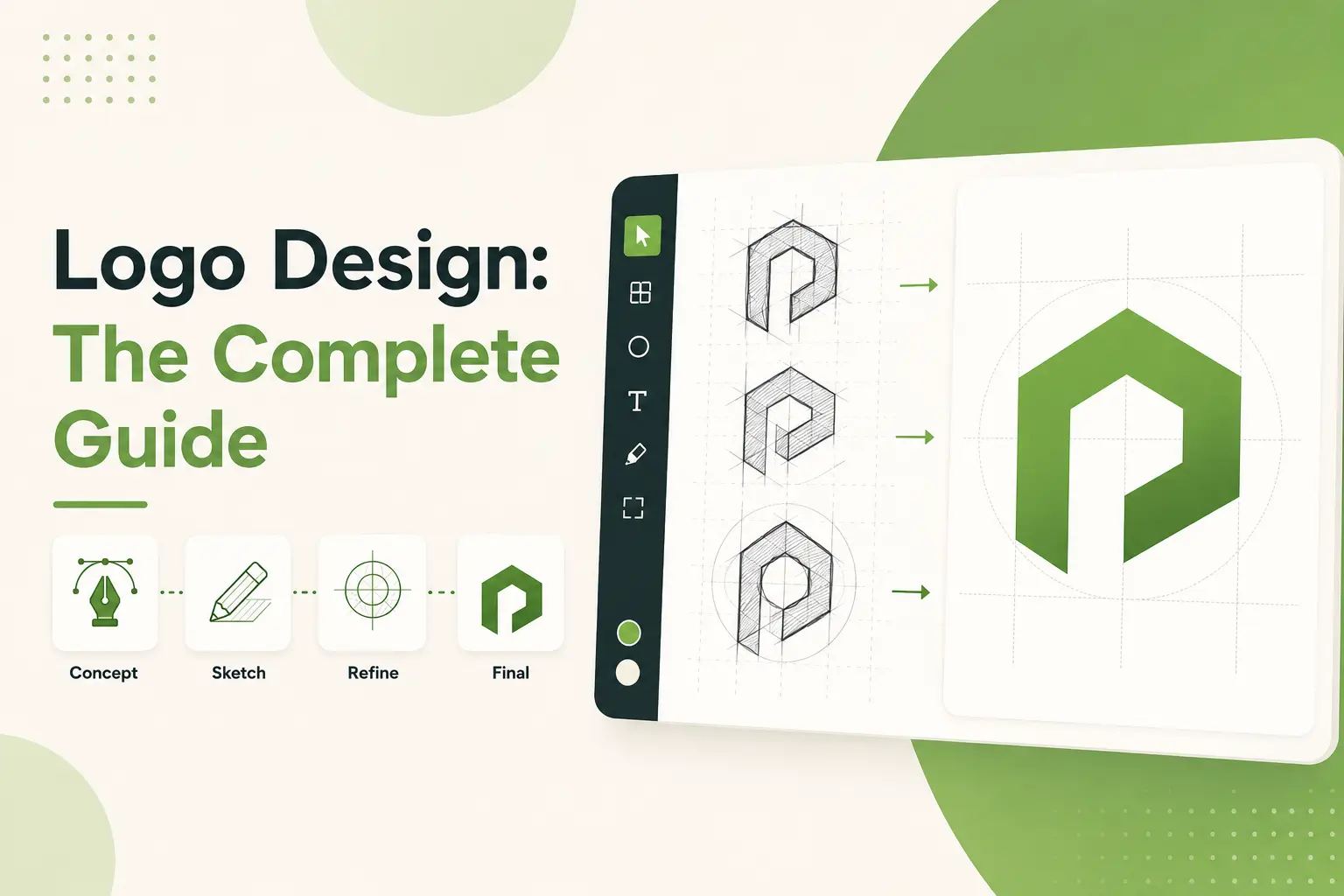
Basics of Website UI Design
You know that feeling when you arrive on a website, and it all just clicks? The buttons are where you’d expect them to be, the colors will not make your eyes bleed, and navigating the app feels second nature. It’s not magic, it’s good UI design. UI, or User Interface, refers to everything the user interacts with on a website: buttons, menus, forms, images, and text. It’s how people talk to your website without talking.
Now, here’s the thing, I didn’t always nail this. Early on in my career and by early, I mean when Geocities was still cool, I created a website that was so cluttered I lost track of how to use it. It was full of flashy banners, five different fonts competing for attention, and a neon green background that exclaimed, do not stay here. Nobody did. If Google Analytics had been a thing back then, my bounce rate must’ve been sky-high.
So what changed? Well, experience, and a healthy shot of humility. Over time, I understood that a good UI does not try to show your design skills; it is about making life easy for the user. It’s like hosting a dinner party, you want guests to have fun together respectfully toward the guests and the home they are sharing. Do you just put everything in a pile on a tiny table and let the guests figure out how to eat without plates? The same goes for websites. Everything has to be presented in a clear, welcoming, logical way.
One of the big lessons I learned was the difference between UI or user interface and UX, or user experience. People always confuse these two, but here’s the thing, UI is how the site looks and feels, whereas UX is how smooth or frustrating the whole experience is. For example, a beautiful button means nothing when clicked, and it takes an eternity to open the next page. Both are needed for any given site to shine genuinely.
If you are beginning to work with it, keep it simple. A clean layout, with tons of white space, works wonders. And for the love of god, only use one font family, and do not switch it up. Really, nothing says amateur hour quite like Comic Sans spliced with Times New Roman. Future visitors will appreciate it.
Another pro tip, before launching your designs, make sure to test them on actual humans. Long ago, I mentioned I knew everything users wanted spoiler alert again, I didn’t. What makes sense to me seems to make zero sense to other people. So find a friend, colleague, or random stranger and observe how they interact with your site. Their insights will spare you innumerable headaches further down the line.
Since Website UI Design should be much more straightforward, one important focus is assisting people with doing the stuff they came for without any struggle. Whether purchasing a product, reading an article, or registering for a newsletter, each component should lead them to that finish line as seamlessly as possible. Because, at the end of it, happy users means happy business.
And hey, if you’re ever looking at a neon green mockup and wondering, Is this even a good idea? Remember my story. Simplicity wins every time.
Important UI Web Design Principles for an Efficient Website
I’ve been designing websites for a long time, at least since the early 2010s. And listen to me when I say this, a good UI design is not just about how good things look. Nope, it’s about creating an experience that users think, Wow, this is easy! But trust me, getting there? That’s not always so simple.
We once had this project, which we thought would be great, and all we needed were in-your-face animations and crazy colors. They weren't. Users hated it. My bounce rate was tremendous, and I wanted to hurl my laptop out the window. That's when the importance of adhering to some fundamental rules instead of following trends hit me. So, here is what I learned over the years.
First, it is simple. Do you know the ones, the sites that bombard you with a million pop-ups, flashing banners, and inscrutable menus? Yeah, nobody likes those. A clean layout allows people to concentrate on what is essential. Think of Apple’s website as minimal yet efficient. Once, I stripped the clutter from a client’s homepage, and their conversions increased by 35%. Crazy, right? Could you keep it simple, folks?
Then there’s consistency across pages, which is a bit like showing up to work in the same uniform day after day. If buttons change colors or fonts turn randomly, users will face confusion. I used to make this mistake of creating links in a different shade of blue because why not? It’s adding variety. People didn’t even know half the links were clickable. The lesson of that experience is to have a style guide and follow it.
Now, it’s time to discuss visual hierarchy. This one’s huge. So, imagine entering a store, but everything is scattered everywhere; you won’t even know where to start, right? The same goes for websites. Use size, color, and white space to direct web visitors’ eyes. Headings, headlines should be more significant than the text in the body, while CTAs must pop. Oh, and whitespace? Don’t underestimate it. Whitespace is the room to breathe, and trust me, users love it.
Another major one is accessibility. Here’s the thing, if your site is not accessible, you’re leaving money on the table, and quite frankly, that’s just rude. Screen readers, alt text for images, good contrast ratios. All that little stuff adds up. A friend admonishing that one of my designs was keyboard-impossible became a wake-up call. Embarrassing? Absolutely. Now, I will double-check accessibility standards before I launch anything.
Finally, there’s responsive design. These days, over half of web traffic comes from mobile devices. If your site looks screwy on a phone, you’re toast. I was testing a site on my old iPhone 6 (yeah, I still have it), and the menu overlapped the logo. From that point on, I test everything across a few different sizes. Some tools, such as Chrome DevTools, make this easier.
Sure, these principles sound pretty basic, but it takes practice to master them. The first step is to start small, iterate often, and learn continuously. You can trust me with this, and your users will appreciate it, and possibly even Google.
The Best Website UI Design Tool

You gotta believe me. Back then, the right tools for website UI design felt like exploring a maze without a blindfold. Remember when I was playing to make a web design, and all I had was Photoshop? Yeah, the cringe, right? Don’t get me wrong; Photoshop is awesome for photo editing, but UI? There were a lot of frustrated late nights, let’s say.
Fast forward a few years, has the game changed. But now you have tools that not only make designing interfaces easier but also kinda fun. Some of these are so obvious that they feel downright illegal. Let's jump right into my favorite website UI design tools in 2025 because, if you are still using that old software, you're missing out on possibly the best software out there.
First up, Figma. If you don’t know Figma, where have you been? This is now my tool for anything from wireframes to high-fidelity mockups. What makes it stand out? Well, it’s cloud-based, so for one, you don’t have to email files back and forth or deal with any version control nightmares. Plus, they’re insane regarding a collaboration; you can work with developers and clients in real-time. As one example, one of my projects consisted of a team on three continents. Thanks to Figma, we saved hours of confusion. It’s light, quick, and frankly, you can’t go back after you use it.
Then you have Adobe XD, another heavyweight. Now, I’ll confess I wasn’t always a believer. However, when Adobe initially released XD, it felt clumsy compared to Sketch. But they’ve upped their game over the years. The prototyping tools are slick as hell now, and that auto-animate feature? So, I had an immaculate sense of developing interactive prototypes without any code requirement. Some time ago, I crafted an e-commerce site where users could swipe between product images, which worked incredibly well in Adobe XD. Just drag, drop, and boom! You’ve got yourself a stakeholder-wowing prototype.
Speaking of Sketch, this one still stands the test of time, particularly among Mac users. I was a Sketch user for quite a few years until I finally switched to Figma, and here’s the thing, sketch is excellent for vector-based designs. There’s also a considerable plugin ecosystem, there is a plugin for everything you can think of. Need icons? Check. Looking to create CSS code snippets? Done. That said, it’s desktop-only, so if working remotely is a key aspect of your workflow, you may want to look elsewhere.
Now, let’s talk about Canva. Yeah, I know, it gets called too basic, a lot. But hear me out. Canvas UI kits are lifesavers if you’re a small business or a solo entrepreneur who can’t afford fancy subscriptions. I helped a friend set up his coaching business website with some Canva templates, and although he had zero experience with design, it looked very professional. Okay, it isn’t going to take over Figma and XD for complex projects, but sometimes less is more.
Finally, do not fall asleep with Zeplin. This isn’t a design tool, but it makes life easier. After you complete your designs in Figma or XD, Zeplin closes the divide between designers and developers. No more pixel values or hex codes, just upload your designs, and Zeplin auto-generates style guides. This saves an enormous amount of time and miscommunication. So do it; your dev team will appreciate it.
So, what’s the takeaway here? Whether you’re already a seasoned pro or just dipping your toes into the deep, dark web waters of website UI design, tools make the difference. From the collaborative brilliance of Figma to the slick animation capabilities of Adobe XD, each tool adds flavor to the mix. And hey, don’t dog Canva until you’ve used it, it’s great for all those quick-and-dirty projects.
Use these tools, determine what works best for your workflow, and keep learning. UI design is changing more rapidly than ever, and to keep up, you need to harness the technology that puts you out in front.
Web UI Design Trends to Look Forward For in 2025

Only now, the screen grabs are filled with lawsuits instead of sitcoms; let me tell ya, if there’s one thing I wish I could impress upon you, it is that staying in the loop with website UI design trends is all like new seasons of your favorite binge-worthy TV show. I remember that in 2020 (pre-pandemic time), the world was obsessed with embracing minimalism. The world was clean lines, white space, and sans-serif fonts. Fast forward to now. Things are way more dynamic. So, let’s get into the heat for 2025. If your taste is only flat design, you will be left behind.
Lately, one of the biggest things I have seen is neomorphism taking center stage. It’s this bizarre but excellent combination of flat design and skeuomorphism, those buttons are made to look like they’re popping off the screen but also melting into it. It was little more than a fad, or so I thought, but then I redesigned a client dashboard last year using neuromorphic elements, and wow, what a difference! It felt futuristic yet familiar, users said. Go figure. However, if you want to try out this trend, don’t go too far. Having too many shadows can clutter up your site quicker than you can say, CSS.
And something else that’s exploding? Dark mode optimization. Honestly, I hated dark mode until recently, I mean, who wants to switch back and forth between different color backgrounds and make their eyes adjust? I realized how much longer my phone battery lasted because of it. And guess what? Turns out users love it, too. Research shows that well-implemented dark modes for a website can increase user retention by 15%. That’s huge! The get-here ensures the text contrasts properly, so readability doesn’t take a nosedive. You don’t want to end up with gray-on-black disasters, trust me.
Oh, and on a side note, let’s discuss micro-interactions. These little guys have been around for ages, but in 2025, they’ll be crucial. Consider hover effects, button animations, or even subtle loading spinners. I was working on an e-commerce site some time ago, and we implemented small heart animations when a user favored a product. Sales went up by 8%! Crazy, right? Micro-interactions keep your users informed, which builds a connection with your platform. Don’t go overboard, you don’t want confetti exploding whenever someone hits submit.
One of the trends I'm personally geeking out on is prominent 3D elements and animations. Do you know those old Flash websites from the early 2000s? Well, a lot has changed since 3D was a trend. Especially using tools like Blender and Three. Js, designers are building immersive experiences without slaughtering page load times. Last month, I assisted a travel agency in applying a rotating globe animation over its homepage. Visitors could select countries to find destinations. Engagement skyrocketed! Of course, performance is paramount, if your 3D shenanigans slow the site down, people will bounce out URLs quicker than you can blink.
Finally, there are voice user interfaces (VUI). Yes,I know it sounds futuristic, but stick with me. It seems more and more people use voice assistants, such as Alexa and Siri, daily. So why not apply that convenience to web design? For example, you could use it to browse recipes hands-free while cooking. Cool, huh? Oh, our VUI, Oh Hiyaga, implementing VUI is not easy. It does require good backend support, but it is worth it if you're looking to stay ahead of the curve.
So there you have it. Neomorphism, dark mode, micro-interactions, 3D magic, VUIs, the future tech defining UI design in 2025. Trust me when I say trying out these trends can be intimidating, but when has growth ever come from being comfortable?
Some Other Design Techniques to Avoid in Website UI Design
If I had a dollar for every time that I designed a shit website UI early on in my career, I’d probably be sitting somewhere on the beach sipping margaritas right now. But mistakes are how you learn or something, right? And let me tell you, if you are in the field of User Interface Design, there are two pitfalls that willip you up. Here are some of the common mistakes I’ve made, and so have others I’ve seen, so you can avoid them.
To start with, let’s harm the open pages with overloading functionality. Yeah, I’m guilty of this one. In the early days, it seemed like my job was to cram every feature in the description, button, and all those flashy animations into one page. It wasn’t. Users got overwhelmed, bounced quicker than a rubber bouncy ball, and left me scratching my head. The lesson here? Could you keep it simple, folks? White space is not your enemy, it’s your best friend. It allows users to breathe and focus on things that matter the most.
Overlooking the Basics of Mobile-First Design, I spent weeks once building a desktop version of a site because I thought we were exempt from any problem involving smaller screens, until we discovered half the buttons didn’t work on smaller screens. Talk about frustrating! Mobile traffic accounts for over 50% of web visits, so skipping this step is like shooting yourself in the foot. However, get out of the rut and experiment with your designs on devices before quitting.
And then there’s typography oh, don’t even get me started. I chose fonts that looked cool, and not easy to read. One project featured small text that users would need a magnifying glass to read. Worth noting, readability beats style every time. Use font sizes no smaller than 16px and no larger than 20px for body text; stick to no more than two or three typefaces max. Your readers will thank you.
Performance optimization is another place where I dropped the ball more times than I would want to admit. I worked on this one homepage, right? It had high-res images everywhere and fancy animations, you know? It took forever to load. According to studies, users leave websites when they take more than 3 seconds to load. Yikes. If your site is bloated with unnecessary code or slows down your images brutally, compress those images, minimize code bloat, and speed up. Believe me, a slow website is a poison for conversions.
And lastly, never wore the design with real people. I once bypassed this step because I was sure I knew what users wanted. Turns out, I didn’t. A/B testing saved my bacon more than once. Test new designs, colors, CTAs, whatever it may be. Data doesn’t lie. So, a good UI takes work, but simple mistakes or inclusions make all the difference. Keep it light, keep it quick, and always prioritize the user. You’ll get it down eventually, I promise.
How to Find Out if Your Website UI Design Is Working

Testing your website UI design is very similar to proofreading an essay, you might think your essay is perfect until a third party points out a typo on page one. I’ve been there, trust me. I remember working on my first big client project (a site for a local bakery), and I thought the design was perfect. Simple layout, nice fonts, and even some fancy hover effects. But guess what? The contact form wasn’t functioning correctly on mobile. Like, at all. Talk about embarrassing.
So yeah, if I could impart one key lesson from all this, it would be that no design is so great that you can skip testing. And optimizing? That’s where the real magic takes place. Let’s go through it step by step so that you don’t end up with an egg on your face or worse, losing potential clients.
User testing starts first things first. It doesn’t need to be complicated or costly. You might pick a few friends or coworkers or even get strangers from the web (UserTesting, to name one). com. Assign them tasks, such as locating the pricing page or subscribing to a newsletter, and observe how they navigate your site. Users will struggle with something that you thought would be obvious, it’s wild how often! I once used a button that said, Get Started Now! but testers kept scrolling past it because it was too similar to the background color.
Coming up next, use tools to go deeper. Google Analytics does wonders for tracking user behavior, but let’s be honest, it’s all about the heatmaps. Tools such as Hotjar or Crazy Egg will show you where people click, scroll, and, here’s the kicker, where they drop off. I discovered that users were bouncing on one project because of a video autoplay sound. That’s the surprise no one needs over coffee at work. Many people turned off the sound, fixed the problem, and bam, the bounce rate decreased by 20%.
And let’s not even get started on A/B testing. On a serious note, this has saved my butt more times than I want to admit. For example, I A/B tested two versions of a checkout page; the “Buy Now” button was bright red in one and softer green in the other. Guess which won? Yup, the red button hit a home run. These small changes are sometimes all the difference.
Here's the thing, though optimization is never indeed done. Websites change, trends shift, and user behavior adjusts. Just keep iterating on feedback and data. Oh, and here's a tip, speed matters. New blog post, Slow load times kill conversions faster than anything else. Turn to GTmetrix or Google PageSpeed Insights to pick apart the bottlenecks. If need be, compress images and minify code; do whatever it takes to keep things snappy.
Finally, and most importantly, think about accessibility. It is not only the right thing to do, but it expands your audience. Use appropriate alternatives for images, make sure your contrast ratios are optimized, and test your site using screen readers. Trust me, it matters.
Building and testing your website UI design isn’t a one-and-done; it’s a continual process. Sure, it takes a bit of work, but it pays off when you see those increases in engagement and conversions. So get your hands dirty and get tested. Your users will appreciate you for it.
What’s Next for Website UI Design - A Prediction for 2025 and Beyond
After all, I’ve been doing this web design schtick for a good few years now and long enough to have seen things come and go like trends in haute couture. Do you recall all the rage about skeuomorphism? Yeah, me too. It was as if we were trapped in a digital nostalgia feedback loop. But fast forward to today, and everything has changed so much that I sometimes find myself in catch-up mode. So when folks come up to me to ask about the future of website UI design in the next half-decade, I can’t help but get a little excited and possibly even a little frightened.
So, as I said, one of the most significant trends I expect is how AI will transform personalization. This reminds me of a few years back when I worked on an e-commerce project where we attempted to build simple user segmentation. You know, displaying different homepage layouts depends on whether someone is a first-time visitor or a returning customer. Sounds simple, right? Well, it wasn’t. We spent weeks tuning algorithms but figured out our personalized experience was closer to guessing than anything else. However, skip ahead to 2025 and beyond, and AI tools will render those efforts in the stone age. Next, imagine websites adapting to browse history, mood, time of day, or even biometric data from wearables.
I'm also excited about the emergence of immersive interfaces. I recently experimented with AR (augmented reality) integration for one of my client's sites. Initially, I thought it would be an overkill gimmick. But when I witnessed the experience of users interacting with 3D product models as if they were right in front of them, my mind turned. By 2026, I expect these experiences won't just be the privilege of large brands with massive marketing budgets; they'll be the norm. Think virtual try-ons for garments, interactive guides of properties, or even learning platforms where students can touch history with artifacts glimmering through their screens.
But here’s the catch, It doesn’t matter if accessibility is not built into the process. When I started working, I created a big-bran landing page that did not even take screen readers into account. Let’s say that users roasted me, and deservedly so. That taught me a lesson I’ll never forget, Good design isn’t all about looking cool; it’s about being inclusive. In the future, we will find stricter rules compelling designers to consider accessibility a requirement. And frankly, it’s about damn time. Voice navigation, haptic feedback, and tools like these will no longer be optional; they will be essential.
Okay, now let’s discuss sustainability. Yep, you heard me right. Fruit Throwing is worried about design, The human impact on environmental design is often neglected. Did you know that up to 30 percent of your website’s carbon footprint is avoidable through energy-efficient coding practices? Crazy, huh? I think functional UI design will take off within a few years. This involves using lighter fonts, optimizing images, and minimizing unnecessary animations. Believe me, your users, and the planet will thank you for it.
Finally, the concept of zero UI has been circulating. Ever heard of it? The idea, in essence, is to create interactions that don’t depend on conventional screens. Imagine running your smart home entirely with your hands or voice. That sounds so futuristic, right? Honestly, I think we’re closer than a lot of people think. Yes, it could take 10 years or two to realize, but mark my words, it is coming.
Website UI design is, therefore, set to be wild, innovative, and a bit mind-blowing in the future. One thing I’ve learned is to adapt or be left behind. Continue to experiment, be curious, and don’t be afraid to fail. After all, every great design begins with a rough sketch or, in my case, a hot mess of spaghetti code.
Final Thought's
At its core, Website UI Design is equal parts art and science, function and form. As we transition into 2025, keeping up with modern trends and tools will help keep your designs fresh, relevant, and impactful. Keep in mind, great UI design is not only about the aesthetics but also about delivering hooks that ensure that your audience keeps engaging with the design.
Want to reach the next level with your Website UI Design abilities? Try applying these strategies and tools today and see your projects evolve into masterpieces.
.svg)
.svg)
.svg)
.svg)