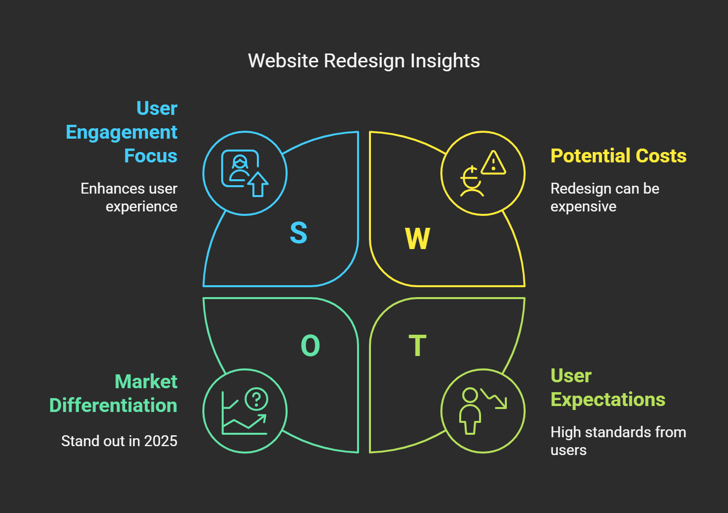
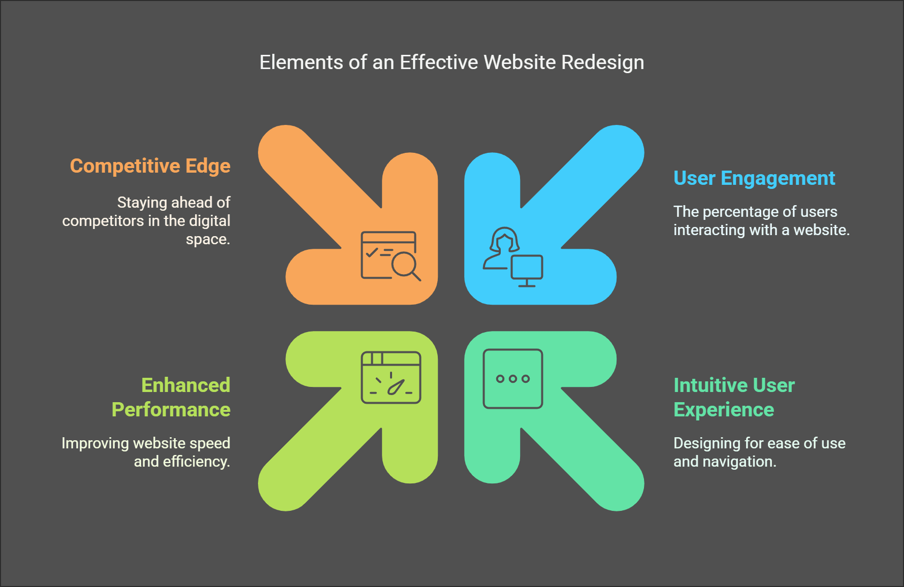
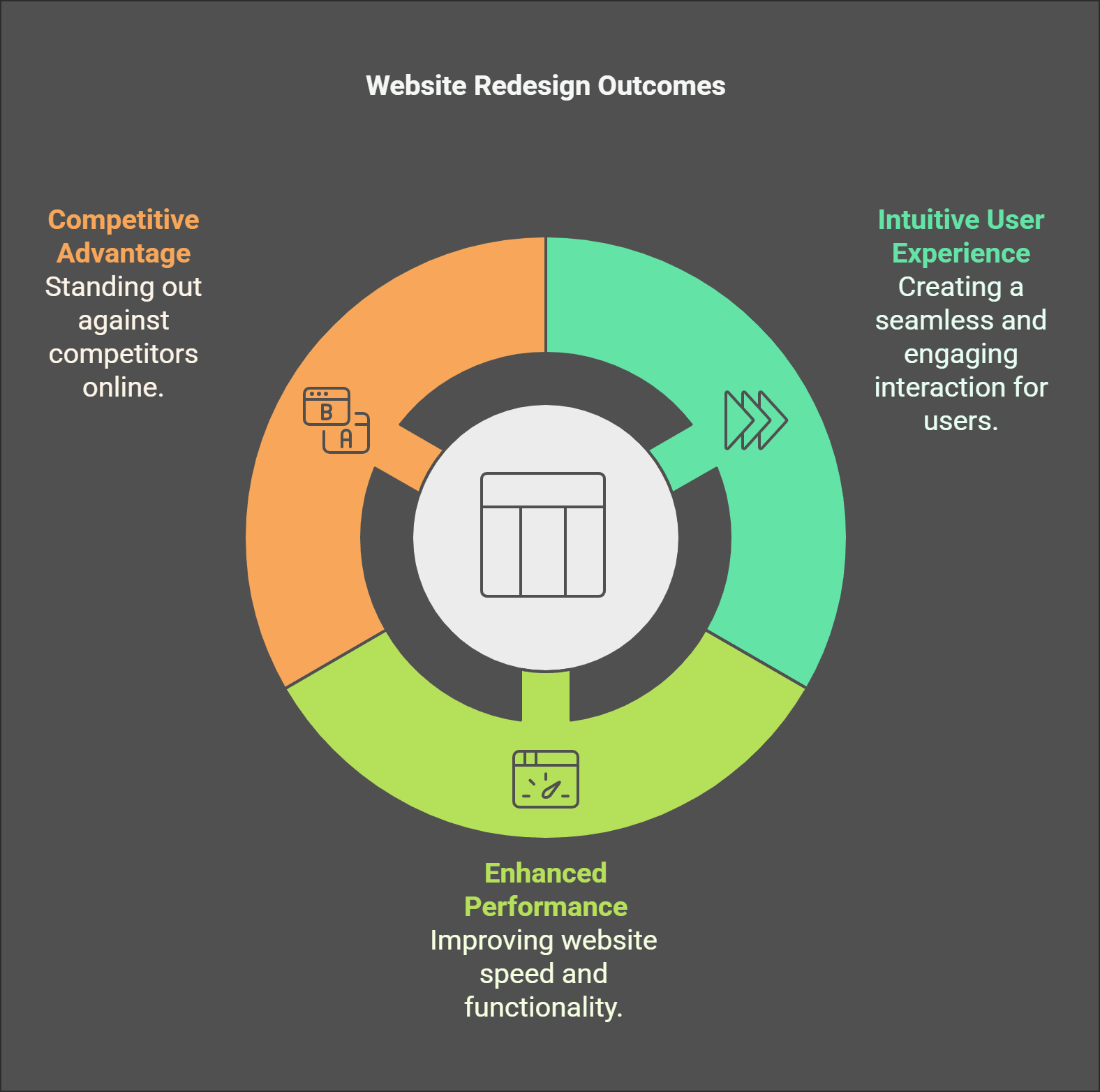
Did you know that 38% of users will stop engaging with a website if the layout is unattractive and the content is not well written? Nowadays, having an old and dusty website is like turning up for a business meeting wearing clothes from the last decade constellation and inefficient. It's important to note that a website redesign is not solely cosmetic; it aims to establish an intuitive user experience, enhance performance, and outpace the competition.
In this guide, I will take you through everything you need about website redesign from planning and conception to execution. Whether you’re a small business or a large enterprise, you will get actionable insights to stand out from other websites in 2025 with this article.
Website Redesign: Why It Still Matters in 2025
But let me tell you I’ve seen my share of websites. Thanks to time capsules, I mean, garage sales and your website served (and sometimes actually did) a lot of great stuff, all simultaneously, but then stopped updating, as if. It was 2012. You know, the kind flashing banners, Comic Sans font (ugh), and those little animated GIFs that refused to die. It was rough. They didn’t think their website was that important because people just called us.
Six months later, when we decided to give their site a much-deserved facelift, their leads went up by 40%. Forty percent! And that’s why website redesign is essential as we approach 2025. No one has time for clunky, outdated sites anymore. When your page takes an eternity to load or feels like it’s showing its age, visitors leave faster than you can say bounce rate.
But here’s the kicker, user expectations are through the roof nowadays. How about the fact that 53% of mobile users leave sites that take more than three seconds to load? Yeah, three seconds. Not five, not ten three. And what if your site isn’t mobile-optimized? Forget about it. Google even began to penalize sites that were not mobile-friendly in its search rankings. So yes, staying relevant is no longer optional; it is survival.
Another client I worked with had an antiquated blog layout and insisted it was timeless. After we overhauled it with clean typography, improved loading speeds, and better navigation, traffic soared by 60%. The lesson? A new design doesn’t just look nice, it does more for you.
So, let’s talk about SEO for a minute. Websites that are fast, secure, and easy to crawl are favorites of search engines. If your site has not had a makeover in years, it's dragging on the back on performance and security protocols. For instance, migrating from HTTP to HTTPS was optional. If you want any respect from Google, it’s pretty much required.
And c’mon, don’t forget accessibility. It’s the year 2025, and designing for everyone isn’t just good, it's a requirement. Screen readers, alt text for images, contrast ratios these aren’t just buzzwords. They allow your site to be usable by millions of people who use assistive tech. And accessible sites will also rank better.
Oh, and I have one other story while I’m here. The other day, I helped a local restaurant update its menu page. Before, it was some janky PDF file hidden five layers of bad navigation deep. After streamlining the layout and adding interactive features click and order categories, scrolling high-res photos their online orders doubled in two months. What is the moral of the story? Small shifts can create significant gains.
So, if you’re running an e-commerce store, a blog, or a portfolio site, don’t snooze on a redesign. Your audience and your bottom line will appreciate it. Believe me, I’ve witnessed it happen too many times to disregard.
When You Need to Redesign Your Website

You know, I’ve been around the block with websites. A long time ago, (we’re talking early 2010s) I assisted a friend with redesigning his company site. It was so old, it felt like an antiquity from the museum of internet history. And let’s not even mention the time it took to load. But here’s the kicker, it wasn't just ugly; it was knocking customers away from him. That’s when I learned an important truth, your website is not just a digital billboard. It is, quite often, the first experience of your brand. If it isn’t up to snuff, you’re leaving money on the table.
So how do you know if your website needs to be updated? Believe me, there are some dead giveaways. First, slow loading speeds are a complete downer. Studies have shown that if your site loads for more than three seconds, more than half your site visitors will bounce faster than you can say “404 error.” I had a client once, that was dragging six seconds on the homepage. By the time their site was finally rendered, users had already moved on to scrolling through Instagram or watching cat videos. Not good.
Another big red flag - poor mobile responsiveness. Listen, I mean, we live in a mobile device first world now. If your site looks wonky on phones or tablets, you are essentially telling half your audience they don’t matter. A few years ago, I recall attempting to shop from the site of this one retailer. Unless I zoomed out, their checkout button was off-screen. Frustrating is an understatement. Unsurprisingly, I didn’t purchase anything and neither will your customers if they encounter similar issues.
And then there are design trends or rather, their absence. Skeuomorphic designs from the early 2010s? You know, buttons that round guys would call buttons and textures everywhere? Yeah, those days are gone. Now, a sleek, modern aesthetic is everything. One of my clients had a site with gradients and drop shadows like it was in 2005. We gave it a flat design refresh and boom their engagement increased by 30%. And sometimes, adding a little spice to the visuals matters.
High bounce rates and low engagement metrics all scream that as well. If people aren’t staying on your pages or clicking on them, your content or layout will likely not do what they’re meant to. The same is true for security vulnerabilities. Nothing says amateur hour like an insecure site. Google slaps those faster than you can blink, which tanks your SEO rankings. Oh, and the companion fear of being left behind by competitors. If their sites are sleek and yours is clunky, who do you think is getting the sale?
Ultimately, a website redesign isn’t just cosmetic. It’s about usefulness, execution, and ensuring your web presence matches your objectives. So, if any of these signs resonate with you, it could be time for you to take another look at your site.
How to Plan Your Website Redesign Project
For example, I’ve done more website redesigns than I’d like to think of. Some were smoother like that when everything fell into place, and my bounce rate went down 40% in a month. Well, put it this way, there was a lot of coffee fuel on late nights. One disaster that sticks out, we launched without checking our mobile responsive (rookie mistake), and our traffic nose-dived overnight. But that's how you learn, right, from errors? So here are a few things I’ve learned about planning your website redesign project.
Now, before we start the process, start by setting your goals. This is not an optional step, folks. Are you looking to increase conversions? Improve user experience? Or perhaps you’re completely rebranding? So, when I worked on a client’s site last year, their primary goal was increasing newsletter signups. Every choice simplifying forms or including eye-catching CTA was made with that goal in mind. In just six months, it resulted in a 65% increase in subscribers. Get clear about why you’re doing it before you even get going.
Next, you need to audit your existing site. And no, I don’t mean reading a few pages as you half-watch Netflix. Dive deep. Look for broken links, old content, slow-loading images, you name it. Google PageSpeed Insights or Screaming Frog are life and time savers here. I skipped this step once on a rush job, thinking, "How bad could it be?” More than a third of our links were leading nowhere.
Now, consider your audience. Who are they? What is it that they are hoping to find on your site? For example, start thinking of sleek graphics and quick load times if you're after millennials. On the other hand, if your users are older, simplicity and readability should come first. A couple of years ago, I redesigned a local bakery’s site. Their customers appreciated recipes and behind the scenes stories, so we created a blog section.
That’s a beast of a different nature regarding budgeting and timelines. Be realistic. Redesigns never go as quickly as you expect. Allow extra time for revisions because, believe me, someone will always have feedback for you after you think you have completed it. And be sure to consider costs for tools, hosting upgrades, and prepros if you need them. The last thing you want is to run out of cash halfway through.
The last step is to find your dream team. Whether they’re freelancers, an agency, or your cousin who knows WordPress, make sure everyone is on the same page. Communication is clutch. One project had three different homepage versions floating around because of miscommunication. Yeah, it's not ideal.
So there you have it, a sound plan creates the foundation for success. Set smart objectives, audit well, consider who needs to see it, spend wisely, and communicate well. Do all that, and you won’t experience some of the headaches I’ve had.
What You Need for a Successful Redesign of Your Website
Believe me, I’ve gone through more redesigns than I want to acknowledge. Some of them went smoothly, and others? Let’s say they looked like what you do when you feel like fixing a leaky roof in the middle of a hurricane. But with every catastrophe, I learned something valuable. And I heard, more than once, that an enjoyable website renovation is far more than putting on a fresh paint job. It's building a simultaneous experience that works together with you and your visitors.
For instance, my first redesign project. At the time, I believed surfing a new color scheme and sending it into the world would do the trick. My bounce rate soared before I had time to say user experience. That’s when it struck me that redesigning a website is like remodeling a house. You can’t only change the paint on the walls; you have to check that the foundation is sound.
The mobile-first design was one of the biggest game-changers for me. I get it, I get it everyone keeps saying that, but believe me, this is no buzzword bingo. It wasn't until I finally optimized my site for mobile that my smartphone traffic shot up almost 40% percent. These days, people are chained to their phones, so if your site doesn’t load quickly or look appealing on a smaller display, you’re losing a lot of visitors. Not to mention touch-friendly buttons. Nothing is worse than clicking on the wrong link by mistake because the buttons are squished next to each other like sardines.
Another factor that made it such a game-changer was the more straightforward navigation. I got way too excited about fancy drop-down menus and animations early on. Turns out, the simpler, the better. If someone can’t find what they’re hunting for in three clicks, they’ll probably bounce faster than you can refresh the page. Now, I cling to clear labels and logical categories. No BS, no nonsense, just straight lines to the info people want.
And boy, where do we begin with speed? I released a homepage that took over 8 seconds to load during one redesign. Well, Google looked at me askance, and my rankings tanked. Learning from this fast page load times are a must-have now. Reduce the file weight of your images, minify your code, and use caching proxies. Your users (and your SEO) will appreciate this.
Accessibility is another thing I wish I’d paid better attention to sooner. A friend who uses a screen reader told me my old site wasn’t too friendly for people on the other side of the glossary. So I dived down the WCAG rabbit hole and added alt text for images, appropriate heading structure, and keyboard nav support. That made my content more accessible to a broader audience but also gave me a reputation bump as someone interested in making content accessible.
Finally, hooking up modern tech like AI chatbots or even basic search has been a life-expander for me. I know people love getting immediate answers, and it takes the pressure off my inbox. Minor additions, like voice search compatibility, have made my site feel modern and future proof.
Yeah, a redesign can feel daunting. Still, if you get these key things right mobile optimization, intuitive navigation, speed, accessibility, and smart tech integration you could take a mediocre site and make it a magnet for engagement. Your future self will thank you for doing the work now instead of scrambling later.
Must-Have Tools & Technologies to Make Your Redesign Easier

Now, let me tell you redesigning a website used to be like trying to build a house with just a hammer and a few nails. There was this one project years ago where I thought, How hard can this be? They wanted the entire project done in 2 weeks, and I was left with Photoshop (yes, still used for web design) and a prayer. By the end of it, my hairline had receded, and I vowed never to enter another redesign unprepared. That’s when I found game-changer tools and technologies.
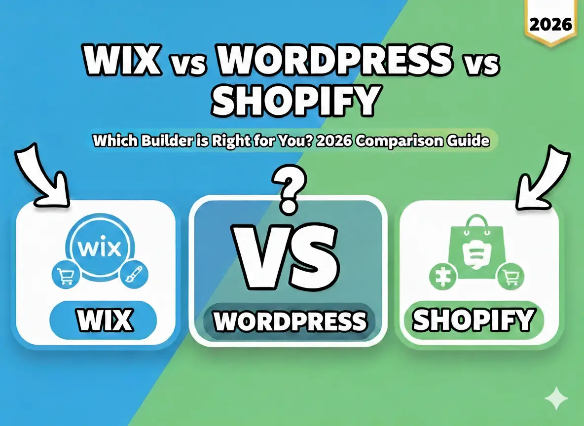
The website builders come to rescue you if you are not a coding master or you don’t have a group of developers flashing on your speed dial. Wix, Squarespace, and WordPress make your life so much easier. For example, I once assisted a small bakery in revamping its website on WordPress. They required an online store, a blog integration, and photo galleries for their drool-worthy cakes. We used plugins like WooCommerce and Elementor, which were up and running quickly. No code is required. For real, these platforms are like a web design of a Swiss army knife.
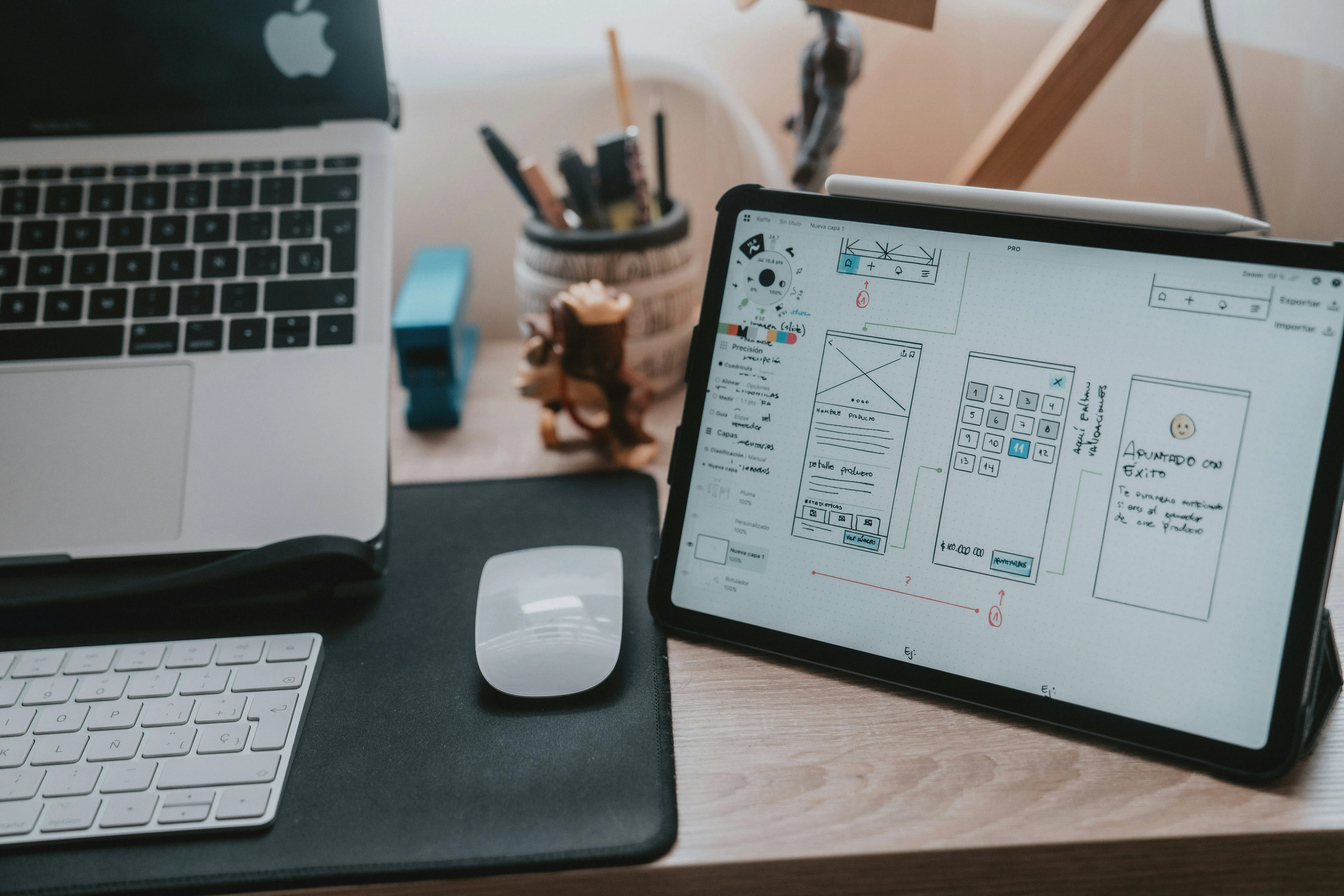
Next up are design tools you’ve probably heard of Figma, Adobe XD, or Sketch. These beads are type changers for wireframes and visuals. I’ll never forget the very first time I worked in Figma for a redesign for a fitness coach. We brainstormed layouts, but rather than skimming ideas on napkins (true story), I produced interactive mockups on the fly. The client enjoyed clicking through the prototype; it felt real, you know? It also had collaboration features so her feedback could stream in rather than creating wanton email chains.
But here’s the catch, analytics tools are a must-have. You can’t just throw up a new design and cross your fingers. A website redesign went wrong, and Google Analytics became my best friend. I once opened what I thought was a perfect e-commerce site, but later discovered that users couldn’t find the checkout button. I always use heatmaps from Hotjar or Crazy Egg before going live to see how people interact with the site from there. It’s like looking over someone’s shoulder while they shop.
Also, don’t snooze on SEO tools. I can’t tell you how many times Ahrefs and SEMrush have saved me. I accidentally tanked an entire client’s rankings on one project because I forgot to redirect old URLs.
Takeaway: Screaming Frog makes its way into all our pre-launch checklists. Believe me when I say that nothing screams amateur hour like losing half your traffic overnight.
Finally, Trello or Slack tools help ensure everyone is on the same page. There’s nothing more disheartening than teams getting misaligned and holding each other up or worse, making errors. Once, because our developer failed to receive this memo, he missed an important deadline because we had to change fonts.
So yeah, tools matter a lot. From visuals to functionality to post-launch tracking, cutting-edge tech will make or break your strategy.
Avoid These Common Mistakes During a Website Redesign
I've been there staring at my computer screen after I launched what I thought would be a sick website redesign. The bounce rate shot through the roof, and people were whining they couldn’t find stuff. Frankly? I was ready to throw in the towel. But hey, there are no mistakes, only lessons, right? So here’s what I found out about the most common pitfalls you must avoid when you refresh your site.
Well, treating the redesign process as an opportunity to forget SEO is like baking without sugar in your cookies. It doesn't turn out well at all. I used to have this genius idea to entirely rewrite my URLs because new beginnings are nice or something like that. After all those URLs were changed and no effort was put in to correct 301 redirects, I guess all the rankings dropped like a stone in the morning. If you’re going to play with URLs, ensure that 301s are done right. Believe me, Google does not easily forgive.
Do you know when you walk into some store, it’s just too much? It's overwhelming when flashing lights, loud music, and clutter around you; the same happens online. Once, I overdid it with animations and pop-ups to the point where users probably needed a map to figure out what to click next. Could you keep it simple, folks? A simple design with straightforward navigation will always beat out flashy gimmicks.
Oh, and don’t get me started on failing the test before launching. There was one particular project we pushed live without checking whether it was responsive for mobile. Guess what? Half of our traffic was from phones; none could use the site.
Lesson learned: Test everything to find a few friends to grab variety, or use tools like BrowserStack. Real-world feedback is gold.
Here’s another thing I did wrong, and it isn’t very comfortable to admit I didn’t back up the old site before trying to edit it. Rookie move, I know. We were hit with such a storm of a redesign that work done in punishing increments of poor, farm-deleted effort disappeared from our scared little fingers like three-bucks-latte on an unsuspecting Monday morning. Before doing anything, always backup your files and databases. If you must, jot it down.
Lastly, communication or lack thereof kills it. Years ago, when I redesigned a client’s site, I didn’t inform their customers about the change. People panicked because the new layout wasn’t recognizable. Send emails, post on social media, and even add a little countdown banner in advance. Keep everyone in the loop.
So, yeah, these are some of the blunders that I’ve fumbled through. Could you not repeat my mistakes? Prioritize SEO, simplify as much as possible, run thorough testing, ensure everything is backed up, and ensure clear communication.
Announcing and Marketing Your Newly Redesigned Website
Let me tell you, launching a new version of a website is like throwing a housewarming party. You’ve worked for weeks, maybe even months making sure it’s perfect, the furniture (or, in this case, the layout) is arranged, the appetizers (your content) are prepared, and now it’s time to invite people over. But here’s the kicker, if no one shows up or knows what’s changed, all that hard work feels, well, kinda pointless. Trust me, I’ve been there.
I assisted in relaunching a client’s e-commerce site a couple of years ago. We spared no expense with new branding, faster load times, mobile optimization, and the work. But when we flipped the switch? Not because the site was not great but because we missed a straightforward step in the process telling people about it. Promoting your redesign is half the battle. So, let’s dig into how you can do better than me in this mistake.
First things first, announce the redesign loudly and proudly. For that, use an email blast to your subscribers first. Don’t simply say, Hey, we updated our site. Be specific. Leave them with a reason to care. For instance, “Our checkout process is now 30% faster,” or “We added a live chat feature so you can get answers ASAP.” Trust me, numbers attract attention. And don’t underestimate social media; it's essentially free advertising. Share before and after images of your site. People love transformations, from kitchen remodels to homepage makeovers.
Here is where the vast majority of people fall flat SEO during the transfer. Launching that e-commerce site broke a ton of old links. Google didn’t care for that, nor did users who found themselves on dead pages. Be sure to 301 redirect old URLs to the new ones. It’s not exciting, but it makes both search engines and visitors happy. And please submit an updated sitemap to Google Search Console now. Faster indexing means crawlers visit your brand-new shiny site faster.
Partner with influencers or allies. If you have contacts within your niche, contact them and request that they spread the word. Perhaps early access to an exclusive feature set, something like a discount for their audience. When I was working at a fitness brand, we would send personalized promo codes to micro-influencers. They shared it with their followers and boom we saw a 25% increase in traffic over a week. Not too shabby, huh?
And don’t overlook user feedback after launch. After our big flop, I began sending customer surveys that read, “What are your thoughts on the new design?” It turned out that some buttons were confusing, and the font size was too small on some devices. Addressing those problems changed everything.
Lastly, celebrate the win! Recognizing how hard you worked on the project, whether internally with your team or publicly, by launching a giveaway. Celebrations gather momentum honestly, you deserve it after all that effort.
So, in short, creatively announce the launch, address technical SEO issues, rely on partnerships, get feedback, and celebrate. Follow these steps, and your redesigned site will not only look good but also perform well.
How to Measure the Success of Your Website Redesign
Let me tell you, there’s nothing like hitting publish on a newly redesigned website. It’s like putting on a new pair of shoes, thrilling at first, but unsure how they will wear after a few miles. That’s why measuring the success of your website redesign is more than just an optional step; it's mission-critical. Trust me, I have been burned before by skipping this part.
About two years ago, I had a new client excited about their new website. It had all the bells and whistles, parallax scrolling, bold typography, even one of those fancy hero videos that auto play (oh man, don’t get me started on that trend). But here’s the rub, we didn't monitor anything after launch. Three months later, I shared that their organic traffic had dropped 40%. And we realized that we had broken a few crucial SEO things in the migration process.
So, where do you start? The first thing to do? Identify what metrics are meaningful to your goals. Are conversions your things that you wish to enhance? Improve user engagement? Or perhaps rank more for specific keywords? Whatever that is, could you write it down? For example, tracking form submissions should be a priority if you are trying to increase newsletter signups.
Let's now discuss tools that make life easier. I use Google Analytics to monitor bounce rate, session duration, and page views. If you are feeling fancy, throw in Hotjar or Crazy Egg for heat maps they show where users click, scroll, or ignore a particular region of the page. I once set up Hotjar on a client's site and found no one saw their CTA button because it was below the fold. Talk about a facepalm moment.
Another opportunity to maximize client value I have always recommended is A/B testing. Sure, it takes time, but the payoff is worth it. After a redesign, we tested two versions of a landing page one with a long-form sales pitch and one with a bullet list. The short version outperformed the longer one by 23%. Sometimes, less truly is more.
And don't forget qualitative feedback. Surveys can provide valuable information, but hearing directly from your audience can be truly enlightening. Send out surveys, check social media comments, or even jump on a call with some of your clients. Trust me, when asked nicely, many people have brilliant ideas.
Finally, remember that it always takes time.
Just chill out if your numbers go down right after the launch. Users might adjust, while search engines must reindex your pages. You need a bit of patience.
When it comes to measuring success, it's not just about the celebrations. It's also about absorbing the information and understanding what strategies you need to let go of. And if you make a mistake in the process, you're not alone. Every blunder is simply an opportunity to learn.
Recap
A website redesign is more than just a facelift; it's an opportunity to reconnect with your audience, improve functionality, and achieve your business goals. Following the steps outlined in this guide ensures your website looks great and performs exceptionally well in 2025 and beyond.
Ready to take the plunge? Start by auditing your current site and setting clear objectives for your redesign. Remember, the digital landscape constantly changes, so don’t wait until your site becomes obsolete. Act now and give your brand the online presence it deserves.
.svg)
.svg)
.svg)
.svg)