Did you know that it takes only 0.05 seconds for people to form an opinion about your brand based on the look of your logo? Yes, your logo is more than a graphic, it is the face of your business. Whether you’re a graphic designer with years of experience or a business owner looking to update your branding, knowing what works and what doesn’t for logos is essential.
In this guide, I’ll take you through everything you need to know about logo design in 2025, from timeless principles to cutting-edge trends. After reading this article, you’ll have everything you need to create a logo that will stand out. Ready to dive in? Let’s get started!
The Importance of Logo Design for Building a Strong Brand Identity
Let me tell you a story. Years ago, I was working with a small coffee shop owner, let’s call her Sarah. She had put her heart into her business but was having difficulty getting customers through the door. One day, while drinking one of her lattes which was fabulous, I saw her logo. It was, let’s say it resembled something pieced together in five minutes with clipart from the early 2000s. And honestly? That logo was an albatross you could hang around your neck.
At its foundation, logo design is all about brand visual identity. But here’s the kicker, design is not just about making something pretty. The logo is the first thing a person sees about your business. Just think about it, when you see that golden arch or the bitten apple, don’t you immediately know what they represent? That’s the magic of a well-designed logo. Sarah’s old logo was not warm or welcoming it screamed cheap, not cozy.
This is where it gets interesting. Something magical happened when we updated her logo bringing in warm tones, a hand-drawn coffee cup, and a playful font. People started noticing. Within three months, sales dipped 30%. Crazy, right? That’s because a well-designed logo does two important things, it inspires trust and makes you memorable.
But what’s the big deal? Let me break it down. First, we humans are hardwired to judge books by their covers. We can’t help it. Most of the time, your logo is the first thing someone sees, whether it’s on social media, a billboard, or even a napkin at a networking event. And if it doesn’t get attention or worse, comes across as unprofessional, you’ve lost them before they have even had a chance.
The second was logos, which establishes an emotional bond. Take my favorite example, the Nike swoosh. Yes, it’s simple, but whenever I see it, I think of determination, speed, and the workout playlists that keep me running that extra mile. That is the beauty of a good logo, it speaks without saying a word.
I’ll be honest, I didn’t always realize how important logo design is. When I started freelancing, I thought I could slap some text onto a square and call it a day. One client even told me my first try resembled a toddler finger painting. The bottom line, research is essential. Knowing your audience, reviewing competitors’ branding, and finalizing your unique vibe are all non-negotiable steps.
So, if you plan to skip logo design because it’s just a small detail, think again. It’s like showing up for a job interview in pajamas, you may be brilliant, but no one will wait long enough to discover it.
Getting lost in details is easy, so here’s a quick tip, Simple is better. You can think of the most iconic logos with as few elements as possible. Why? Because simplicity sticks. People must recognize your logo on a tiny Instagram profile or a big billboard. Believe me, scalability will prevent a lot of headaches later on.
But at the end of the day, logo design is not just about looks, it’s about a strategy. It’s the cornerstone of your brand identity, which binds all your marketing efforts together. So yeah, it matters a lot.
Guidelines for Designing an Effective Logo

Let’s be honest, logo design is not some at random business. Oh no, my friend. It’s an art, a science, and occasionally a headache. I’ve been creating logos for years. Yes, I’ve made my fair share of mistakes, and if I’ve learned anything, simplicity is king. Always has, and always will.
Give this one time I was creating a logo for a local coffee shop. I just got so excited about all these little details, a little steam swirl here, a vintage coffee grinder illustration there, that at the end, my logo looked like someone sneezed on the page. My client graciously described it as overwhelming. I apologize for my armchair quarterbacking.
Lesson Learned: Less is more. The best thing is that a clean and simple design looks professional and resonates far more than anything over the top and complicated.
Now, versatility is an important topic, trust me. Your logo must work everywhere from business cards through billboards to Instagram profile pics. The first time, I tried to design a logo with super thin lines for a tech startup. Guess what? When we scaled it down for their app icon, those fine lines vanished altogether. It was as though they had disappeared into thin air. So, ensure your design is scalable and can hold at any size. Try it out before you settle on anything.
Memorability is also a significant point. Consider Nike’s swoosh or Apple’s, well, apple. These logos are iconic because they’re recognizable. How do you achieve that? By keeping it the right balance of uniqueness without being excessive. One trick I swear by is thinking outside of the box regarding negative space. One of my favorite examples is the hidden arrow in FedEx, it’s subtle but brilliant. Do include clever touches like that, but don’t shoehorn it in. At times, simple is better than smart.
And then there’s timelessness or what I call future-proofing your logo. From TikTok dances to new social media trends, trends fade in and out instantly, am I right? Remember those neon geometric logos we saw back in the early 2010s? Yeah, they aged like milk. Avoid trendy fonts, layouts, and color schemes that won’t look dated in five years. Your future self will appreciate it.
Lastly, relevance. It may seem obvious, but your logo should fit your brand vibe and audience. For example, I once partnered with a local yoga studio that desired a bold, industrial-inspired mark. Uh, nope. So, we shifted to soft pastels and flowing lines instead. The result? An excellent match for their laid-back clientele.
It is simple, flexible, unique, evergreen, and relatable. If you keep the following principles in mind, you’ll be golden. Trust me, having messed up myself enough to know what you should be doing instead.
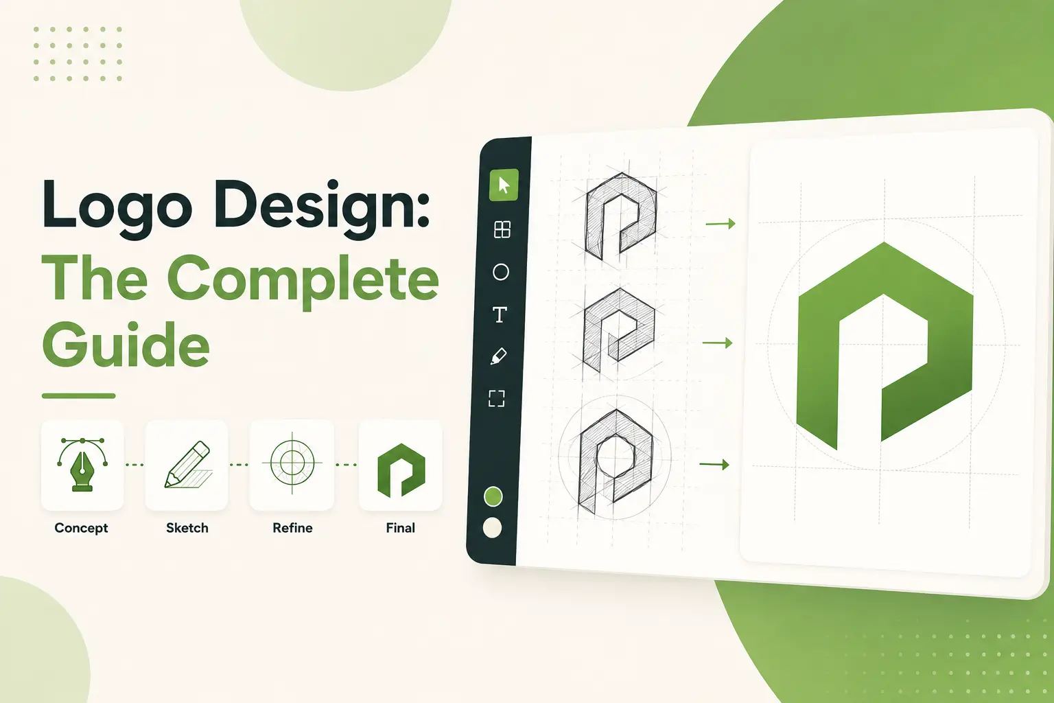
Logo Design Process: Step-by-Step Guide
Designing a logo is not something you throw together and hope for the best; let me tell you something. I’ve been through this process more times than I want to admit, and let me tell you, there’s a method to the madness. I will walk you through it step-by-step, bringing you all the juicy stuff and mistakes in the process.
You said you were doing some research. Yes, I know that sounds boring, but let me explain. A year or two ago, I was creating a logo for a local bakery, IIBAKING. I was so focused on sketching that I didn’t do my homework. It turns out their closest competitor already had pretty much that exact design. Awkward! I mean, I dig deep right from the get-go. Who’s your audience? What are your competitors up to? What makes your brand unique? These questions are not optional they’re critical. Do at least a few hours of research before proceeding.
Once you do your research, it’s time to brainstorm and sketch. Now, here’s where the fun begins or so I thought until I spent one afternoon trying to sketch for three hours, and nothing I came up with worked. Now, I keep it loose; I keep it messy. Jot down anything that pops into your mind, no matter how silly you think it sounds. You’d be amazed at how often those bad ideas trigger something great down the line. And hey, remember to consider scalability on this one. A logo might look great on a billboard, but will it translate when shrunk down on a business card or Instagram profile pic?
Once the sketching is done, it’s time to transition your ideas into the digital realm. For these, no other tools like Adobe Illustrator come in handy. If you still aren’t familiar with vector graphics, now is the time to learn. A raster image is like a rubber band good luck with resizing it for print. One tip I swear by? Keep it no more than two or three colors in the early days. Too many colors make your design look chaotic.
The next phase is feedback, which, honestly, can be brutal. Did I tell you about the bakery project I mentioned earlier? And, after nailing something that I thought was spot on, the client hated it. Always display several alternatives. Give them options, explain your thinking behind each idea, and listen to what they say. And feedback loops can seem endless, but they’re essential to get right.
Then, when everyone is happy, you prepare the files. That means exporting in every single format under the sun SVG, PNG, PDF, you name it. They have high-res versions for print and web-friendly ones, too. It’s much worse to send off a file and get informed it wouldn’t work because you weren’t optimizing.
It’s a process that carries a lot of patience, creativity, and tough skin. But when you see that final logo in the wild on websites, storefronts, or packaging, it’s worth every second. Remember these steps, but remain flexible, and remember that a good design takes time.
Best Logo Design Trends of 2025

I’ve been designing logos for a little over 10 years now man, I’m getting old and every year, some new trend comes out. Remember when skeuomorphism was all the rage? Do you know those shiny, 3D-esque icons? Geez, those were a blast until they weren’t. Fast forward to 2025, and logo design is like this new thing. It’s sleeker, smarter, and frankly? A little more daring. Allow me to take you through what’s sizzling at the moment.
First, we’re going to look at minimalist designs with bold typography. This one is a bit older but doesn’t appear to be going anywhere anytime soon. Last year, I worked with one of my clients, who wanted to include five different symbols in their logo. It needs to say everything, they said. It didn’t work. Their brand suddenly looked modern and professional once we simplified it to clean lines paired with a strong font. The lesson here? Less is sometimes, indeed, more. Think like Airbnb or Spotify; their logos are simple but easily identifiable. If you’re daydreaming, consider how to define the effort with one essential element instead of a lot.
Now, for something meatier, gradients and bold color palettes. Ugh, gradients are back, but actually in ways that feel fresh. Rather than the cheesy rainbow fades of the early aughts, designers blend colors to create dimension. By the way, I recently worked on a project with a gradient from teal to purple. The client was thrilled with how energetic it felt without being over the top.
Pro tip: Experiment with complementary shades with color palette tools like Adobe Color. And don’t be afraid of bold colors, people will notice them.
Another big trend, these will be everywhere in 2025. It’s the angular lines and asymmetrical shapes that shout out innovation. And I’ll admit, I royally dropped the ball when I made a logo too symmetrical, it came out stocky and generic. But once I started messing about with irregular shapes, things got interesting very quickly. Try mixing circles, triangles, and polygons in new ways. Just ensure this still fits your brand personality. You don’t want to be stuck with a tech company with a more appropriate logo at a daycare center.
Then, there are hand-drawn and custom illustrations. This one seems so personal. Brands will always want to connect emotionally with their audience, so handcrafted is popular right now. I had fun designing a coffee shop logo last month, it had an animated little bean guy holding a cup. The most authentic, it felt, customers raved. If you’re considering going this route, keep it simple. You don’t need too many details because then you drag it into the mud, ya know?
Finally, let’s briefly discuss dynamic logos. These babies shift depending on their vantage point. Sounds complicated, right? Well, it kinda is. But if done well, they’re brilliant. Such is the notion behind a logo that adapts slightly depending on whether it’s on Instagram, a billboard, or even packaging. I follow one brand that keeps a static base shape but will swap out colors or textures based on the season. It adds variety without sacrificing consistency.
All these trends have one thing in common and that is, they all prioritize sticking to your roots while standing out. So, if you are wading into logo design in 2025, go ahead and take risks, but make them bright. Keep experimenting, stay curious, and listen to your gut. All trends are temporary, but great design is eternal.
Logo Design Tools and Resources
I know because when I first started, I had no idea where to start with logo design embarrassingly. So, I recall sitting at my desk with a blank page before me, thinking, How do people even think of this stuff? They do not just appear. Without the right tools and resources, it may not happen. And believe me, I got in the zone when I finally got my groove on with them.
First of all, let's get into the professional-grade stuff. If you are seriously interested in logo design or graphic design in general you've likely heard of Adobe Illustrator. It's the gold standard for vector-based work important because logos need to scale without losing quality. But here's the kicker, it's not exactly for beginners. I watched hours of YouTube tutorials on how to use and choose the pen tool. Worth it, though. Once you learn the ropes, Illustrator becomes an extension of your mind. If you are on a budget, there is also Affinity Designer, which is way more reasonably priced but just as powerful. It might've saved me some money if I'd known about it.
Now, what if you’re not a full-blown designer? Perhaps you’re a small business owner or solopreneur requiring something quick and decent. That’s where tools like Canva and Looka enter the picture. One of the best parts about Canva is that it’s drag-and-drop simple, and those who aren’t designers can use their pre-made templates to give us a head start. If you know what you want, Looka uses AI to generate different ideas for logos based on your likes and dislikes. Sounds cool, right? Well, yes, until you discover that about half of the designs bear a disquieting similarity. It’s still a good option if you’re low on time or cash.
And speaking of free resources, don’t forget that they exist. They’re life savers when you bootstrap. Websites such as Font Squirrel and Google Fonts are great for discovering typography that isn’t popular with the term generic. The same applies to icon libraries like Flaticon or Noun Project, they are great for using little visuals in your logo. Just be careful because there are times when free stuff has restrictions on licensing. I learned that lesson the hard way when I used a font that technically wasn’t licensed for commercial projects. Awkward email from a client?
So here’s one resource I wish I’d found earlier Coolors, when you’re just starting, figuring out what colors to use in a logo seems impossible. Coolers allow you to generate color palettes instantly, and it’s just a bit of fun. You just set the colors you want, hit the spacebar, and bam fresh combos reveal themselves. Hundreds of hours of second-guessing myself.
Lastly, invest in Mockups. Seriously, even having your logo on a t-shirt, business card, or website header can have an impact. Placeit is a site that provides hundreds of customizable mockup templates, and it’s so easy to use. Moreover, demonstrating a polished presentation to clients is always the best way to seal the deal.
The best tool is simply the one that does it at the end of the day. Whether it’s high-end software or an online generator, make something that suits your brand. So try things, make mistakes you will, and keep adjusting until you get it on some level that feels right.
Things to Avoid when Designing a Logo

Not gonna lie; logo design is one of those things that looks easy until you try to do it. I know the feeling, staring at a blank screen, wondering why my awesome idea looks like something a toddler might’ve scrawled. I’ve made plenty of mistakes over the years when designing logos. And believe me, the hard way was not fun. But that’s how we grow, right? So today, I will share some common pitfalls I’ve experienced, and how you can avoid them.
First off, let’s discuss making things overly complex. At first, I thought that filling my logos with many details would help them stand out. For example, remember when I redesigned a logo for a coffee shop? Steam was coming off the cup, little coffee beans were strewn everywhere, and a mini sun rose in the background. Yeah, It seemed like a hot mess. The client hated it, and frankly, so did I. I didn’t realize back then that, when it comes to logo design, less is more. A clean and minimalistic logo is the way to go because they are easy to read and scales up or down nicely. To Consider, Think of Nike’s swoosh or Apple’s apple (sorry for the pun). Simple but iconic.
Using low-quality images or clip art. There was this one project where I needed a quick icon for a tech startup. Instead of creating something original, I grabbed a stock image from some random website. Big mistake. Not only did it look generic, but the resolution was so bad that it pixelated when printed on business cards.
Lesson Learned: Always use vector graphics or create custom illustrations. Your logo must be sharp on a billboard or a tiny favicon.
Oh, and another gem, scalability is out the window. I once had a client who wanted me to design a logo with super thin lines and highly complex designs. Sure, it looked great on a computer screen. But then it came time to put it on a T-shirt. Disaster. The specifics got lost, and it all just blurred in together. Now, whenever I design a logo, I zoom out, make it smaller, and test it everywhere like phone screens, banners, you name it. It doesn’t work at all if it doesn’t work small.
Another trap I nearly fell into was copying other brands’ styles. I even tried replicating a famous sports brand’s typeface because I thought it’d add some edge to my design. It didn’t. Clients demand originals, not copies. Do research, understand what else is out there, but find your lane.
Finally, remember to test your logo in real examples. I have never forgotten one instance where I submitted a logo without checking it in black and white. It was illegible when faxed. Yes, faxes are still a thing. Always think ahead. But test your logo against other backgrounds, in grayscale and at different sizes.
This is my hard-earned wisdom on how to avoid the disaster of a bad logo. Ensure simplicity, uniqueness, and consistent testing before launching.
How to Work Alongside a Professional Logo Designer

So, let me say this, I can tell you that working with a professional logo designer is a different world than anything if you’ve never had that experience. I recall hiring one for the first time, that was equally a thrilling yet nerve-wracking experience. You’re handing this big chunk of your brand’s personality to somebody else. But believe me, when you do it right, it’s worth every cent. I’ve learned a few things about this process along the way.
Get yourself an appropriate designer, that’s half the battle. In my early days, I chose to skimp. Like, super cheap. I saw some random freelancer on one of these platforms that guaranteed logo design for $5. The result? A nondescript logo could’ve belonged to any coffee shop or tech startup.
Regarding sound quality branding, hire someone who knows what they are discussing. Search for designers and their portfolios that match your vision. For instance, if you are all about clean, minimalist logos, search for someone whose work begs for simplicity. It makes all the difference.
Once you’ve selected a designer, communication is everything. One thing I did wrong early on was not providing enough details upfront. I just said, I want something modern, without explaining. As it turned out, my notion of modernity was defecating nowhere in their poor neighborhood. I always begin with an intense creative brief. This can include details about your company, target audience, competitors, and even some footage of logos you like. Don’t be modest, share as much as you can. It’s like giving them a road map to hit your dream logo.
Oh, and can we discuss budgets? Yeah, this bit can hurt a bit. Depending on experience and scope, a designer charges a few hundred bucks to thousands. I initially thought, Who would pay $2,000 for a logo? Then it hit me, they’re not just paying for the final result but for expertise, creativity, and the hours spent brainstorming. So yes, establish a fair budget. And no, $5 indeed won’t do the trick for real.
I tripped up in another area, too feedback. I didn’t know how to give constructive criticism early on. Rather than saying, I hate it, be specific. Perhaps the typeface is too whimsical for your law office firm, or the colors clash with your website aesthetic. Be clear but kind. And don’t forget, teamwork makes the dream work.
One moment that stuck out to me was when I was working on my second project with a designer. We hit a rough patch because neither of us understood his expectations of the other. But after an exhaustive phone call working out all the details, and some awkward pauses on both our parts, we finally found common ground. That’s when the magic happened. The logo turned out to be better than I envisioned; it still gives me goosebumps.
Lastly, patience is crucial. Good design takes time. Take your time; any rush will come back to haunt you. I assure you there were times when I would have liked to scream, Just be done with it already. But holding off those extra days was worth it.
So, hiring a professional logo designer doesn't need to send shivers down your spine if you're a small business owner or have a side hustle. It just means showing up, being open-minded, and enjoying the ride. Your brand deserves it.
How to Decide Between DIY and Professional Help for Your Project

To kick things off, let me say this, there is no one-size-fits-all answer to this question. Trust me, I've been on both sides of the fence. At one point, I thought, How hard can this possibly be? Sometimes, it's doable. My messy, real-world experiences.
A few years ago, I decided to revamp my website. I thought, well, I’m smart, I have Google, and there are many tools out there. So, I went full-on DIY mode. I spent thousands and thousands of hours trying to make everything perfect and tinkering with WordPress themes. And honestly? It wasn’t terrible. My site was fine, but there were little things that annoyed me. Like lust, how text prematurely ascended on mobile, or how colors felt, not right. As it turns out, those little details are more important than you might guess. A friend finally mentioned that though it wasn’t bad, it didn’t exactly shout professional.
That experience taught me an important lesson, DIY is doable if you’re prepared to invest the time, and I don’t mean just a little time to get the hang of it. If you’re bootstrapping your business or are in the earlier stages of growth, you may be able to save some cash with a do-it-yourself approach. But then again, let’s not fool ourselves, it won’t have that sheen unless you know what you’re doing.
On the other hand, getting a pro is like magic. Do you remember that website I just mentioned? Eventually, I succumbed and brought a designer on board. Man, what a difference! She asked me questions I hadn’t considered, such as who my ideal customer was and what vibe I wanted to give off. The result? A decent-looking professional site that would turn visitors into clients. Worth every penny. But, and I stress this very much, it wasn’t cheap. When it comes to small businesses or solo entrepreneurs, the budget is tight.
Here’s the thing, You don’t have to spend a fortune to hire a pro. You don’t have to go directly to some fancy agency asking for five figures. Freelancers, especially newer ones building their portfolios charge lower rates. Just be sure you vet them first. Request previous work samples, read reviews, and talk with them to see if they get your vision.
If you do opt to take the DIY route, here’s a tip from someone who’s been there, Start small. It’s not necessary to revamp your entire brand in one weekend. Give your full attention to one project at a time, whether logo design or blog posts. Try out free resources such as YouTube tutorials or design blogs to sharpen your skills. Oh, and don’t skip feedback. Share what you’ve created with friends, family, or potential customers. New eyes notice things you overlook.
So, this gets down to priorities. Are you low on cash but high on time? DIY could be your jam. But if you care about your sanity, and results soon, a pro could be worth the expense. Either way, remember this, your brand deserves work. And, if you’re going to do it yourself or pay to have it done, put your heart into it. If you think about it, people don’t relate to perfection; they relate to authenticity.
So, what’ll it be? Are you rolling up your sleeves or handing it off to an expert? Whatever you pick, don’t half-ass it. Your brand deserves better than that.
Frequently Asked Questions
What makes a logo successful?
A successful logo is simple, memorable, versatile, relevant to the brand, and effectively communicates the company’s identity and values. It should work across different media and sizes without losing its impact.
How long does it take to create a professional logo?
The time required varies depending on the complexity of the design and the number of revisions. On average, it can take 1-4 weeks, including the discovery phase, concept development, and feedback iterations.
How much does a professional logo design cost?
Costs can range from $100 for basic designs to thousands of dollars for complex and custom designs. The price depends on the designer's expertise, the scope of the project, and additional services like branding guidelines.
Can I use my logo across different platforms and media?
Yes, a well-designed logo is versatile and scalable, making it suitable for websites, social media, merchandise, packaging, and large-scale prints like billboards.
Do I need a new logo if I rebrand my business?
Not always, but it’s often recommended. A new or updated logo can reflect the changes in your brand identity, values, or market positioning.
End Note
Creating a logo isn't easy; however, with some guidance, it can be the most satisfying part of starting your brand. From nailing the fundamentals to keeping up with the latest trends, you can do plenty to make your logo stand out in 2025.
More than a visual element, your logo is a storytelling device that tells the world who you are and what you mean. So, if you’re doing it yourself or bringing in a pro, take the time to do it right. Your brand should get nothing but the best.
Are you ready to design the logo you’ve always wanted? Begin brainstorming today, and bookmark this guide so you can reference it whenever necessary.
.svg)
.svg)
.svg)
.svg)