Did you know that 88% of users are less likely to visit a site if they have had a bad user experience? In today's digital-first ecosystem, UI/UX design is no longer an option but a necessity. Knowing UI (user interface) & UX (user experience) principles can be the difference between a well-designed or poorly designed product, whether you are a seasoned designer or just starting.
This article examines all things UI/UX design in 2025, including emerging trends, must-have tools, and tips for creating seamless, efficient designs. Let's get started!
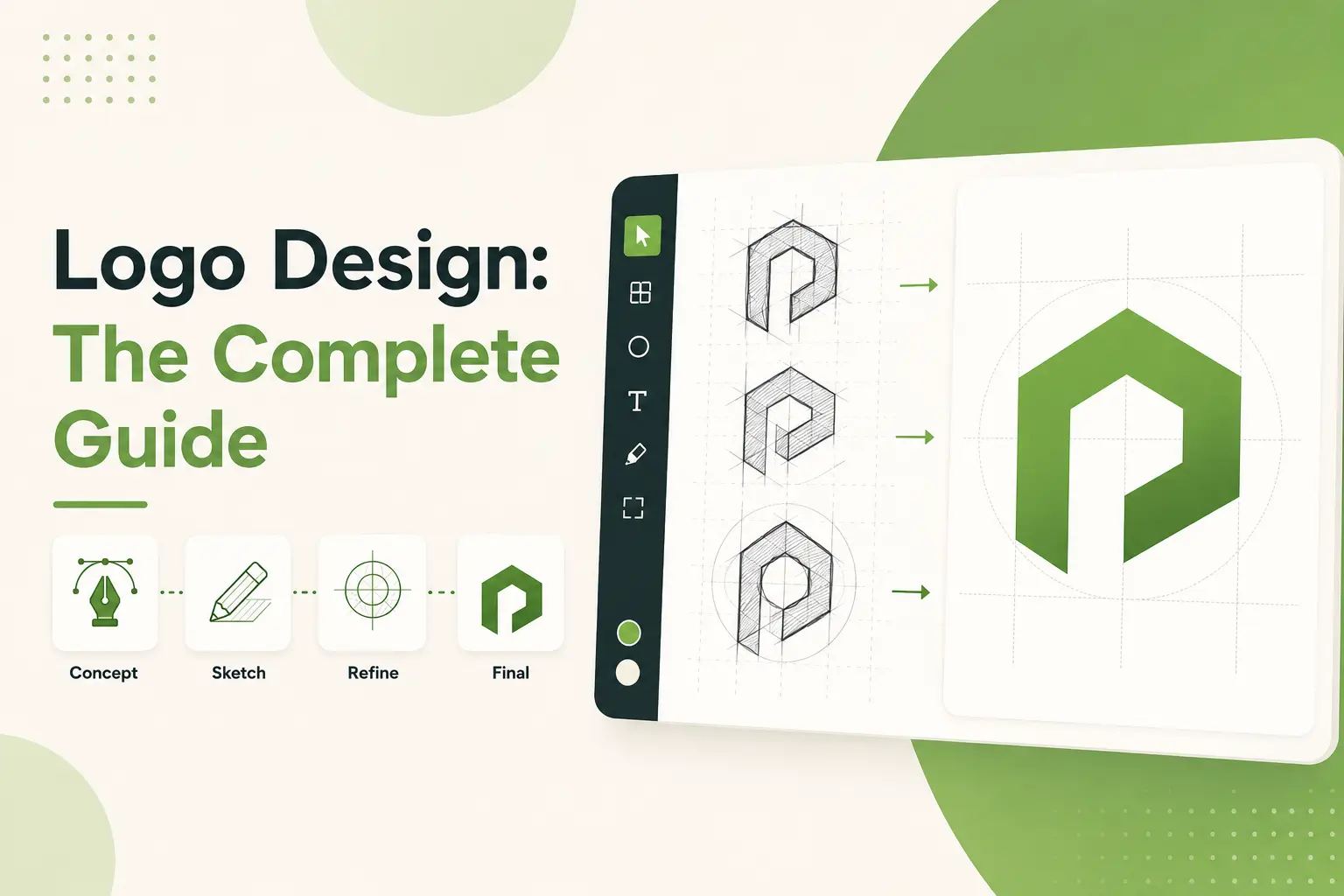
Fundamentals of UI/UX Design
.webp)
The funny thing is, I used to confuse UI with UX. When I began my career in design, I considered them somewhat similar, like two sides of the same coin that no one bothered to clarify. And let me tell you, It made for some awkward moments. Like when I pitched a client on how magnificently the user interface experience would be. They looked at me blankly, and I could feel my face getting redder than a tomato. Yeah, not my finest hour.
So, here’s what I learned since then: UI (User Interface) and UX (User Experience) are pretty related but not interchangeable. Think of it like this, if you’re constructing a house, the UI is all about the paint colors, the couches, and the fancy light fixtures. It’s the things people look at and use directly. On the other hand, UX is alike to the foundation of the house and the plumbing and layout. You don’t see it as much, but everything collapses if it’s not done right.
I want to share a quick story about my start as a designer. Once, I worked on a project where we spent weeks polishing the visuals. The buttons looked great, the icons were crisp, and the color palette? Stunning. But guess what? Users hated it. Why? because using the app was like trying to solve a Rubik’s Cube with a blindfold. It hit me that even the most attractive designs can fail if the user experience isn’t seamless.
Here’s the thing, UI design is aesthetic; it’s how things look and feel. Are the fonts readable? Do the buttons pop, but not to the point of being overwhelming? Is there enough white space around components so users don’t feel like they are drowning in clutter? But these are all questions a good UI designer asks themselves every day.
On the other hand, UX Design focuses more on functionality. How intuitive is the flow? Is it fast for users to be able to find what they are looking for, or do they have to jump through hoops to get them? One trick I gained along the way was that I would map out the user journey before I designed anything. Honestly, take a pen and paper (or a digital tool, if you’re fancy) and outline every step your user will take. I promise it prevents a world of headaches down the line.
Oh, and here’s another thing I wish someone had told me earlier, it counts when you show up consistently. Whether it’s about button styles, font sizes, navigation patterns, etc, consistency makes things easy for you and the users. Nothing is worse than wandering around a website where half the links are blue, and the other half are green. Confusing? Absolutely.
A bottom line I prefer to focus on when discussing UI/UX design is the following: All UI and UX design aspects are user-focused. If your design doesn’t make their life easier, or at least less frustrating, you’re doing it wrong. So the next time you’re getting one of your projects ready, ask yourself, Does this look nice and function nicely? If the answer is yes, congratulations, you’ve got the basics down.
And hey, don’t be hard on yourself if you screw up a few times on the way. We all do. Keep learning, testing, and tweaking until you find that sweet spot. After all, great design is not built in a day but over time.
Essential Principles of UI/UX Design

I've designed interfaces for, I don't know, it feels like an eternity (okay, maybe not eternity, but long enough that there were enough mistakes). And trust me, nothing is more humbling than spending weeks working on a design only to have users trip up on it. Like this one time, I promise this is true I created this slick dashboard. It had all the bells and whistles, gradients, animations, and even a little confetti effect when you completed your tasks. But guess what? My test users couldn't understand how to delete an item. That was a total facepalm moment. That's when I understood how important UI/UX best practices are.
As always, simplicity is best, and less is nearly always more. When I started my career, I believed the best way to go was by cramming every feature I could think of into one screen. It wasn’t. I once worked on a project with too many buttons and dropdowns, which overwhelmed the users. They don’t know how to click first. After some user testing, and a lot of feedback, I learned to simplify. Now, I adopt the motto, If it doesn’t add value, eliminate it. Go with a simple design, and users will be happier, period, trust me.
Another big one is consistency. This may seem tedious, but hear me out. Train your app to leave a mark on your user interface so that the user can feel the continuity of your app. Annoying, right? I did that once, and that exact mistake. The search was at the top of some pages, buried under a menu on others. Users hated it. After standardizing the layout throughout all the screens, the engagement increased by 30%. What is the moral of the story? Make your fonts, colors, and interactions predictable.
Here’s something I wish someone had pounded into my head sooner, visual hierarchy matters. To begin with, I considered every component as if it warranted similar attention. Bad idea. As it turns out, humans skim content in specific patterns, F-shaped or Z-shaped. So now, I’m using size, contrast, and space to guide their eyes to where I want them to go. For example, making the call-to-action button larger and more prominent than everything else?
Oh, and don’t even get me started on accessibility. A few years ago, I created a website without considering colorblind users. Someone mentioned that the red error messages blended into the background for people with deuteranopia.
Lesson learned: Accessibility is not optional. Check using contrast checkers and use alt text for images. It enables all users to leverage your product and enhances SEO.
Finally, never dismiss the potential of a mobile-first design. I used to prioritize desktop versions back in the day. Then smartphones blew up, and suddenly, half my audience was pinching and zooming through tiny text. These days, I design mobile and then desktop, scaling up. It saves you a headache, trust me.
These principles aren’t rocket science, but they’re easy to forget. Please keep it simple, be consistent, lead the eye, be accessible, and design mobile-first. Just do that, and you’ll be lightyears ahead of where I was when I added confetti to a task manager. Live and learn, folks!
Best UI/UX Design Trends for Inspired 2025

I know; I’ve been designing interfaces for what feels like forever well, at least the early 2010s. Remember when we were all skeuomorphic back in the day? Those shiny buttons seemed to pop right out of the screen. Fast forward to now, and they’re less than half a degree from where they need to be. But that’s part of the fun, right? So here’s my take on some of the top UI/UX design trends I’m seeing for 2025. Believe me; these aren’t guesses; they result from years of errors and much brainstorming fueled by coffee.
The first is that dark mode isn’t going away anytime soon. When Apple introduced this a few years ago, I figured it was a gimmick. As it turns out, users love it, not only does it reduce eye strain and make color pop in ways with light themes. An app I worked on had dark mode implemented for the redesign last year, and we saw a 15% increase in retention. Fifteen percent, that’s huge. If you haven’t already joined this bandwagon, 2025 is your year.
Now, let us discuss micro-interactions. These tiny fellows are so under-appreciated. Do you remember the first time you loved something on Instagram and experienced the heart-thingy animation? It felt good. That is precisely what micro-interactions do: they help people feel connected to your product. I created a checkout flow a few months back with subtle animations of button clicks. Users said that they felt more confident in the process. Who realized little details can hit so hard?
Oh, and here's another that's going viral, voice user interfaces (VUIs). I'll be honest, I was a little skeptical at first. Speaking with machines still seems a little like sci-fi to me. But after doing a project involving voice commands in smart home devices, I get it now. We want convenience, and VUIs agrees to do precisely that. Experts estimate that over 8 billion digital voice assistants will be used worldwide by 2025. Yes, you read that correctly. You're missing out if you're not considering how voice fits into your designs.
Another trend I’m nerding out over? AI-driven personalization. I know this client wanted their e-commerce site to feel alive. It also acted as an aggregate for browsing behavior and provided recommendations with machine learning algorithms based on browsing behavior for the presentation of such products. The result? Sales skyrocketed by 30%. Personalization is no longer a nice-to-have; it’s a must-have.
And please let us not forget neomorphism. This style merges flat design with soft shadows, enhancing the microscopic feel while not being overbearing. At first, I didn’t know if it was going to be a stick-around, but damn if it didn’t grow on me. Just don’t go overboard, excess floating buttons can make things look cluttered.
Anyway, those are my picks for 2025. Keep testing, curiosity, and, most importantly, listen to your users. They are, after all, the real trendsetters.
Core UI/UX Design Tools for Modern Designers

When I decided to learn UI/UX design, I thought I’d need a pencil and a small board. A couple of years later, my toolkit resembles NASA’s control room more than an artist’s studio. But hey, that’s why this job is so exciting you’re always learning new tools to keep pace with the ever-changing design world.
One of the first things you come to realize? Tools for prototyping are lifesavers. In the old days, I spent hours explaining my vision to developers with static images and hand gestures. It didn’t work. Then I found Figma, and whoa, did it change the game? Figma allows you to build interactive prototypes that authentically reflect how your users will interact with your product. It’s also cloud-based, meaning no more sending giant files attached to emails or worrying about version control. Plus, collaboration? Seamless. My team could jump in, leave comments, and adjust designs in real-time. Honestly, if Figma were a person, I’d probably name my firstborn after it.
But let’s not forget Sketch, also a heavyweight champ in the UI/UX arena. Sketch is the peanut butter to your jelly if you are primarily designing for macOS, they go together. It has phenomenal tool sets for vector editing and plugins. The plugins are where it gets delicious. There’s precisely a plugin for everything from automating herculean tasks to bringing in advanced animations. Depending on how you look at it, that also can be a bit overwhelming. Been there, done that, and got a stress headache.
Funny story, I once spent three days building a prototype in Photoshop because someone else told me, this is industry standard. As it turned out, Photoshop was not made for UI/UX. The lesson was there, every tool has its place. That's why I'm interested in Adobe XD now. It is the perfect bridge for graphic design and user experience. Last field allows you to wireframe, prototype, and share clickable demos with your stakeholders all in one platform. Plus, it's friendly with other Adobe apps, which is key if you're already neck-deep in their ecosystem.
And we can’t talk about tools without noting InVision. This little bad boy is great at creating experiences where static screens turn into dynamic experiences. Do you remember those micro-interactions (the thing that everyone is obsessed with today)? InVision allows you to do that easily. Once, I put a small hover animation on a button, and my client gasped. It’s the little things, people.
Last but not least, let’s give a massive shoutout to Miro and MURAL for ideation sessions. More times than I can count, these digital whiteboards have been my saving grace. Whether you’re plotting user journeys or organizing feedback, they make teamwork feel less like herding cats and more like well, actual teamwork.
So, what’s the bottom line? This is the best tool, depending on your project and workflow. Experiment, see what sticks, and don’t be shy about mixing and matching. After all, being a designer is like being MacGyver you need to know which gadgets get the job done.
Mistakes to Avoid When Doing UI/UX Design

I’ve been designing interfaces for some time, some good, let's say they could have used more thought. And honestly? Most of the time, I didn’t lack the skills; I failed to remember simple principles. So today, I want to share some of the mistakes I’ve personally made (and seen others make) so that you can avoid them. Believe me, your users will appreciate it in the long run.
First, one of the bigger sins is over-designing. When I first started, I thought that by adding cool animations and a lot of colors, I would impress people. I worked on one project where we had buttons everywhere, sliders, hover effects, you name it. At first sight, the client loved it, but you know what? Users were overwhelmed. They weren’t sure where to click or where to even look.
Lesson learned: Less is more. Keep it clean, lots of whitespace and features that are there only to serve a purpose.
Ignoring responsive design. We all know how mobile-first design works, but sometimes it falls through the cracks. I had this one site that was stunning on my desktop. No, seriously, jaw-dropping stuff. But when I looked at it on my phone afterward, half the text was cut off, and I couldn't tap buttons without zooming in. It wasn't very comfortable. So now I test all designs across devices before deployment. Here's a pro tip, tools such as BrowserStack are the saviors of this issue.
Skipping user research. I’ll admit, there have been times when I thought I understood exactly what users wanted. On one app redesign, I spent weeks developing what I believed to be the perfect layout. It turns out no one cared about my fancy dashboard at all because they just wanted quick access to the FAQ. I don’t skip the research phase anymore. Surveys, interviews, and usability tests are diamonds in the rough for identifying real needs.
Let's not even start with the failure to engage feedback loops during development. Once, I passed off a prototype to developers and wasn't checking in frequently. When we reached QA, the dropdowns weren't working correctly, and navigation was clunky. We could've caught those problems earlier if I'd gone back earlier. What is the moral of the story? Always be clear and avail yourself of free communication.
Finally, do not underestimate performance optimization. If your site loads slowly, your users will click away faster than you can imagine. I recall developing an e-commerce site, and images were taking a while to load. Visitors twinkled left and right. We optimized file sizes and compressed assets, and boom, instant improvement. Page speed matters.
So there you have it, don’t overload your designs, design for multiple viewport sizes, listen to your users, stick around during development, and always mind performance. Do you know these things, and you’re golden? Or at least, better off than I was back in the day.
Career Path in UI/UX Design: Everything You Need To Know

Well, let me tell you something, jumping into the UI/UX design field was never in the cards for me. It kinda just happened. While trying to figure out what to do with my career, I came across this role where they wanted someone to make things look nice on the internet. It’s so much more than that. But hey, that’s where it all began for me. If you’re considering entering this space, believe me, you’re on the right track. Here’s what I learned along the way.
First thing first, skills. When I started learning UI/UX design, I believed a good eye for colors and fonts was all it took. You must learn tools such as Figma, Sketch, or Adobe XD, these are your bread and butter. I once spent a few weeks diving deep to learn how to use Figma properly because I kept fucking up the layers (how embarrassing). So please don’t repeat my mistakes; begin with a tutorial and practice daily. Wireframing? Prototyping? Yeah, those sound fancy, but once you understand them, you will feel like a beast in the best way.
Here’s the kicker: yes, certifications, but real-world experience also. I signed up for an online course (Interaction Design Foundation) early on. It gave me a strong foundation, but nothing compared to working on projects. I recall accepting a little side project revamping a local bakery’s site. The client was unsure of what they were looking for, which led me to determine user personas and layout their customer journey. More than any certificate ever could, that project taught me.
Networking is also a major factor. Want to make networking less awkward? I did not until I discovered community platforms like Dribbble and Behance. These sites aren’t merely for displaying your work, they are goldmines for finding other designers. I posted a case study on Behance once, and someone contacted me to offer me a job. Crazy, right? So please don’t sleep on putting together your portfolio and getting it out there. Here’s a pro tip, featuring before and after photos of your designs. Recruiters eat that stuff up.
However, here’s the reality–some days, it’s not sunshine and rainbows. I questioned myself at times, mainly when clients shot down my ideas. And then, there’s this one project where I designed this real slick dashboard, and the client is like, Can we just tone this down? But guess what? I learned to be better at communicating with stakeholders; I learned resilience during those moments. Learning to articulate your design rationale early on can save you a lot of pain down the road.
Or, if you’re trying to decide whether to freelance or take a full-time job, both have their pros and cons. Freelancing gives you freedom, but it also turns you into a gig-hunting machine. Full-time positions provide stability, but occasionally, you may feel constrained by corporate rules. My journey started with freelancing, and once I had the confidence, I moved on to a full-time position. Do what feels right for you.
Lastly, never stop learning. Trends change quicker than TikTok dances. One year, everyone loved neomorphism, and then bold typography got all the attention the next. If you are up to date, you are relevant. Read blogs, attend webinars, and try out the new tools. Believe me, the legwork pays off.
So that’s it, my two cents on creating a career in UI/UX design. It’s not easy, but it’s so rewarding and worth it if you reach out and do the work. Ready to leap?
Final Thoughts
By 2025, you will have a good idea of why you need UI/UX design. Whether you learn the nine principles of user experience, discover where trends are taking us, or learn how to perform one-off tasks, the UX skill set is profiled, and there's much that can be learned to take the user experience many steps further. Keep that great design that is more than just pretty; it needs to serve a purpose and help your audience in their lives.
Want to see your designs soar to the next level? Start experimenting with new tools, stay ahead of industry trends, and never forget your users' needs.
.svg)
.svg)
.svg)
.svg)