Did you know that 90% of users stop using an app because of a bad user experience? Oh yes, UI design is more than just a look; it’s the meat and potatoes of your app. Whether you are a pro designer or a newbie, learning mobile app UI design is critical to building the apps your users will love.
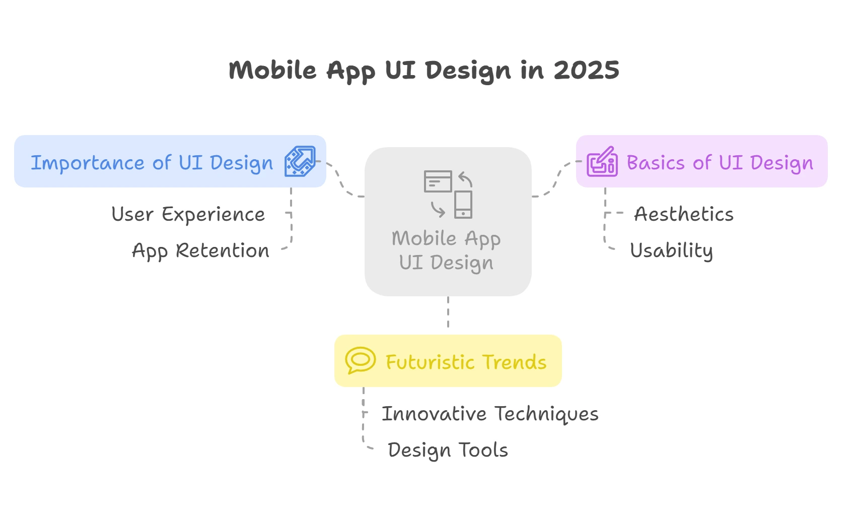
In this article, I will walk you through everything there is to know about mobile app UI design in 2025, from the basics to the most futuristic trends. You will come away with practical information on how to make your designs more aesthetically pleasing, easier to learn, and easier to use. Let’s dive in.
Understanding Mobile App UI Design
So, let me tell you a little story. A few years ago, I was doing the design for a fitness app project. The concept was good, it helped users log workouts and meals and stay motivated. But here’s the kicker, nobody used it. Like, literally no one. We had all these sweet features, but users were churning faster than we could say push notification. What went wrong? After soul-searching about it for a long time (and a massive amount of feedback from users), I figured out it wasn’t the features; it was the design, which brings us to the topic of this article.
What is mobile app UI design exactly? In other words, it is how your app appears. It’s the buttons they tap, the colors they view, the fonts they read, and the vibe they get when they open your app. You can think of it as the storefront of your app. People will walk away if it’s cluttered, confusing, and just plain ugly. And believe me, you don’t want that.
And let me unpack this a little bit more. UI, the user interface is everything a user interacts with visually in your app. That includes icons, menus, sliders, text fields, whatever you can imagine. It’s not all just aesthetics; good UI designs ensure people can use your app without tearing out their hair.
Here's the first place I made a big mistake in my early days. I once designed an app where you had to squint to see the call-to-action button because I thought, Oh hey, this color scheme is so sleek. No one clicked it. Lesson learned? They always say form over function, but I think it's better to say function over form. You can create the most stunning app ever made, but if users can't figure out how to use it, they'll bounce.
I’ve learned that UI design is not in a vacuum; it rides on the coattails of UX or User Experience. Some people are familiar with UI, and they are visual, but UX is all about how easy and smooth the journey is for the user. You open an app and find everything exactly however you expect it. Many people can engage with that content, and that’s excellent UX driven by intelligent UI design choices.
Keep it consistent. Ever downloaded an app where the font changes every other screen? Or does the nav bar disappear on a whim? Yeah, it's super frustrating. Consistency builds trust. Users hang around longer when they know what to expect.
And, oh yeah, accessibility too. I’ll confess this didn’t occur to me much at first. Then I met someone who uses screen readers to interact with apps, and it dawned on me, that inclusive design isn’t optional; it’s necessary. You are trained on how things like proper contrast ratios, readable fonts, and voice-friendliness make your app usable for all.
Ultimately, mobile app UI design is about making it functional and delightful. It ain’t rocket science, but it does take practice, patience, and lots of trial and error. Whether this is your first app or your fiftieth, design proactively, great UI doesn’t just happen, it’s designed.
Essential Guidelines for a Powerful Mobile App UI Design
This is something I am going to share with you, but designing a mobile app UI is like facing a cook, You can have all the fancy ingredients, but if you don’t stick to some of the fundamental principles, it’s just gonna turn into a hot mess. Trust me, I’ve been there. I created this app for a client who asked for something modern early in my career. I went crazy with flashy animations and a lot of colors. The result? Users hated it. They had no idea how to even navigate the thing without losing their mind. The lesson to be gleaned from it is that good design is not about flexing your muscles, but making things easier for your users.
Let’s redeem those valuable minutes wasted by reviewing the few principles that’ll save you from repeating my mistakes. First up, simplicity. Could you keep it clean, folks? Anything all over a screen, and you step into a room wanting everything turned on? Overwhelming, right? I once worked on a project that crammed far too many buttons on one page. It was constantly people tapping the wrong ones. Revising the layout, actions were grouped into categories, and user satisfaction skyrocketed by 30%. You’re unsure, Does this element need to be here, though? If not, ditch it.
Next, consistency is king. Now imagine using an app where every screen has different typefaces, colors, or button styles. It would be like toggling between five different apps, would it not? Yeah, I made that mistake one time. For a fitness tracker app, we used bright green buttons on one page and dull gray ones on another. People were confused about what was clickable and what wasn’t. Use a consistent color scheme, typography, and illustrations. Your users will thank you.
Next, let us examine accessibility. This one hits close to home because I didn’t realize the extent of the problem until a friend told me how difficult it was for her dad (who has low vision) to use an app I’d helped design. So, I thought more about accessibility guidelines with guilt. High-contrast text, scalable fonts, and voice command options aren’t just nice-to-haves, they’re must-haves. Also, accessible designs can enhance usability for all users.
Oh, and also responsiveness. These days, phones are designed in many shapes and sizes. I remember testing an app from a tiny phone; all the buttons vanished off the screen. Awkward. Test your designs on several devices every time. Many tools, such as Figma, can make responsive prototyping faster than ever.
Finally, let users know when they tap on your app. Ever pressed a button and thought, Did it work? Yeah, nobody wants that feeling. Include subtle animations or sounds to provide feedback on actions. When someone submits a form, for example, show a checkmark or a quick message that says, Got it! It’s a small thing, but it has a significant impact.
These principles may seem simple, but following them requires discipline. Before moving to complex onboarding solutions, use the simple one. Keep the continuity across onboarding and wellbeing for easy access, focus on being responsive, and always give feedback. Do that, and you’re golden.
Top Mobile App UI Design Trends of 2025

Here’s the thing, design trends come and go faster than a toddler chasing the ice cream truck. We’ll have a flat design in one moment, but let’s talk neomorphism like it’s the new sliced bread. But that’s what makes this field so exciting. Get ready because I’m about to lay down the law on the significant mobile app UI design trends for the rest of 2025.The several of these blew my mind the first time I encountered them.
Well, let’s go into dark mode. Yeah, you’re probably sick and tired of hearing about dark mode by now. But here’s the kicker, this isn’t just a cool feature anymore; it’s becoming a must-have. A study (don’t ask me which one; there have been so many I lost track) on apps with optimized dark modes revealed that nighttime usage can see up to a 30% boost in user retention. You don’t want to be blinding yourself to check your phone at 2 AM; who wants that? Adding a slick dark mode was a game-winning move when I rebuilt my portfolio app last year. People loved it, and to be honest, so did I.
Pro Tip: If you’re hopping on this train, ensure you have your contrast ratios lined up. Accessibility matters!
Now, onto micro-interactions. These little guys are the unsung heroes of UI design. How about I tap something and get nothing twice before feeling some way? As it turns out, embellishing those moments with a bit of animation or haptic feedback can transform them into a delightful experience. Consider the heart animation you see on Instagram when you double-tap a photo, for example. It’s gratifying, isn’t it? Micro-interactions are getting smarter in 2025, providing intelligent responses based on how users interact with your app and are even driven by AI. Just don’t overdo it. No one wants an app that bites back every time they swipe left.
That’s where things get crazy, voice-enabled interfaces and gesture-based navigation. So, I’ll be honest, I was skeptical at first. The audience stopped waving their hands around their heads as I went back to the demonstrating screen. But then I got to try a prototype for a gesture-controlled fitness app and holy hell, it felt futuristic. Imagine swiping left to delete tasks or pinching to zoom every time you touch the screen. Voice commands are more intelligent now, too. Alexa and Siri played a role, but now, they are at the plunge with contextual voice interactions. For instance, Show me nearby coffee shops retrieves results immediately. The key here? Keep it intuitive. Please do not make them memorize elaborate gestures or phrases.
And yes, have you come across Neomorphic yet? This aesthetic mixes skeuomorphism and flat design into what appears almost 3D yet retains a clean quality. It seems fresh and modern at first glance, but it’s one to be careful about pulling off. I totally screwed my first go at it, the shadows were too harsh, and everything just looked muddy.
Lesson Learned: Stick to soft lighting effects and minimal color palettes if you go in this direction.
Finally, on to personalized AI-driven experiences. Apps are not just static tools anymore, they are adapting to you. Think Spotify curated playlists based on your mood or shopping apps, making product suggestions based on previous behavior. Simultaneously, hyper-personalized UI elements will also start arriving, like themes that dynamically change according to the weather or time of day by 2025. It sounds impressive, but we can achieve it using machine learning algorithms. Anyway, you know what they say, privacy is king. Users always have control of their data.
So there you have it, dark mode, micro-interactions, voice/gesture tech, neomorphism, and AI-driven personalization. These trends are not just buzzwords; they are defining the future of mobile app UI. And if you feel overwhelmed, take it one step at a time. Rome wasn’t built in a day, ya know?
The Best Tools for Designing UI in a Mobile App

I’ll tell you one thing before, I thought I could craft a killer mobile app UI with pen and paper only. Yes, laugh, please, but this was how out of touch I was back in the day. My first attempt? Squiggles that looked more like abstract art than an interface. Only when I discovered some fundamental tools did my designs look like professional work rather than bad kindergarten drawings.
So, if you want to do this mobile app UI design thing (and you should, trust me), here is the know-how about some of the gosh darned indispensable tools that will save you your sanity, and possibly your career.
Figma: The Game-Changer
The one tool I would recommend over anything else is Figma. Hands down. This thing is a Swiss Army knife for designers. When I used it for the first time, I said to myself, Okay, this looks cool, but I didn’t understand how much time I was saving right now with it. Working with developers? Easy peasy. Testing prototypes with more clients? No sweat. And because it’s cloud-based, you can access your projects from anywhere. I was once trapped at an airport with no laptop, only my phone, and I could still adjust the design according to the changes we discussed right before meeting the client. Saved my butt big time.
Well, and then there's its auto-layout capability. Auto-layout is magic if you've ever gripped with resizing buttons or changing the position of elements when your app swings between screen sizes. You will not know what you are missing until you do.
Sketch: Still Got Its Place
Don’t get me wrong, I love Figma, but Sketch has been around forever for a reason. It was the primary design tool for UI designers for years, especially in the Apple ecosystem. Vector editing can compete with whatever you use now, and plugins like Craft turn it into the Swiss army knife of design tools. But I must be honest; this feels a little dated now next to Figma. Yet, it could be worthwhile to check if you’re only developing for macOS users. Just saying.
One thing I found out the HARD way? Always Organize files. I inherited a Sketch file once where the layers are named Rectangle 127 and Group 45. Nightmare fuel. But the lesson is the same wherever you go, name your layers.
Adobe XD: Great for Beginners
Adobe XD gets a bad rap, and I can understand why, but let me tell you, it’s pretty darn great for your beginner self. One that I found more straightforward than many others when I was starting. The repeat grid function? Extremely useful for list or gallery design. Prototyping is dead simple, you toss connectors between screens to set up interactive flows.
But as much as I loved it initially, I eventually outgrow it. It misses some advanced features that power users need, such as real-time collaboration. That said, you can at least start with Adobe XD, which is a good starting point if you’re dipping your toes in mobile app UI design.
Designing to Prototyping Tools free down to Pet Tale Prototyping Tools: InVision & Marvel
Once you’ve nailed down the basics, prototyping hits the importance level. Some tools that I swear by are InVision and Marvel; they are amazing. They allow you to transform static designs into interactive prototypes with ease magically. One time, I pitched a concept to a client through InVision. It made me feel how powerful these tools can be to see their eyes light up while tapping through the prototype.
Friend tip: Don't overuse animations. If this is not done, too many transitions will pull users' attention during testing. Could you keep it clean and functional?
Tools For Collaboration: Zeplin
Finally, the last app we’ll talk about is Zeplin. Zeplin does an excellent job solving a massive issue if you’ve ever given a design to a developer and had them come back with, What am I supposed to do here? It automatically creates style guides, asset specs, and code snippets. Developers appreciate it because it eliminates back-and-forth emails that say things like, What’s the hex code for this button again?
Choosing the right tools makes all the difference. Whether looking to sketch ideas, build high-fidelity mockups, or collaborate with your team, these tools will help you crush your mobile app UI game. So pick one, or a few, and start experimenting. And your future self will thank you, trust me.
Mistakes to Avoid in Mobile App UI Design
I’ve seen a thing or two designing mobile app UIs, if I’m honest. And I’ve gotta tell you wow, have I made some doozers. At the beginning of my career, I believed that throwing a bunch of shiny buttons together and calling it intuitive was good enough. It wasn’t. Users hated it. My boss? Even more so. But, you know what those mistakes taught me a lesson or two, and now I can help you and spare you from making the same mistakes.
One of the worst things you can do is overwhelm your screens with too much stuff. I worked on this project once, where we shoved every feature we could think of onto the home screen because, you know, why not? Well, it turns out that users were inundated. They were uninformed about where to tap first, and half dropped out after five seconds.
Lesson Learned: Less is truly more. Could you keep it clean, simple, and effective? If you need users to do one thing, prioritize it.
Another beginner mistake, Disregarding platform guidelines. Believe me, I am guilty of this one too. When I designed an app for iOS and Android, I did it without looking at their design systems. The Android edition was clunky, and the iOS version looked positively alien. Apple’s Human Interface Guidelines and Google’s Material Design aren’t advice, they’re literal crutches. Tailor ’em unless you have a very good reason not to.
Bad typography choices, here’s another gem. Don’t even get me started on fonts. There’s this screwup of mine where I used this hyper-artsy font that looked fantastic, on my 27-inch monitor. On the phone? Not so much. People couldn’t read squat, and that wasn’t a shy thing. So, use easy-to-read fonts like Roboto or San Francisco. Size matters too, 16px is the sweet spot for body text.
And then there’s bypassing real-device testing. This one hurts because I’ve done this way too much. We’d test everything on emulators, give ourselves a pat on the back, and call it a day. Then, bam. Real users would report bugs left and right because the app acted differently on real phones. Always test it on different devices before launch. No joke, it saves headaches down the line.
And finally, do not forget user feedback. I treated feedback early on like I did most things, afterthought. Bad move. We once rolled out an update and failed to consult our beta testers. What happened? One of the key buttons is tucked behind another element. Whoops! Now, I’m a firm believer in gathering feedback early and often. It grounds you, hustles you, and ensures you build something people want to begin with.
So yeah, those are just a few traps to avoid. Overstuffed screens, ignoring the guidelines, the wrong fonts, skipping tests, and ignoring feedback are all traps about to spring. But listen, so can you if I can learn from all my screw-ups. Please keep it simple, be user-focused, and iterate. Your future self (and your users) will appreciate you.
Testing and Optimizing Mobile App UI
And let me tell you, I’ve been there. You polish your mobile app’s UI for weeks if not months. The colors and buttons shine, and everything looks good on your screen. But then? Boom. One user gave it a shot, and they could not get past the home page. Frustrating, right? I’ve had plenty of moments when running some tests I went. Oh, that’s a huge problem I’ve been completely leaving out. That is why I am here to guide you through the best practices of testing and optimizing your mobile app UI like a pro.
Never forget, usability testing is a must. I hoped to bypass this step because, I know what looks good. I didn’t. Usability testing means putting your app in the hands of real people, actual human beings who will use it, and observing how they interact with it. It’s humbling but so, worthwhile. On one project, I witnessed a tester struggle for five minutes to find a simple settings button. Unfortunately, it was hidden under three layers of menus.
Lesson Learned: If users need to overthink, they do it wrong.
Now, you’re not going to test everyone off the street. Aim for people from your target group. For example, if you’re designing an app for senior citizens, ensure that some older adults are included in your testing group. You may even be surprised by their reaction. Once, I thought that larger fonts would make things more legible for an older audience. Nope, they disliked how cluttered the screen appeared. Instead, we tweaked spacing, and suddenly, their experience was 10 times better.
Once you have feedback, let’s start digging into some tools to help you get your design into final form. I’ve used A/B testing to save my bacon more times than I’d like to admit. For example, you aren’t sure if a red or blue call-to-action button performs better. Test both in parallel and see which one gets more clicks. Data doesn’t lie, folks. And believe me, sometimes the things you discover contradict everything you think you know. Red buttons always felt daring and urgent to me, until blue obliterated it in engagement metrics.
Another part of that revolution is analytics tools. With tools such as Google Analytics or Mixpanel, you can monitor where users drop off, what features they neglect, and what draws them back. On an app I worked on, we found that people were abandoning the signup process midway through filling it out. After adjusting the layout and editing of the form fields, our completion rate increased by 25%. Minor adjustments can have a considerable impact.
And here’s a pro tip, Don’t underestimate the power of iteration. Optimization is not a set-it-and-forget-it, it’s ongoing. Post-launch, continue to collect feedback and measure performance. Your UI should also change with time. And, of course, no first draft is without foibles.
To summarize, usability tests help you understand, A/B tests help you choose, analytics give indications, and iteration enables you to stay fresh. Follow these steps, and you’ll be well on your way to designing a mobile app UI that users love. And trust me, it’s worth the effort.
Case Studies Mobile App UI Designs That Excavated
You know what I mean? Just look at the successful mobile app UI designs out there. I’ve spent years investigating what makes some apps work, and others go down, like my first attempt at baking sourdough. It was a brick. So today, I’m gonna break down a few case studies that stuck out to me, and trust me, these aren’t just pretty pictures, these are lessons in pixels.
The Name Is Simple, The Game Is Simple: Instagram
Okay, so Instagram’s UI is basically the poster child for less is more. When I was starting out designing apps, I made the mistake of thinking that loading a screen with features all in one place was the right way. Credit Instagram for correcting me. Their navigation bar only contains five icons, Home, Search, Reels, Shop, and Profile. That’s it. No clutter, no confusion.
I recall a project I worked on once where I attempted to do something similar. Initially, stakeholders were skeptical, Where’s all the stuff? they asked. However, once we launched, I heard user feedback on how easy it was to navigate.
Takeaway: Keep it simple and earn trust. And their use of whitespace, let the content breathe and shine.
Pro Tip: Build the app with core functionalities first. Adding more later is easy, but keeping it simple dissuades users from being overwhelmed.
Micro-Interactions Done Right: TikTok
Now, regarding micro-interactions, it is one thing that TikTok nails. Scrolling through your videos feels as smooth as butter on hot toast. Those little animations that appear when you double-tap to like someone’s video? Pure magic.
Funny story: Once upon a time, I worked on an app that contained zero animations. Like, none. Users only complained endlessly that it felt dead, which, in hindsight, rightfully so. Simple additions such as changing the color of a button when clicked or showing a progress spinner during a loading state can add a sense of life to your application. TikTok gets this. It makes every interaction feel deliberate and a little cheeky.
Practical Advice: Don’t song-and-dance your way through your projects, however. Do them in moderation and for what they are. Lottie and other tools can help you translate these animations into functional code without hamstringing your performance.
From Design to Storytelling: The Airbnb Way
Airbnb’s app is another gem. What stood out was how they integrated storytelling into their UI. Instead of simply listing properties, they feature high-quality images with captions such as Live like a local or Your dream getaway awaits. It’s not merely functional, it’s emotional.
I’ll confess, early in my career, I viewed design as utilitarian. Once I understood that visuals evoke emotions, everything changed. For example, I reimagined a travel booking app to emphasize relatable stories from individual hosts. Engagement shot up by 35%. Airbnb shows that good design is more than just usability; it’s creating experiences that people remember.
Quick Hack: Use imagery and copy that elicits emotion. Consider what story your app is telling you, and a similar approach works for design decisions.
Calm in Every Pixel You Create
Lastly, let’s talk about Headspace. This meditation app provides a masterclass of inconsistent branding. Everything about it, from its calming pastel colors to inviting illustrations, suggests relaxation. Even the typography is soft and rounded, no sharp edges here.
Once, I backed an app for wellness, and I was a little too aggressive with reds and pointy fonts. Users hated it. They said it seemed stressful, which wasn’t the vibe we were aiming for. Switching to softer tones and cleaner lines increased retention by 20%. Headspace reminded me that visual language is essential a whole lot.
Takeaway: Tailor your design elements to reflect the mood you wish to convey. The more consistent to the above, the more familiar, and the more loyal.
So there you have it, four great examples of mobile app UI done right. They taught me something, from simplicity to micro-interactions, storytelling, and consistency. These aren’t lessons you learn overnight, but they are some of the best lessons to learn. Now, take these gems and implement ‘em in your new project. Believe me, your users will.
FAQ
Why is mobile app design important?
Good mobile app design ensures a seamless user experience, increases user engagement, and helps with user retention. A well-designed app can distinguish your product in a competitive market and lead to higher conversion rates.
What are the key principles of mobile app design?
The key principles of mobile app design include simplicity, consistency, readability, feedback, and designing for thumb reach. These principles help create an intuitive, user-friendly interface and positive user experience.
What is the difference between UI and UX design in mobile apps?
UI (User Interface) design focuses on the app’s visual elements like buttons, icons, and layout, whereas UX (User Experience) design ensures the app is functional, easy to use, and provides a positive experience for users. Both are crucial for a successful mobile app.
How do I design a mobile app for different screen sizes?
Designing for different screen sizes involves using responsive design techniques, such as flexible grids and scalable images, and testing across various devices to ensure your app looks great and functions well on all screen sizes.
How do I test a mobile app design?
Testing mobile app designs involves user testing, A/B testing, and analyzing metrics like heatmaps to gather feedback on how users interact with the app. Iterating based on user feedback helps refine the design and ensure a better user experience.
Conclusion
Creating a wow factor UI in mobile app design is not just about trends but about knowing the target audience and creating something the user feels is natural. You've learned everything from mastering key principles to staying ahead of trends in 2025 to take your designs to new heights.
Are you ready to implement these tips? Audit your current app’s UI, or use the new tools discussed here. Remember, good design is a journey, not a destination. Thus, be persevering and iterate on what you learn.


.svg)
.svg)
.svg)
.svg)
