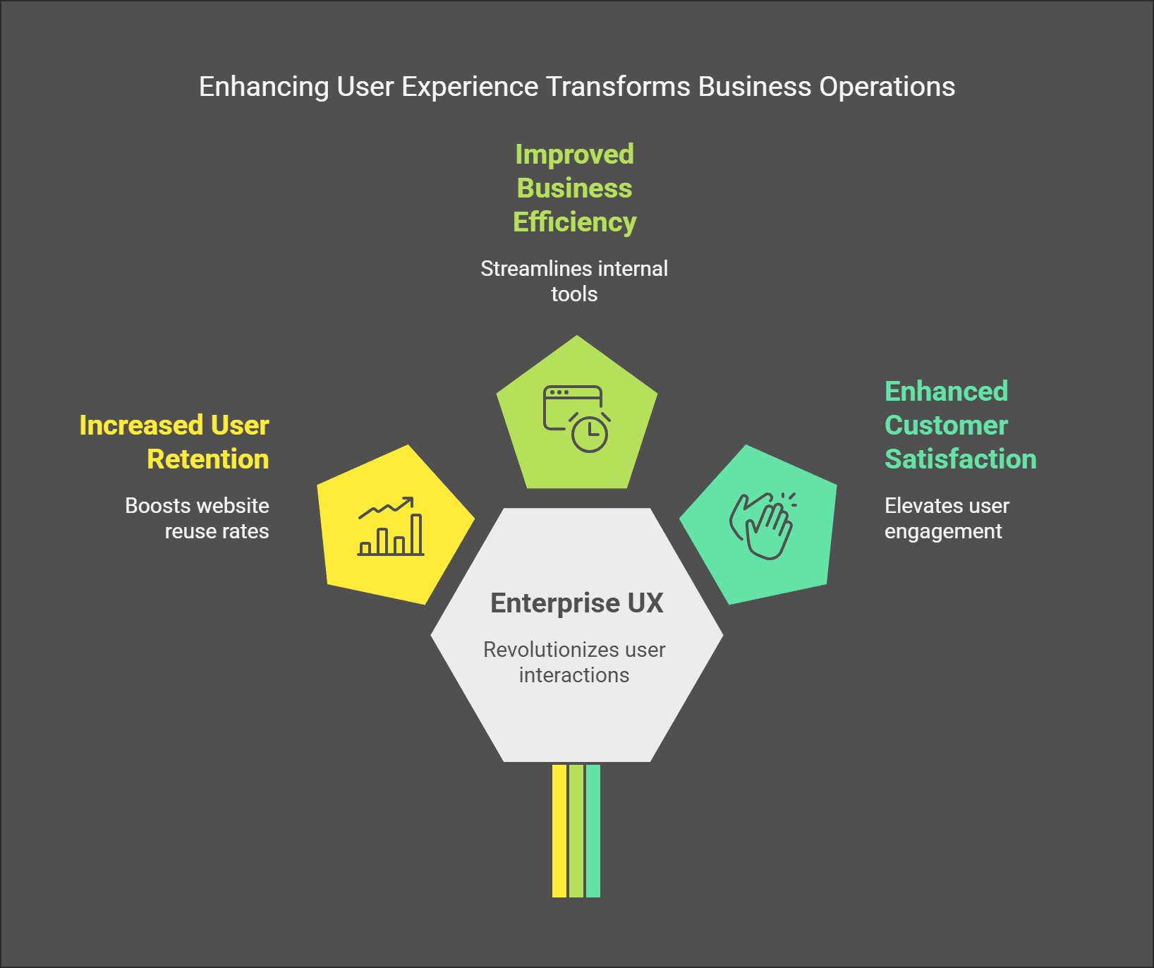
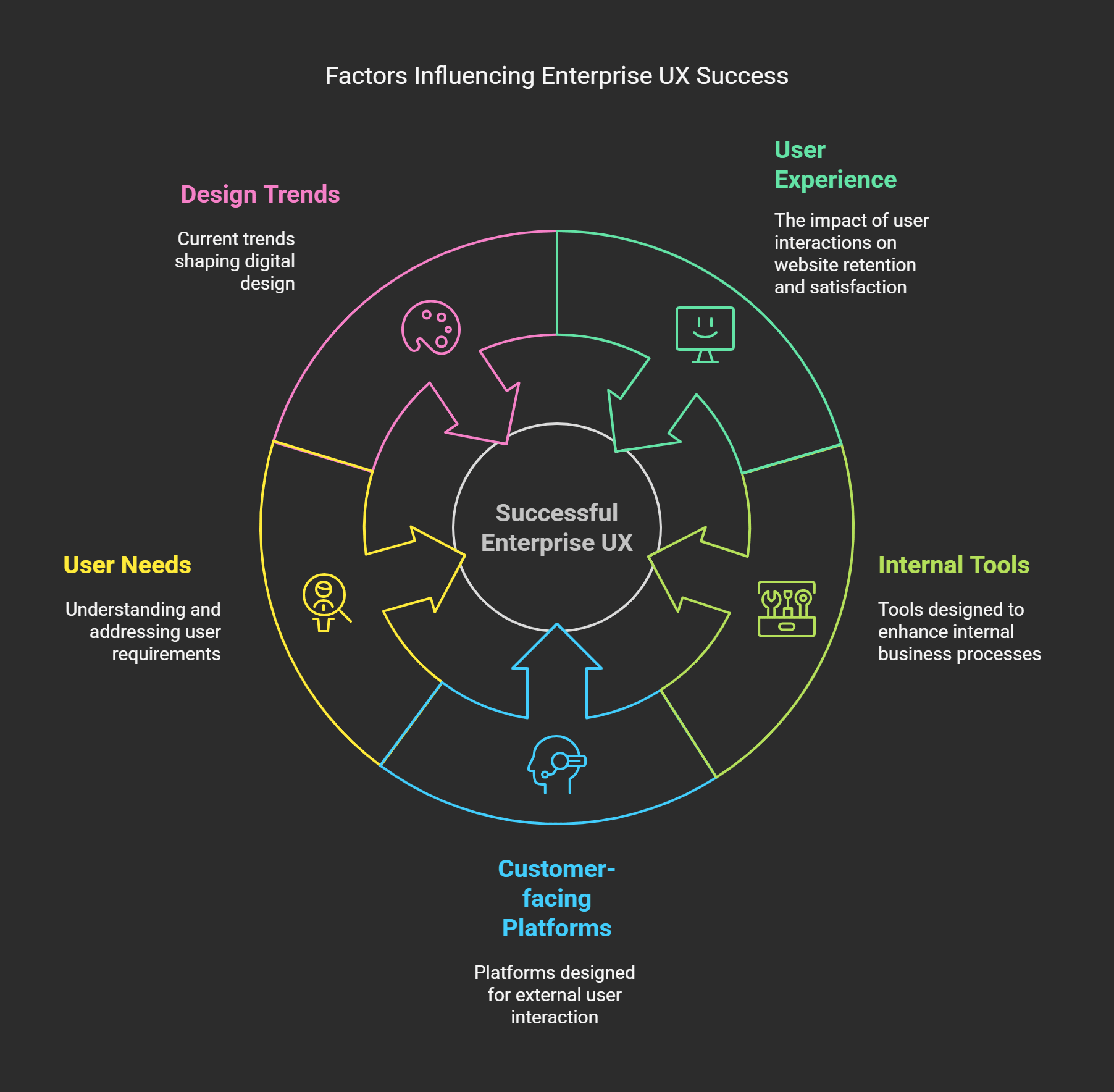
Furthermore, did you know that 88% of users are less likely to reuse a website after a bad user experience? Enterprise UX: A game changer for the digital age mastering Enterprise UX can empower internal tools and external customer-facing platforms, revolutionizing how businesses function and interface with their users.
In this article, we will discuss everything you need to know about Enterprise UX, why it matters so much in 2025, and how you can use forward-thinking strategies to create seamless, scalable experiences. From user needs to the latest design trends, I will cover every aspect of success in the world of Enterprise UX.
Enterprise UX: What It Is and Why It Matters

A few years ago, I was working with this vast company - let's call them “GiantCorp”- to rework how they did their internal software system. Now, GiantCorp had all the bells and whistles, the latest and greatest technology, a checkbook the size of a swimming pool, and a team with enough brains to power a small city. But here’s the kicker their employees despised using their tools. Like, hated it. One dude said he would do the paperwork by hand instead of logging into their clunky dashboard. And honestly? He wasn’t wrong.
That’s when I understood for the first time what Enterprise UX is and why it’s so important. You see, Enterprise UX isn’t just about aesthetics; it’s about designing systems for those who use them daily. Whether that refers to CRM platforms, project management tools, or HR portals, these are the digital spaces where people spend hours of their lives. If the systems are sucky, morale sinks, productivity nosedives, and frustration levels soar. Not an exact recipe for success.
Now, let’s dissect it a little. Enterprise UX is the practice of user experience design for enterprise-grade applications. These aren’t your off-the-shelf consumer apps like Instagram or TikTok; these are enterprise-grade, often custom-built, tools designed to support massive data stores, multiple user roles, and complex workflows. Think Salesforce, SAP, or Microsoft Dynamics. Sounds boring? Maybe. But here’s the kicker, studies show that companies investing in a good Enterprise UX can expect a 500% return on investment from increased efficiency and reduced training costs. Yep, you read that correctly the five hundred percent.
But the thing is, Enterprise UX is not without its challenges. Unlike consumer-facing products, you’re working with users who may not get to choose whether to use the tool. They have no choice because their work is predicated on it. So if the navigation was an exercise in wandering through a maze, or key features lay buried under heaps of menus, you have a problem. I recall one project where we found out midway that our client’s sales reps were bypassing whole sections of the app because they couldn’t figure out how to navigate them. Talk about wasted effort.
Enterprise UX why should you care? At the outset, happy users get better results. When workers find a tool easy to use and helpful, they’re more inclined to embrace it fully, positively impacting overall performance. And then there’s the ripple effect, better adoption means fewer support tickets, less time spent retraining, and ultimately, happier customers if the tool touches external interactions.
Another nugget from my experience is don't cut corners on research. Once, I made the blunder of assuming I knew what a user needed without asking. It was the feature I found to be genius that was never used, while a simple hotkey changed the game. Involve real users early and often.
Enterprise UX is about empathy. You’re building tools for people not robots and treating ’em as such has big payoffs. So the next time you find yourself staring at a screen full of spreadsheets or wrestling with an outdated interface, ask yourself, Could this be easier? The odds are yes. And do it, and I promise you that you will be thankful in the future for that.
Best Practices for Successful Enterprise UX Design
Now, I want to tell you something, I used to believe designing for enterprise users was the same as planning for normal consumer users. I built this project early in my career for a logistic company. We created what we believed to be a “slick” dashboard with all the bells and whistles, charts, graphs, color-coded alerts, you name it. But when did we roll it out? The feedback poured in users hated it. As it happens, they didn’t need fancy visuals; they needed clarity and efficiency. That experience taught me one big lesson, enterprise UX has its beast.
So here are the main principles of effective enterprise UX design. These aren’t textbook definition lessons I’ve learned over the years, frequently through trial and error (mostly error).
Simplicity Over Shinhwa (Focus on Usability)
Here’s the catch, enterprise users do not care about how aesthetically pleasing your interface looks if it prevents them from getting their work done in less time. I once worked with a team that squeezed in slick animations and gradient buttons because the client wanted that. At the same time, the actual functionality was buried under layers of needless clicks. When we took things back to basics with no snazzy transitions and with clear labels it was night and day. So, it's aesthetics vs usability. Always choose a toaster oven toaster. Trust me, no one will be grateful to see a spinning logo animation on deadline.
Accessibility Isn’t Optional
I once designed an app for warehouse managers and forgot all about font size. Some had grey hair and wore reading glasses thicker than mine. Half the text they couldn’t read without squinting. This is a reminder that accessibility is not just some compliance boxes to check but a consideration of how we feel comfortable using our products. Make use of larger fonts, high-contrast colors, and keyboard navigation options. Oh, and test everything on real users with different abilities. You’d be amazed what you miss otherwise.
Consistency Is King
It may seem tedious, but trust me. Imagine a piece of software where every screen had completely different layouts or terminology. Frustrating, right? I worked on a CRM tool, and it seemed like each module was a different app. The problem was that users were confused, support tickets went through the roof, and it was a mess. So, I advise staying with the same design pattern across your platform. All the same icons, the same language, the same flow.
Scalability Matters
Enterprise systems grow. One day, you’re designing for 50 users; the next, 500. Scaling poorly can decimate performance and faith. I witnessed this with a financial reporting tool. At first, it was great, but as more departments adopted it over time, load times went from seconds to minutes, he said. Be scalable from day one. Designing things modularly, leveraging a cloud-based infrastructure, and optimizing data access and control from the start.
Feedback Loops Are Gold
Finally, don’t underestimate the power of feedback loops. In one project, we added an easy way for users to flag problems inside the app. Guess what? It was our secret weapon for improvement. Instead of speculating what users wanted, we had actionable insights directly from the source. Create mechanisms for getting feedback, whether it’s surveys, comments sections, or even simple thumbs-up/thumbs-down buttons. And then actually act on it. Nothing undermines user trust more than failing to listen to their input.
When all is said and done, enterprise UX design comes down to profoundly understanding your users and effectively solving their pain points. Sure, it’s not always sexy work, but hell, does it feel great when you hit it? The takeaway should be this, keep it simple, make it accessible, stay consistent, prepare for growth, and understand your users. Persevere in this way, and you will be golden.
Enterprise UX in 2025: The Top Trends You Should Know
You know, I’ve been in enterprise software for a long time enough to have seen some crazy shifts about the enterprise software stack. Dashboards used to be about cramming as many features on the dashboard as possible. If there wasn’t a button overload, people thought it wasn’t professional. But since then, how the times have changed. Now? It’s all about simplicity and personalization. Let me tell you why.
A couple of years ago this huge project for a logistics company closed http://home page. Their system had so many tabs that even the IT people who were training new employees had trouble. One chortle said he needed a PhD to log in. We re-engineered the entire thing with AI machine-driven personalization. All of a sudden, users were facing role-based dashboards. Drivers had delivery routes. Managers had performance stats. The feedback? Productivity shot up by 30%. That’s when I understood, personalization isn’t a luxury it’s a requirement.
And about AI, let me tell you, it’s everywhere these days. Claude 2: In 2025, AI is transforming Enterprise UX more than ever imagined if when you logged into your CRM rather than scanning through reports, that system said “Hey, here are three leads you need to work on today.” Sounds futuristic, right? Well, it’s happening. Salesforce Einstein and Microsoft Dynamics pave the way among the tools. And they’re not perfect yet every now and then they suggest something that makes no sense but in general, they’re time savers. And really, who doesn’t want that?
A third trend I love is low-code and no-code platforms. Does anyone remember when making an app felt like reaching the summit of Mt. Everest without gear? Yeah, those days are long gone. Tools such as Airtable and Zapier enable teams to spin up prototypes in hours instead of weeks. I recently assisted a small HR team in developing a leave management tool on one of these platforms. No developers are needed. By the end of the week, they had something that worked and couldn’t stop raving about it. If you haven’t tried out low-code tools yet, seriously, give it a go now.
Oh, and mobile-first design? It’s not optional anymore. A friend of mine works for a manufacturing company. Most employees don’t sit at desks; they're on the floor. He told me horror stories about attempting to use desktop-based systems on small phone screens. So yes, we did a super responsive redesign. Voice commands, swipe gestures, you name it. Having things on mobile increased the adoption more than they could imagine.
And then there’s AR and VR slowly entering the mix. And I’ll be honest, I was skeptical at the outset. Enterprise virtual reality? But then I saw a demo of using VR headsets to train warehouse workers. They could, for example, practice stacking pallets virtually instead of reading manuals. Mistakes didn’t cost dollars or endanger lives. Pretty cool, huh?
So, what’s the biggest takeaway for me from all of this? Keep learning. These trends will not go away, and ignoring them means getting left behind. Start small, perhaps play around with AI tools or use a low-code platform. The users will be grateful, I assure you.
Conducting User Research for Enterprise UX
My experience was on more of an enterprise client level, like a Fortune 500 level. We were building a dashboard tool for hundreds of employees in departments. Sounds simple enough, right? Wrong, I committed the rookie mistake of thinking I knew what users needed because we’d done our homework. An awkward interface no one was excited to engage with. It was trying to fit square pegs in round holes.
Takeaway: There is no way around it; user research is paramount.
So, how do you conduct enterprise UX user research without making the same mistakes I did? Let me explain.
So, you are in an exploratory phase, and first things first make a list of your stakeholders and outline who your end-users are. This is where most people screw up, they pay too much attention to the people who’ll be making decisions (the suits) and pay no mind to the people who’ll be using the system daily. In my experience, we spent weeks serving the C-suite’s needs, only to discover the C-suite's needs later did not reflect the frontline staff's needs. So, gather round and map out all the roles involved. Are they data analysts? Sales reps? IT support? This helps to adjust your questions better.
Once your list is stocked, it’s time to roll up your sleeves and collect insights. I love using surveys, interviews, and contextual inquiries. Surveys are useful for quantitative data on how many users feel frustrated with the current system but they will not provide the whole truth. For that, you go to interviews. This allows you to explore pain points further. One tip? Ask them open-ended questions like, ‘What’s the hardest part of your workflow?’ instead of yes/no ones. You’ll get richer responses.
Depending on your perspective, this is where it gets fun or messy. Understanding users in their environment is called contextual inquiry. Yep, you’re essentially shadowing them as they work. The last time I sat beside a sales manager, he switched between five separate tabs to manage a single customer record. Her struggle gave me much more insight than any survey ever would have. Fair warning, not everyone likes being watched, so explain why you’re there and keep it low-key.
Another trick I swear by is mapping out user journeys. This means logging every action a user takes to accomplish something. When we finally laid out the sales team’s process, we had over 20 steps to create a single report. No wonder morale was low. By simplifying these workflows in the design phase, we reduced the process to eight steps.
Be sure to approve analytics tools if they exist in the current system. Analytics tools like Hotjar or Google Analytics provide insight into where users drop off or spend the most time. On one project, we discovered that users bailed on a form mid-way because it requested information they didn’t have available. A simple fix has a considerable impact.
Finally, test early and frequently. Don’t wait for the product to be perfect before sharing it with users. Much like design iterations, you may feel too rough around the edges to show off your early-version prototypes but believe me, the input from real-world users is worth its weight in gold. Also, detecting problems earlier tells you to refactor your code rather than facing costly redesigns in the future.
User research for enterprise UX isn’t easy, it's sometimes dirty, slow, and painful. But when done well, it takes good ideas and forms them into solutions people want. And frankly, there’s nothing more gratifying than hearing someone say, “Wow, this makes my job so much easier.” That’s the holy grail we all are pursuing.
Solution and Technology for Building Enterprise UX
If you’ve ever attempted to put enterprise UX together from zero, you know how much it is like building IKEA furniture without instructions. You think you have all the parts, and halfway through, realize you’re missing that one weird screw and now things feel unstuck. Trust me, I’ve been there. But I’ve learned over the years which tools and technologies make things easier instead of more complicated. Let me break it down for you.
First, let’s talk about design tools because, truth be told, these are the spine of any decent enterprise experience design venture. Once upon a time by once upon a time, I mean a few years ago, my team was stuck doing everything in Sketch. To get it out of the way Sketch is excellent but when we got into larger, more complex enterprise projects, it just couldn’t handle it. That’s when we started using Figma.
Figma enables several designers to work on a single project simultaneously, which is vital when working with feedback from designers, stakeholders, and those who will use the app. And, man, its prototyping options are smoother than butter. And no more exporting files or losing versions: it’s all there in the cloud.
But hang on, what about when you need something speedy and dirty? Adobe XD has done wonders for me for rapid prototyping but from as far back as I can remember. It doesn’t have the same bells and whistles as Figma but gets the job done, particularly if you’re already up to your knees in the Adobe ecosystem. Once, I had to toss together a prototype for a client meeting in less than two hours. With XD, I whipped up something good enough to wow them. Do you know what? We landed the contract. Well, the moral of the story is that sometimes less is more.
Let us move on to collaboration tools. Enterprise UX isn’t a one-person show you’re working with cross-functional teams, so communication is essential. When I began my career, I mistakenly abandoned anything but email threads to provide updates. Some communications fell through the cracks, people got confused, and deadlines set off like a banana peel on a marble floor. Use them every day, all day Miro, Slack. Miro is great for brainstorming sessions and visually mapping out user flows, and Slack helps keep everyone aligned without flooding inboxes. No, but seriously, you're missing out if you aren’t using these for anything yet.
And then there’s the tech stack itself, the backend stuff that makes your pretty designs come to life. It has become commonplace for enterprise apps to be powered by cloud services. AWS and Microsoft Azure are industry standards, but don’t overlook Google Cloud. They’re serverless, reliable, and work nicely with APIs. APIs are the glue pulling it all together. APIs are your best friend when you want to pull data from Salesforce, integrate with payment gateways, etc. Just make sure you document the heck out of them. I've seen too many faceplant projects because six months later, no one understood how the API went.
Finally, accessibility testing tools are also worth mentioning. I didn’t consider it early on, and wow, did I suffer for it. We introduced a dashboard tool once, only to discover it is unfriendly for screen readers. I now swear by tools like Axe and Wave, which check that your designs conform to WCAG. Not only does this save you legal headaches, but it also makes your product usable to everyone.
Enterprise UX is really about knowing how to do it rather than which tools you use at the end of the day. Be willing to scale back and try new things. And the best part of all, if things aren’t working out for whatever reason, remember coffee solves everything.
Mistakes in UX Design for Enterprise Applications
You know what? Enterprise UX design is not easy. I’ve been there, trust me. If you think you’re building this excellent tool to transform workflows, users will hate it. Or even worse, they simply don’t use it. Yeah, it's not fun. In my years of working with leaders, I have made many mistakes and seen others make them as well. Well then, let’s discuss the main pitfalls, the big knocks that need to be avoided if you want your enterprise UX to work at all.
One of the biggest blunders is overcomplicating things. I once worked on a project where we thought taking 1001 features up front was the way to go. Why not present the user with 20 options on one screen? But guess what nobody used all or half of those features. It was overwhelming. People didn’t know where to begin, so they avoided the platform altogether.
Lesson Learned: Simplicity wins. Only do what users want and then build. If you’re unsure, try asking yourself would I like to use this? If the answer is no, go back to the drawing board.
Another pitfall, Ignoring non-technical users. This happened to me when I was early in my career. In this case, we were designing an internal dashboard for a company, and we took the assumption that everyone was well-versed in their use of data analytics tools. As it turns out, the staff were not tech-savvy at all. They needed clear labels, tooltips, and even walkthroughs. The responses poured in, and boy, did they hurt. But hey, it made me realize that you need to think of all types of users, not just the power users.
Another classic is the failure to connect design goals to business goals. Sounds obvious. But I’ve watched whole teams get obsessed with making something look slick and miss entirely the point of the tool. For instance, I once worked on a gorgeous sign redesign. Reps complained it made them slower because key actions were hidden behind layers of menus. Aesthetics are essential, of course, but functionality must come first. Consistently ask yourself, Is this helping the user get to their goal faster?
Another area where people drop the ball is performance optimization. Slow load times or clunky interactions can destroy adoption rates. I once had a project where the app took ages to load reports. Users would walk away from their desks, get coffee, and return expecting it to be ready. Not ideal. Speed matters, folks. Extensive testing of your designs is needed, especially for complex systems that process hundreds of data.
Finally, please do not base your realistic expectations on my examples. Irregular navigation, fonts, or button styles can make users feel baffled. Think about clicking “Save” in one area and discovering it’s called “Submit” in another. Frustrating, right? Use a consistent design language across everything; it makes life easier for everyone.
So, to summarize, keep it simple, consider all types of users, link your designs to business goals, optimize performance, and be consistent. These are not earth-shattering discoveries, but they save you migraines. Believe me I have the gray hair to show for it.
Enterprise UX - Successful Use Cases in the Wild
If there’s one thing I know, I’ve been in the enterprise software game long enough to know that not all platforms are created equal. Some are slow, clunky messes that make you want to throw your laptop out the window (we’ve all been there). But then there are those shining examples of someone getting it right. And believe me, when they get enterprise UX right, it’s like the New York Philharmonic playing Johann Strauss through the Halls of Congress. Let me share a few stories from my experience working with these systems and what we can learn from them.
Consider Salesforce, for example. If you’ve ever used their CRM platform, it is pretty smooth and packed with features. Back in the day, I was on a team that was charged with rolling out Salesforce for an entire sales department. At first, the collective groaned “Oh what, now another complicated tool?” But guess what? It had come out two weeks earlier, and the most tech-averse people were navigating it like pros. Why? This is because Salesforce had the whole “intuitive interface” part down. They didn’t bombard users with options; they streamlined workflows and ensured every button served a purpose.
And then there’s Microsoft Teams. Fair enough, I wasn’t always a fan. The early editions felt like wrangling cats with so many tabs, so much going on. But ultimately, Microsoft raised their game. I vividly remember one day when we were in the throes of a chaotic product launch, and our teams turned to teams to help pull it all together. Integration with other office apps saved us hours of back-and-forth emails. Plus, the chat function worked without a glitch. What surprised me was how quickly it pivoted to cover disparate types of workers; managers could track project progress, and creatives shared files effortlessly. And here is what I was taught, enterprise UX is all about flexibility. You have to design for all, not just a specific user category.
But here’s the kicker, not every example has a happy ending. I used to work for a company that deployed custom-developed ERP software. Sounds fancy, right? As it turns out, no one bothered to ask the employees how they worked. The result? A disaster. They disliked it so much that they resumed resorting to spreadsheets to escape the system. Talk about a waste of money. That was a lesson learned, user research is not optional. To skip it is like building a house before checking if anybody needs a roof over their head.
So, what can you learn from this? Focus on usability rather than flashy features. Second, build in feedback loops early and often. And lastly, never belittle the forces of cross-platform compatibility. These real-life wins and failures remind us that good enterprise UX doesn’t occur by accident. It requires consideration, experimentation, and a ton of listening.
If you’re hoping to implement new tools or design your own, keep these lessons close. Your users will appreciate it and so will your bottom line.
Final Insights
Enterprise UX is not a nice thing anymore; it’s a must for organizations that wish to survive the coming years leading up to 2025 and beyond. Focusing on these three principles will help your company develop creative digital experiences that provide a superior user experience. Keep in mind that high-quality Enterprise UX is not only aesthetics but also solving real problems and generating measurable results.
Available to upgrade your enterprise projects to the next level? Audit your current systems, collect user feedback, and use these strategies to make changes. Are you ready to take charge of the future of Enterprise UX?
.svg)
.svg)
.svg)
.svg)