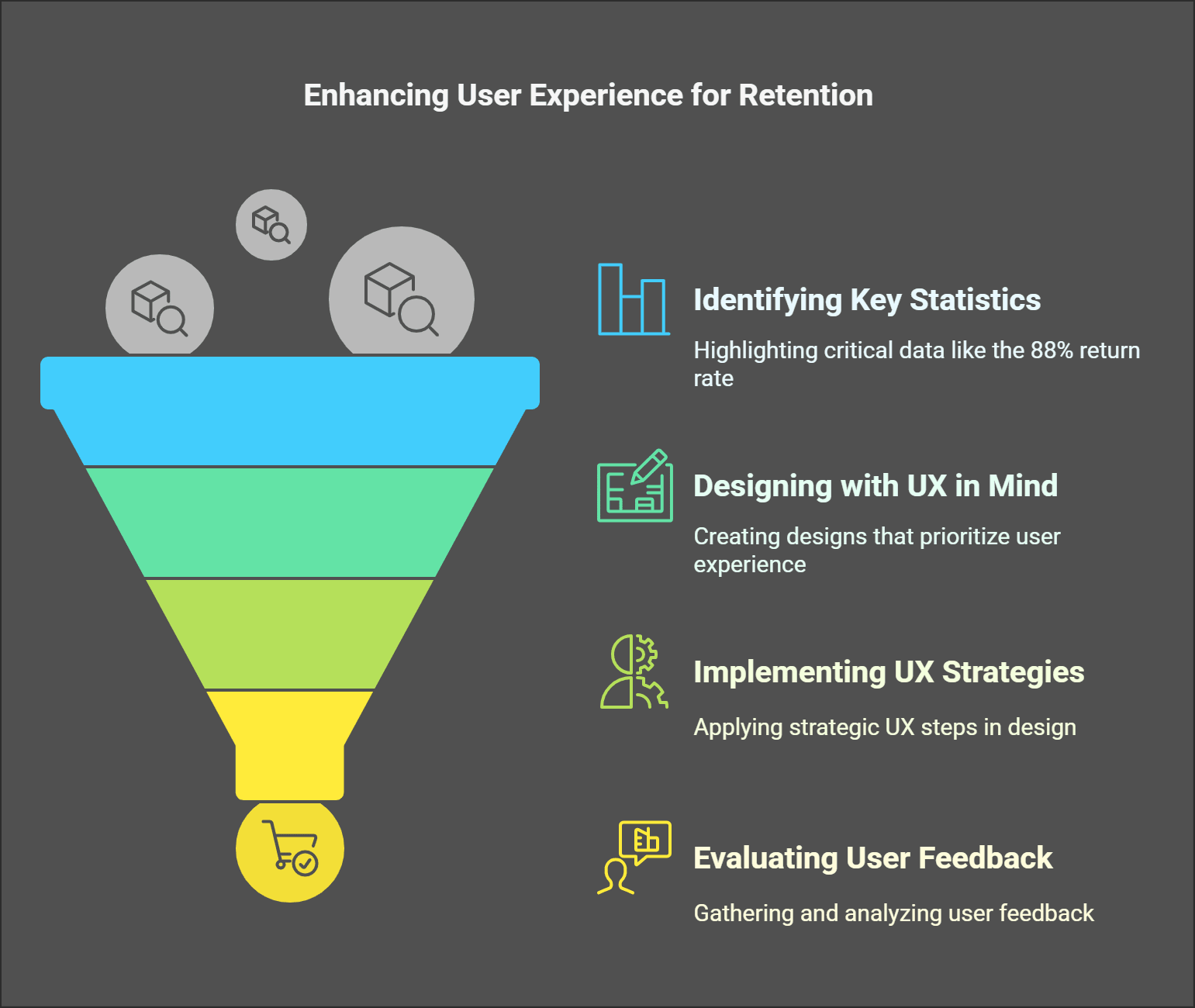
The significance of user experience, or UX, has garnered attention increasingly in recent years. This hasn't come out of thin air; it stems from the statistics we’re all left with. Out of the many, this one caught my eye: 88% of online shoppers would not return to a website after having a negative customer experience. With slippers left at the door, brands directly compete for their attention and the whole shopping experience.
The statistics alone are enough to create a solid design structure. Go over any business, and they will hunt you for not enabling them to connect their brand to the world (or, in other words, market) breathtakingly. Skilled or novice-actor, I'd request a step-by-step guide when engaging myself in new territory. That's why, from today onwards, consider this your go-to handbook on the fantastic world of UX, and you won’t regret it.
In this guide, I’ll share tips on the key stages of the UX design process that allow you to unlock actionable plans and steps to create designs that users want. After reading this article, you will have a clear plan you can always reference, so you’re equipped for any UX problem.
Definition of UX Design Process
The truth is, I didn't always get what UX design meant. Even in my more primitive years early on in my career it was apparent that creating an attractive interface was all there was to design the user experience. Was I ever off the mark? My outlook completely changed thanks to a singular experience. In one of my projects, we developed an application for small business owners, and everything looked great on paper. During our usability testing, everyone seemed to be utterly lost. And I mean, lost in the where the heck are the buttons sense. It dawned on me that designing anything is not just about aesthetics but about solving real-life problems.
Therefore, I will explain what the UX design process is. It's a bit like making a cake. You don’t simply put flour, eggs, and sugar into a bowl and hope for the best. While that might be plausible on some level, there is a specific series of actions that need to be adhered to achieve the most delectable outcome, and to me, skipping even one step of those will result in a disaster that nobody would want to touch. The entire UX design process aims to ensure that products (websites, apps, etc.) relieve some user pain points and offer a smooth and pleasant experience. No, it is not hocus pocus; there is a procedure.
Here's the situation, the user experience (UX) design process initially incorporates some form of research. I have quite a few stories about this phase. For instance, there was a time when I bypassed user interviews because I had made assumptions based on prior research. I was disappointed. A saying goes, “There is a chance of getting many things wrong based on guessing.” That’s exactly how it felt in this particular instance. Nowadays, I never skip research. Questionnaires, interviews, and even observing people as they use related products it's all great.
Now comes the turn of Information architecture after finishing the necessary research. It may seem monotonous, but picture yourself in a shop without labels and shelves that are haphazardly placed. It’s infuriating. The same applies to digital products. It is essential to organize content in a way that makes sense. Take, for example, one of my projects. Changing our navigation menu based on user feedback reduced bounce rates by 30%. Yes, thirty percent. All that is just from improving the structure. Is this not mind-blowing?
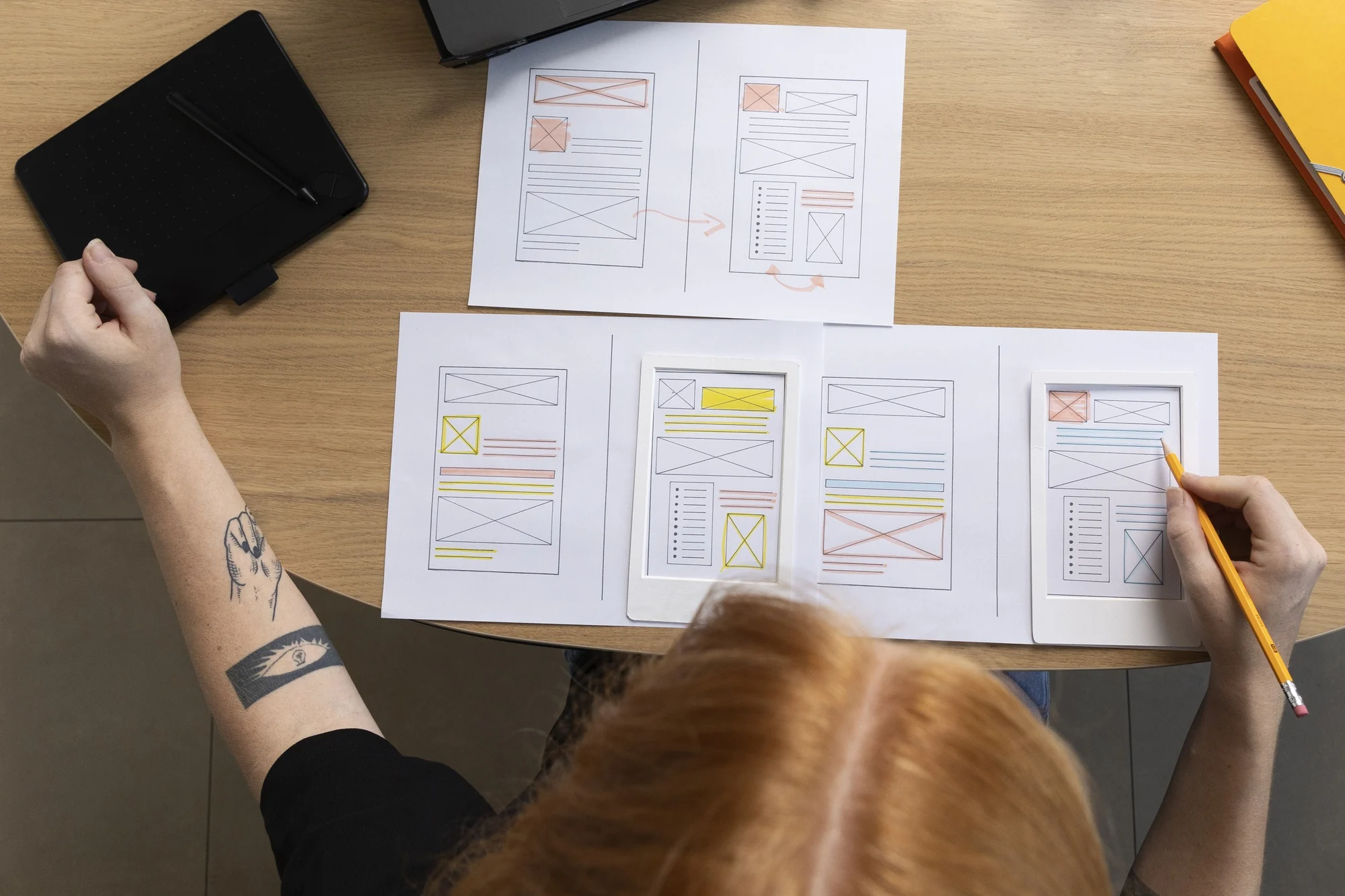
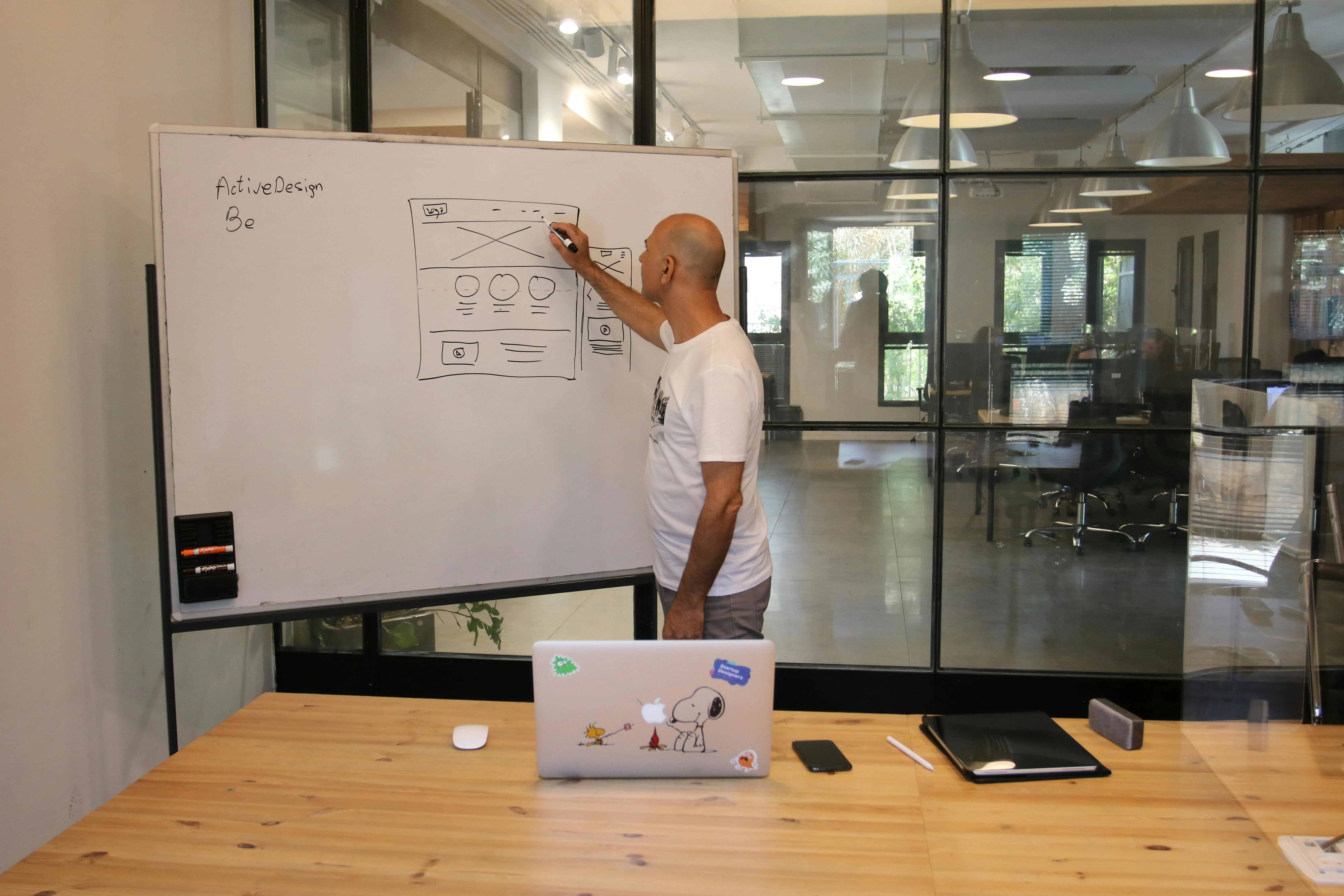
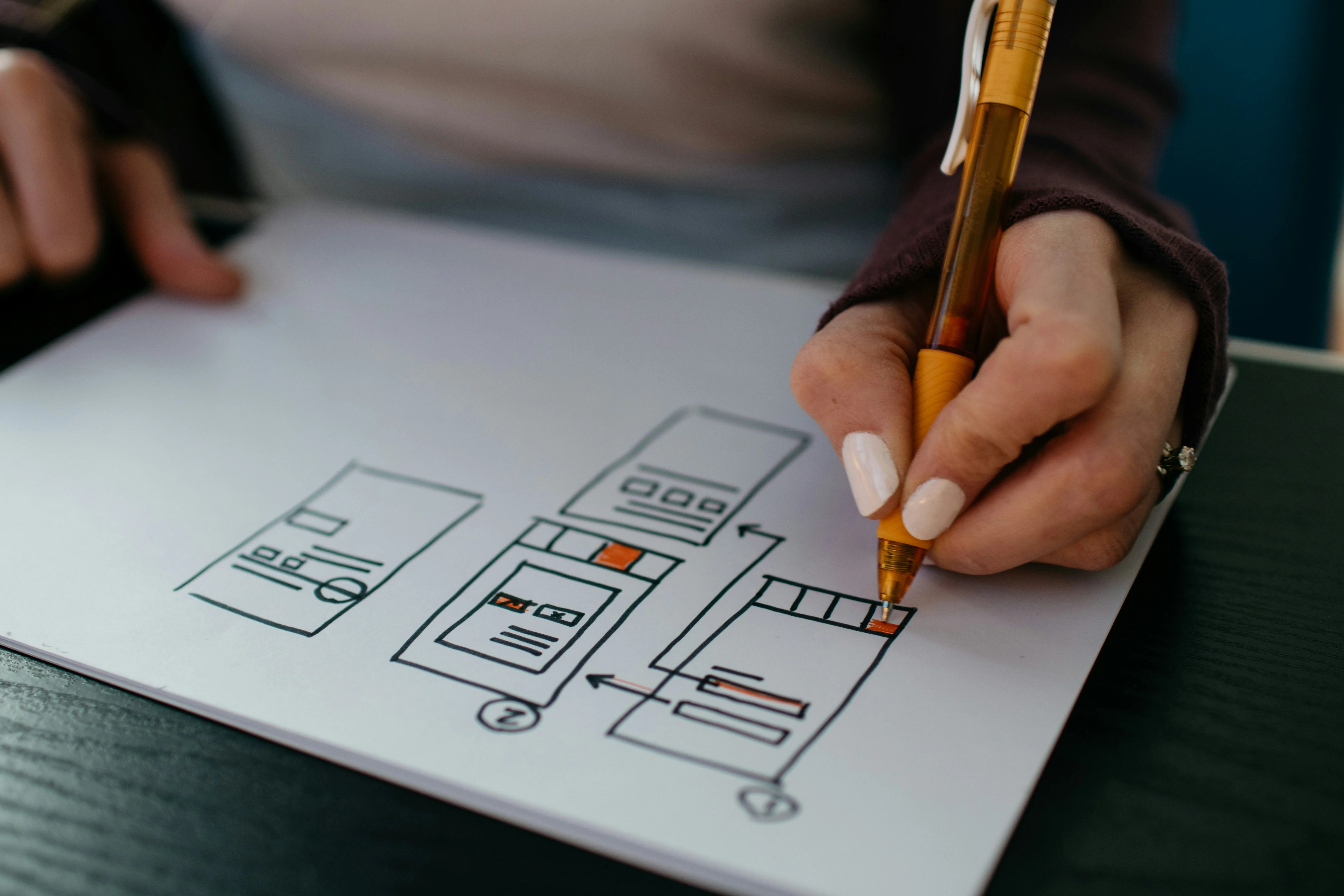
Then, there is wireframing and prototyping with no shadow of a doubt, the most enjoyable aspect. I recall spending countless hours trying to perfect minute details in Figma only to realize that sometimes, less is more. It’s essential to convey ideas accurately rather than over-polishing something. I believe in testing early and often, making it my motto.
Moving on to the next step, which I have the utmost respect for, is usability testing. Watching real users interact with your design can be cringeworthy, to say the least. But it's better for issues to come out before launch. We once caught a major oversight in testing a checkout button that was almost invisible in the background. Mid-blunder, I learned my lesson.
So, the implementation stage is finally reached. Designers now pass on their work to developers. As always, communication is important here. It's remarkable how often the design changes during processing. We solved that problem very quickly through pair programming sessions.
Fundamentally, the UX design process is iterative. It’s never completed in the true sense of the word. Even post-launch, the cycle is kept alive by monitoring analytics, feedback, and user prompts. Truth is, the best designs adapt to users over time.
Sure, it may feel overwhelming at times. But it’s important to lean into it and trust the journey. Every single step counts. Every error teaches something new. If I can confidently transition from an utterly lost beginner to a designer, so can you.
Key Stages of the UX Design Process
I’ll tell you something, I didn’t get it right initially. In my early years of practicing UX design, I thought it solely revolved around making everything visually appealing. I thought it only involved adding nice fonts and colorful splashes. Oh, was I mistaken? Good UX took me months or years to understand that it is not solely about aesthetics but, as the deceptively simple saying goes, “good design is good for real people.” This, trust me, is effective in simplifying understanding of the key stages of the UX design process.
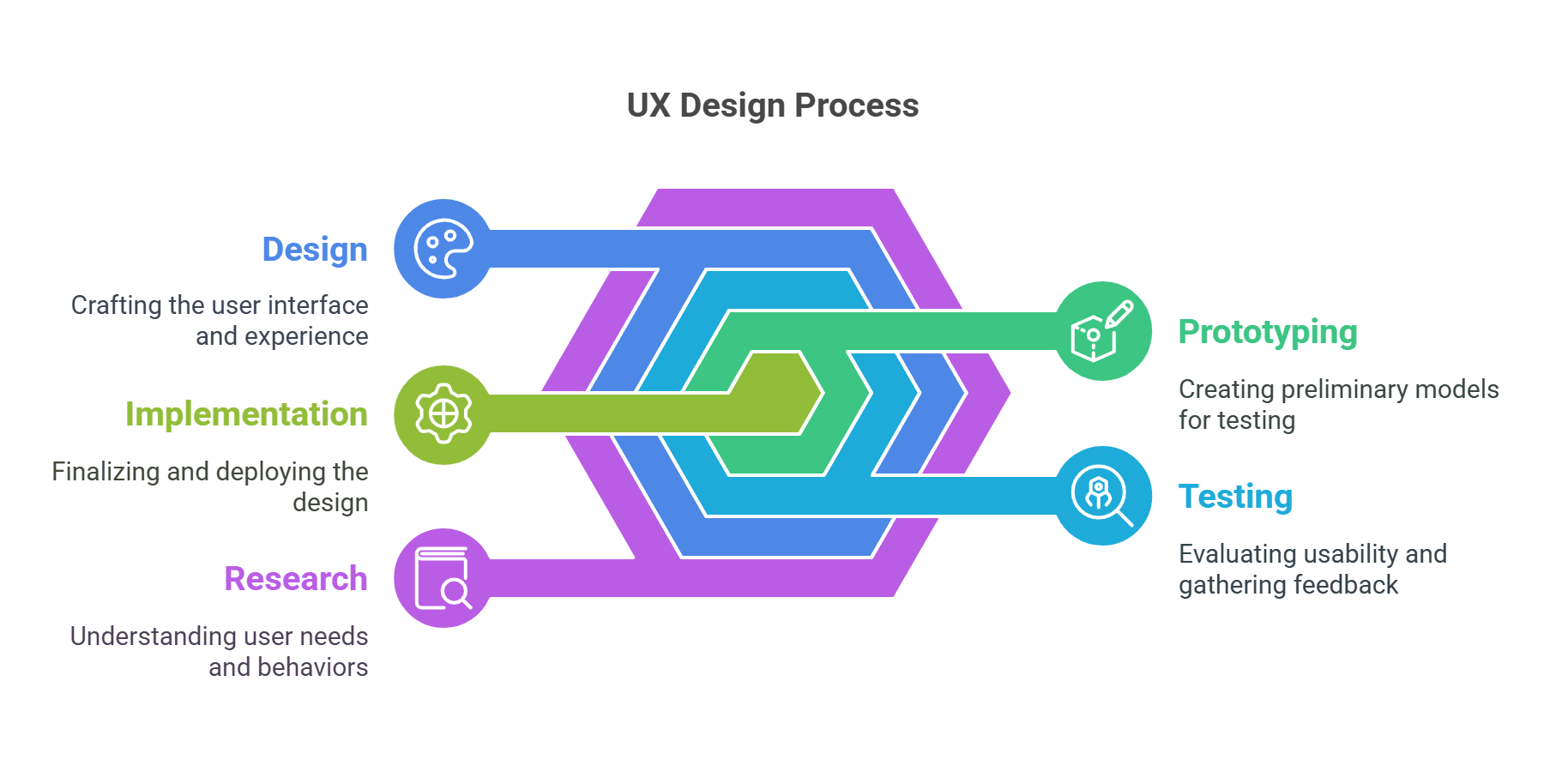
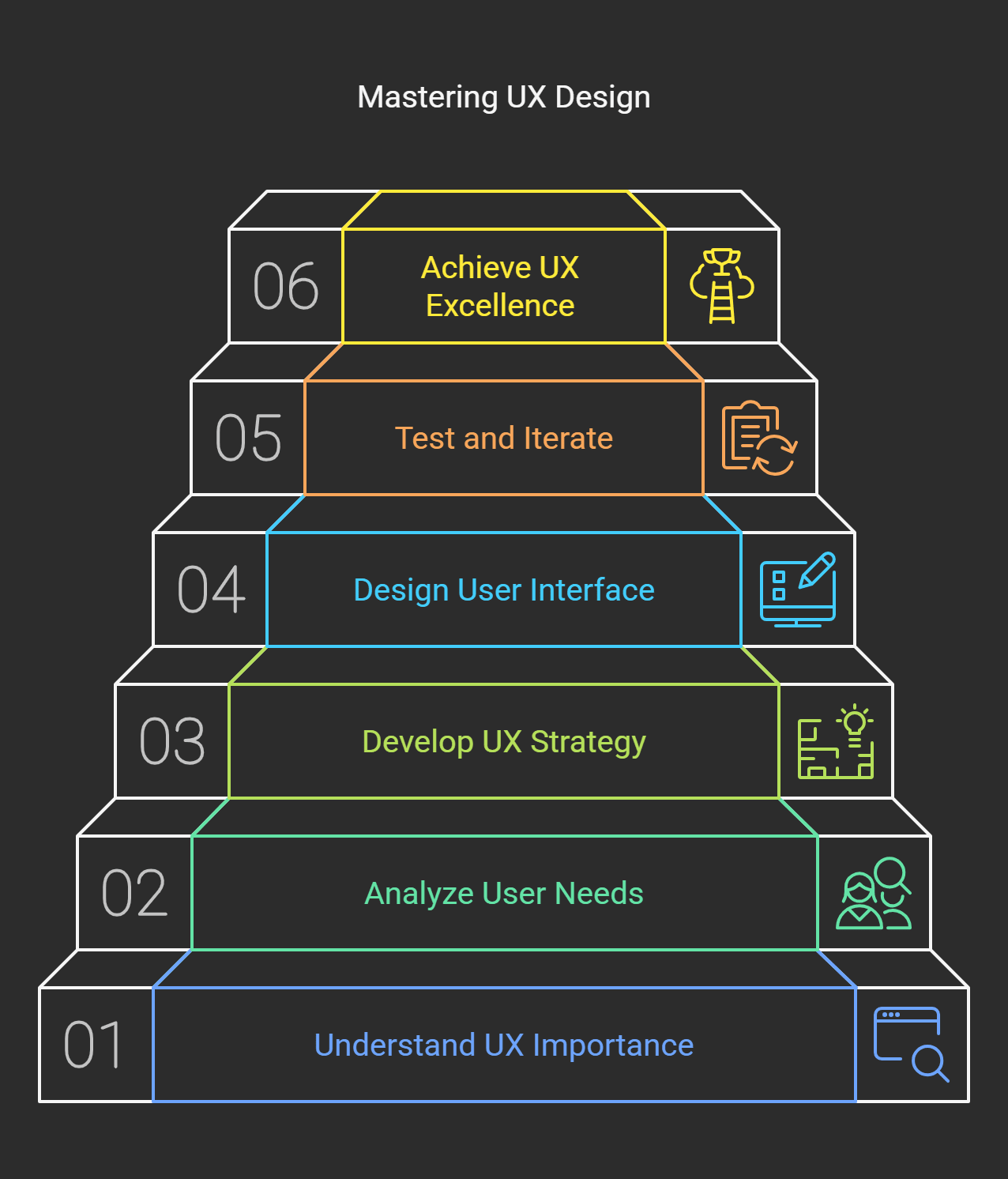
This is how I tackle things now. After lots of trial and error, I’ve defined five core stages: Research, Information Architecture, Wireframing/Prototyping, Usability Testing, and Implementation. Each phase might sound simple, but there’s always a catch. Let me break down a few gems.
Research is where the magic begins.
This section used to annoy me because, let’s face it, what designer wants to waste time looking at the survey results or conducting an interview when they could be working on a design? I had one project go off like, entirely off the rails before I learned how important research is. We built an app under the assumption that users would want certain features only to discover that they couldn’t even log in. Talk to users a great deal and very early on. Gather valuable information about users’ behaviors using Hotjar and Google Analytics. User personas are a great tool believe it or not, it’s fun. It’s like bringing a fictional character to life.
Next up: Information Architecture
If the research is the foundation, IA is the blueprint. It’s time to plot how everything is mapped out and how every bit connects. I recalled working on a website redesign project before, and honestly, we completely messed up the navigation menu. Users were clicking in circles and getting frustrated. This taught me the significance of clear sitemaps and logical user flows. It’s simple, folks: If grandma can’t navigate through your site, then you are definitely doing it wrong.
Wireframing and Prototyping
Currently, I live in Figma, which is my happy place. Wireframes allow you to try out ideas without any fancy visuals. One piece of advice? Start low-fi. I’m being serious. Stick figures and boxes work perfectly well as starting points. Then, move to high-fidelity prototypes. I once made the mistake of jumping straight to hi-fi and spent countless hours perfecting tiny details, only to scrap the entire thing later.
The best thing about Usability Testing is that it saves lives or, at the very least, projects.
The importance of testing the design before giving it to an authentic audience is the criticism it might face. It is easier said than done. You can use platforms like Maze, UserTesting.com, and others to gather and analyze qualitative data. A person squinting at their screen can provide insight that nothing else can.
Don’t forget the last two steps, which are implementation and iteration.
Remember that milestone you set for yourself on launch day? Well, let me tell you the sad truth that “it’s a wrap” is not an acceptable phrase to use afterward. The cycle of monitoring performance metrics and improving the product is a must. As long as the product lives, it should always remain enhanced. Remember the mile-long UX principles we went over? Well, those are essential in a product, and developing UX guidelines is a never-ending journey.
There isn’t an exact phrase for integrating all these; it works wonders.
Stage 1: User Research - Understanding Your Audience
Buckle up, folks. I used to think ‘user research’ was just a complex way of saying “making assumptions about what people want.” Early in my career I won't know how early I designed this genius app in my head. My app's over-the-animation and button-pressing round effects made the user experience stand out. But guess what? Because it doesn’t solve any real problem, no one wanted any of those flashy features. One thing I learned from this failure is that without understanding your audience, you’re designing in the dark.
And here’s the hot take, user research is mandatory. When skipped, it becomes a game of blindfold darts on a board. You might hit, but chances are you’ll miss entirely. Trust me, I've done that. The good part is that user research isn’t wizard work; you must know where to look.
Talking to users directly is invaluable. There is no substitute for sitting down, virtually or in person, with users and asking them questions. I remember interviewing a group of small business owners. Initially, their most significant pain point was managing finances, which is entirely usable. Surprisingly, they struggled with administrative tasks such as meeting scheduling and reminder notifications. Guess what? Those conversations saved me weeks of building something irrelevant.
The contemporary world is fast-paced and requires quick solutions. With that said, not everyone has time for endless interviews, meaning a survey might be just what you need. It is the fastest way to obtain information without driving you to exhaustion. Access to limitless information is not the issue; instead, the source and the intention behind the data collection are the issues. Instead, ensure that your questions are not leading, such as: “Don’t you hate filling out forms?” Changing this to “What is your perspective on the form-filling process?” is far more accurate. This is a slight difference but important when collecting honest answers.
Let's touch on user personas. These little profiles changed my life. One time, I created a persona called "Samantha". She was a working mother balancing managing a job and caring for a family. With each design choice I made, I asked, “Would Samantha use this? Would she find it helpful?” It kept me grounded. Moreover, these personas helped the whole team get on the same page.
Of course, tools like heatmaps and analytics are clutch, too. The day I launched my new landing page will stick with me forever. With Hotjar, I could see users dropping off halfway through scrolling clear as day. So, I moved the curtain for the action button and boom it went up 20% higher. Data does not lie, people.
Here’s the kicker, user research is not a “one-and-done” sort of deal. People's habits change, trends shift, and tech evolves. What worked last year might flop today. Always keep learning from your audience because, ultimately, great design is not about impressing yourself but serving them.
Ok, I've talked long enough. Now, you can grab your phone and dispatch a survey or go to Google Analytics to learn more about their audience. And if you end up failing, get in line. Everyone has experienced that.
Stage 2: Information Architecture - Organizing Your Design
Listen, I’ll be the first to admit that it took me quite some time to grasp why information architecture (IA) is critical. During my earlier design career days - well, let's say the design career days - I was convinced that adding a set of buttons and menus was a good enough starting point. Little did I know. This was not going to be the case, never going to be the case. I once worked on this e-commerce site where users would infamously struggle to locate the checkout button.
It was not placed on the same page as the other buttons; users had to scroll through five pages of random product recommendations. What do we call that? A Clinical Disaster, folks. The unfortunate outcome? A 40% drop in sales, which you can easily assume did not please anyone in the company.
Let’s start with the most important thing to know, design structure is more than aesthetics. It relates to assisting users in retrieving relevant information seamlessly, avoiding frustration. Have you ever been to a website and thought to yourself, “I am lost?” There's a high probability that this website’s IA was a complete and utter disaster. And to tell the truth, users boil down to this, if I can’t figure out what to do next, I’m taking a detour of a lifetime. Forget about the back button, it’s an instant reaction.
This is what I took away from the aftermath of that disaster and a whole lot more since then. First things first, solid groundwork needs to be done. Content needs to be mapped out before even considering visuals. This includes sitemaps, user flows, and yes hierarchies. I’ll give you an example: I spent an embarrassing amount of time sketching how the screens linked when redesigning an app for a local gym. Members had to quickly access class schedules, membership information, and contact details. When the logical organization was implemented, engagement increased by almost 60%. And that, my friend, is good IA working wonders.
As a UX researcher, I have developed countless tricks, and sorting cards is paramount. I know it sounds mundane, but hear me out. Whether you go the DIY route and grab some index cards or decide to go the fancy route and use online tools, make sure to write out the features of your project. Once you do that, shuffle them around until they make sense. The other day, I did this for a blog platform, and wow, did it save us a bunch of dev hours? Turns out our navigation structure was awful because of our misplaced assumptions.
Cleary labels are one of the most critical pieces of information. Trust me, a lot. Labeling something uses words associated with a specific field or discipline that are available to your audience. Do not use jargon only you understand. And remember when I labeled a part of my work “Synergistic solutions”? It was a misfire, and no one clicked on it. Lesson simplified: don’t use complex lingo. Call it a ‘help center’ or ‘resources’ depending on what works for your audience.
As a last note, never forget about scale. Forgetting this early on led me to an unavoidable mistake. I cluttered a single menu with endless options because it seemed to simplify access. There were a lot of new features, and when they rolled out, it was absolute chaos. So, plan ahead and allow for flexibility.
Finally, test with usability testing to see if actual users can navigate your creation. You may notice some apparent problems immediately, but other times, the issues are more nuanced, like someone pausing over a poorly phrased link. Those little moments contribute to the bigger picture.
Information architecture that works accurately organizes content and assists users. It increases client satisfaction and improves performance. When you manage this aspect of design, trust me, the stressful aspects of design only increase.
Stage 3: Wireframing and Prototyping - Bringing Concepts to Reality
I remember an early design wireframing blunder. Wireframes were fancy doodles that could be created after all the fun parts were finished. Skipping the wireframe almost always guarantees a brand new name for your project, something like a cake without the measurements. It's not straightforwardly disastrous, but it will end in chaos.
The best way to describe wireframing is as a time when ideas begin taking shape. It’s when you sit down and think of what form everything requires without polishing anything. I’ll admit that I struggled with the red flag first. The same logic applies to my initial struggle when building an app interface for a client with a vague reference to “something modern.” Always rushing into high-fidelity mockups gets you nowhere because modern equals sleek until your navigation strangles and overpowering buttons morph into a maze devoid of “user flow.” Always go simple.
The wireframing process has changed for me significantly, and here is my procedure for doing it. Grab a pen and paper or even Figma and Sketch if you like. Those tools are so great. Now, start with the essential sections, such as the header, sidebar, main content area, and footer. It's almost like doodling, but not quite. This is not about impressing anyone at all. It’s about solving problems. For example, I was working on a project where I had to create five different layouts for a checkout page. Some had two columns, while others had three. Testing these low-fi versions helped us immensely.
Now that you have the basic structure figured out, you can move on to prototyping. If wireframes are blueprints, prototypes are a test drive. It’s time to feel how everything works. Users click through smoothly. Does the menu slide out like butter or get stuck halfway? There’s no more significant annoyance in development than discovering halfway through your project that something doesn’t work as you thought it would. Developers hate that, trust me.
I recommend low-ty prototypes. Functions are clickable but still skeletal. Yet they offer the chance to try for functionality without being clogged down by the look. When working on an e-commerce site, one of my low-fi prototypes attempted to test whether customers could see the 'Add to Cart’ button; it turned out that they were not. Whoops! Following the feedback, we shifted its placement and saw a 15% increase in conversion rates. Not bad for a little tweak, huh?
From foiling the bare-bones stage, have faith in yourself and shift into high-fidelity prototypes. Now add fonts, colorful hues, and vibrant images. With tools like Adobe XD or InVision, this part becomes fun. Never forget, no matter how well one hundred marks it, you should keep on attempting to test it. Put it through genuine users and ask them to try completing specific tasks while you observe their mannerisms, whether in person or through a screen. They will astonish you every time.
Pro tip: Document everything and note what works and what flops; when reason is given, positive vibes are guaranteed for the “Future.” Also, do not forget to take a breath, especially when deadlines loom and designing gets stressful. Wireframing and prototyping are all about exploration at the end of the day. Until deemed worthy, you’re not married to any idea.
To sum it up, wireframing and prototyping are mandatory if you’re working on websites and apps or even on physical products. They save a ton of resources and stress. Also, seeing the initial scribbles materialize into something real will always tickle my fancy. You should go ahead and try it. Your clients and, more importantly, you will be grateful.
Stage 4: Usability Testing - Final Steps in Your Design Process
Regarding usability testing, it was simply a bonus rather than a requirement. After working on the app for the client and what I thought was a flawless “chef’s kiss” project the reality hit hard. In hindsight, the app was far from perfect. We started receiving users' emails within 48 hours, claiming they were having issues as fundamental as signing up. That one cut deep. I could have easily avoided this pain if I’d completed a proper usability test before launching.
Let me put it this way, while usability testing does involve finding bugs and verifying the functionality of buttons and other features, it does so much more. It examines if your design works for people instead of only figuratively for you and your team members who live inside your head. This is a lesson I learned the hard way when we had to replace a whole onboarding flow because “Get Started Now” lacked comprehension. It's astonishingly accurate that being straightforward delivers better results than clever design.
I'll give my first tip, start with small steps. There's no need for a big laboratory or a fancy setup with many participants. Research indicates that even a study with five users can uncover about 85% of usability problems. Isn’t that wild? I once got three of my friends to help me with a project. I paid them with coffee and asked them to complete three specific tasks on the prototype, accessing a crucial part of it. They provided some great feedback. One friend stated, “I don’t know where to click next,” and I thought her screen was self-explanatory. Do not make any assumptions about the moral of this story.
What is another thing I messed up on earlier? Not recording sessions. Why would you record anyone’s sessions? I thought I would remember everything. Now, I capture everything the recording can be video or audio, and I need to take notes afterward. When someone describes their struggles, it hits you so much more complicated than when you try to remember them. Additionally, hearing someone try to articulate their struggles can serve as helpful evidence when stakeholders are apprehensive about why something needs to be altered.
Oh, and feedback loops. Usability testing is not a one-and-done kind of thing. After obtaining feedback, you must implement it and then test it again, wash and repeat. One e-commerce site I worked on had four rounds of testing before launching. Every round uncovered new things, like shoppers missing and integrating with the background. In the end, conversions went up by 20%. Is it worth it? Absolutely.
Final nugget, Pay attention to body language in the middle of the test. Someone squinting, pausing, and audibly sighing is something to watch out for. Those cues highlight more significant issues. Not many people are likely to notice one tester scrolling back and forth, waiting to find a menu, but they will see your face looking frustrated. After simplifying navigation, the problem was solved.
In short, usability testing is not about showing how great a designer you are but how well you can serve your users. It can be a hassle, but watching people seamlessly navigate your product is priceless. Grab some testers, ask the hard questions, and polish the product. Users will appreciate the effort.
Stage 5: Implementation and Iteration - Launch and Learn
In simple words, when you implement something, you put forth all your effort into every tiny detail, alleviating equal measures of excitement and dread. I can recall the first time I ever “launched,” which was an overwhelming moment regarding curiosity and nervousness. It's not going as per my future expectations. The algo provides insight into the only thing that moves the needle.
Allow me to present an imaginary chapter for you. The day before launch might be different for all. Still, for everyone who chose to rely on prototypes, it gave them a reason to be enthusiastic based on guiding frameworks and conducting usability trials. Alarms of “confetti time” within my mind were the signal to initiate the preparation phase for the long-anticipated. Rest assured, hours into launch, users began reporting persistent application issues. This was an irritating scenario without an apparent mental reprieve to be induced into my brain.
But here’s what I learned from that disaster and trust me, it was a disaster at first. The day of the launch is not the finish line; rather, one of the many milestones along the way. Here are some thoughts that I wish someone had shared with me back then.
To start, work closely with developers in the early stages of the implementation. Initially, I approached coding as this enigmatic black box where my designs went, and somehow, things appeared on the other end. I couldn't have been more wrong. Developers contextualize, and guess what? Context matters! Explaining why specific features are crucial is far better than dealing with the repercussions later. For instance, I designed a button that was beautiful but, in reality, was impossible to code without extensive rebuilding. Always check feasibility early; it is a lesson learned.
Second, always track key metrics post-launch. After my bumpy start, I integrated Google Analytics with Hotjar and tracked how people interacted with the application. Watching users interact with my design was profoundly shifting. For example, I thought one feature would be a huge hit, but I was surprised it got almost no activity. On the other hand, there was a tiny detail that became a fan favorite. This was incredibly valuable and allowed us to build towards future updates.
Don’t forget about not iterating over other things; consider it part of an unending cycle. You're supposed to build and build based on the feedback you're receiving. With every passing month after the launch, we started working on 2.0, which has new features and some fixes that have already been implemented. User retention skyrocketed by 35% Post-Launch, and that's when they clicked for me. Good UX is not an end goal; it constantly evolves.
As a final note, remember to celebrate the small wins in your journey. From resolving annoying bugs to receiving positive feedback, appreciating yourself for the effort goes a long way. Trust me, those little victories will help carry you through overwhelming times.
Ultimately, implementation and iteration are about maintaining humility and open-mindedness. Regardless of your prep work, there will always be surprises once your product is out in the wild. But hey, that’s the beauty of it, right? Keep learning, keep improving, and above all, stay persistent.
Tools and Resources for Improving the UX Design Process
Trust me when I say all I thought I needed as a 'starter pack' for UX design was a sketchbook and colored pencils. How wrong was I? There is an entire array of resources and tools, each specially crafted to simplify tasks that enhance productivity significantly. But here's the catch, not every tool works for everyone. Through countless years of aggravation, I've nearly broken my brain trying to figure out what works. So, let me share what helped make my process more manageable.
Figma was a breath of fresh air for me. It is impossible not to have heard of it for most of my life. As with each innovation, I was resistant due to my lack of comfort. But it clicked when my teammates started using it for cross-team cross-team collaboration. Everything is on the cloud, so say goodbye to the hassle of emailing documents and grotesque control version problems. If you're stuck on Sketch or Adobe XD, do yourself a favor and switch to Figma. You won't regret it, I promise.
Please don't misinterpret me. Figma isn't everything you need and doesn't solve all problems. For wireframing, I will always prefer Balsamiq. It's super basic, which might sound dull, but that's why it's fantastic. Balsamiq does not complicate things if you pay attention to the outline without being sidetracked by catchy designs. This one project was where we spent endless hours resolving colors and typesetting fonts instead of getting a functioning site. Blunder, I mean, we were so naive. I distinctly recall our experience after we shifted to Balsamiq mid-project; we finally got our priorities in order.
However, tools are not only for design; they can also be used for testing. UsabilityHub became one of my favorite platforms when I learned how much guesswork goes into making design decisions. Do you want to know if users can locate your CTA button? Just run a 5-second test. Should you go with layout A or B? A/B testing has your back. The platform is also affordable, which is excellent for freelancing or bootstrapping. Just be prepared for testers’ honesty because it stings at first, but, oh boy, does it help later.
Oh, and let’s discuss Miro for a second. If brainstorming sessions seem like herding cats, this virtual whiteboard tool will change your life. We used it during a major redesign last year, and suddenly, attempting to organize ideas felt less of a struggle. Mind maps, flowcharts, and sticky notes are all features that Miro offers. Half of my team is in different time zones, so Miro is great for remote collaboration.
A toolkit isn’t complete without mentioning analytics. Hotjar and Google Analytics single-handedly saved me from the chaos of trying to understand how real users engage with designs. The worst feeling is pouring your heart into something only to find it has the highest bounce rates. With heatmaps and session recordings, you can pinpoint the exact moment things go downhill. One time, I found out users overlooked a key feature because it was camouflaged in the background.
Lastly, the importance of learning resources shouldn’t be underestimated. Platforms like Coursera and Interaction Design Foundation help me stay sharp, and even YouTube channels like NNGroup do the trick. Much is on offer, from accessibility standards to new voice UI trends. Keeping up to date isn’t a choice; it’s a necessity.
And there you go. Whether wireframing, prototyping, testing, or analyzing the right tools can offer clarity when there’s overwhelming chaos. Starting small and experimenting lets you find what fits your process. Trust me, your future self will appreciate you for it.
Usually Overlooked Issues and How to Overcome Them in the UX Design Process
UX design sounds all good when you’re pencil sketching wireframes or showing off prototypes. But believe me, it’s not always smooth sailing. I went through many hiccups, a few kinks and a few roadblocks and lemme tell you, nothing taught me more than these challenges. So get ready to lay it down, folks, because I’m about to give you the 411 on some mega-common roadblocks in the UX design process and how to slay ‘em like it’s no big deal.
Let’s start with deadlines, shall we? Sometimes, they stress me out like crazy. I remember this one project we had three weeks to deliver a mobile app redesign for a client that changed its mind halfway through. Sound familiar? When research doesn’t take as long as one expects down to the wire, tight timelines are brutal. What did I learn? Prioritize ruthlessly. You don't have to lay out every single feature before moving forward. Start small, implement core functionalities first and iterate as time permits. And if your stakeholders complain, hit ‘em with this: “Good UX is not built overnight; it’s built over time.”
Stakeholder feedback or, as I like to call it, over feedback. Imagine pouring hours into a prototype only to have someone come in and say, “Nope, let’s do this over. It occurs with more frequency than I’d like to admit. The key to the above is to set clear expectations about it upfront. Instead of jumping straight into designs, sit down with everyone involved and define some goals together. Don’t wait until later for them to know what “good” looks like so they’re not surprised.
Pro tip: When presenting early concepts, spokesmodels should stick to low-fidelity wireframes, which allows the stakes to be lowered and participants not to feel so married to the visuals.
Now, striking a balance of creativity with data-driven decisions is a different animal. At the start of my career, I relied too much on my gut and not enough on real, live user insights. Like when I created an e-commerce checkout flow based solely on aesthetics, not usability testing results. Guess what? Users hated it. We aren’t here to party, and data doesn't lie. Based on actual surveys, heatmaps, or A/B tests, always ground your creative decisions in data. Even if something feels wrong, the numbers agree; trust the numbers. Your ego will heal before your users will ever forget poor design.
Oh, and please don’t even get me started on collaboration issues. Pulling developers, marketers, and product managers together to take the proper steps is like herding cats. No two people speak the same language. In the past, I’d submit specs to our dev team, convinced they were unambiguously clear until they returned wondering why buttons were suspended in mid-air. It turns out I forgot to include spacing guidelines. That facepalm moment right there. Invest in tools such as Zeplin or Figma, which close the communication gap. And never take anything for granted trust, but check handoffs.
Finally, we all get hit by resource constraints at some point. Budget cuts, restricted user access, legacy software you can guess the rest. When resources are scarce, deliver impact. For example, guerrilla testing (picking up random people at coffee shops) helped me out of a jam once when formal usability labs weren’t available. It’s a little scrappy, but it gets the job done.
At the end of the day, those challenges aren’t dealbreakers; they're simply part of the gig. Every hiccup is a life lesson resiliency, industry adaptability, creative critical thinking. Keep going, keep learning, and remember this great UX isn’t perfection; it’s intention.
End Note
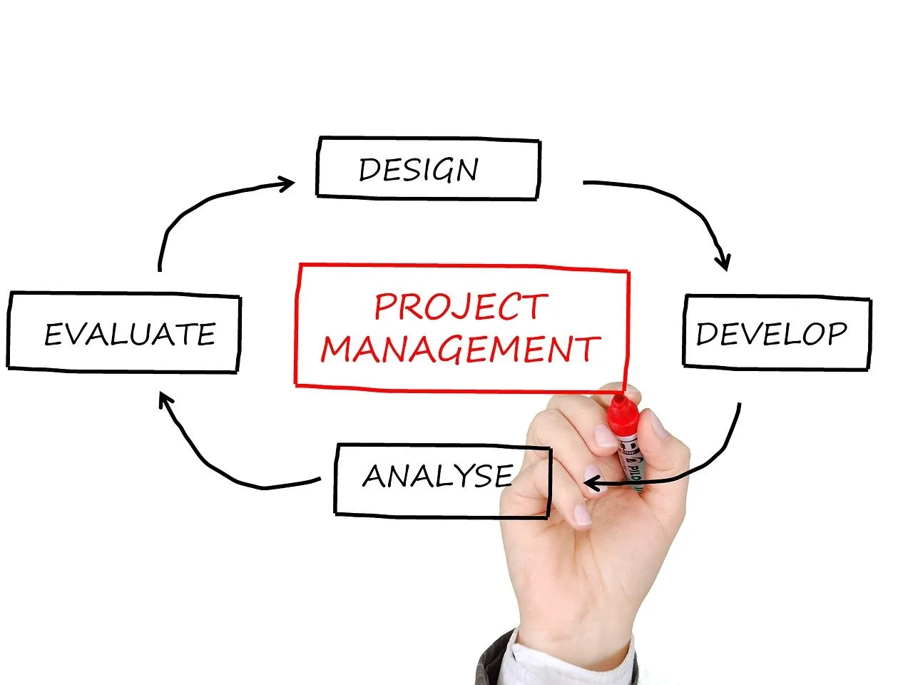
The UX design process is more than a series of steps; it's a mindset, one seen through the lens of providing value to users. If you follow these stages of research, design, prototype, test, and implementation you will have adequate tools to create impactful user-centered designs. Keep in mind that great UX is never “done”; it grows as you learn more about your users’ needs.
Want to level up your UX skills? Pick at least one new technique from this guide, implement it today, and see your designs go from good to great. Ensure you report your progress to me. I want to hear about it.
.svg)
.svg)
.svg)
.svg)