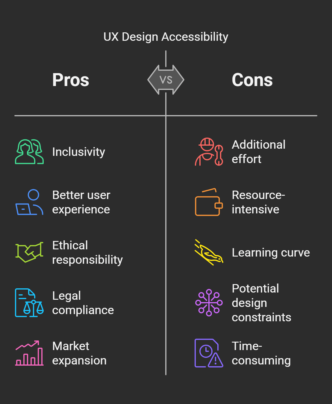
Did you know that more than 1 billion people around the world experience some disability? That’s close to 15% of the entire world. However, UX design still fails to prioritize accessibility in many digital products. As designers and creators, it is our responsibility and an opportunity to make our work accessible to all users.
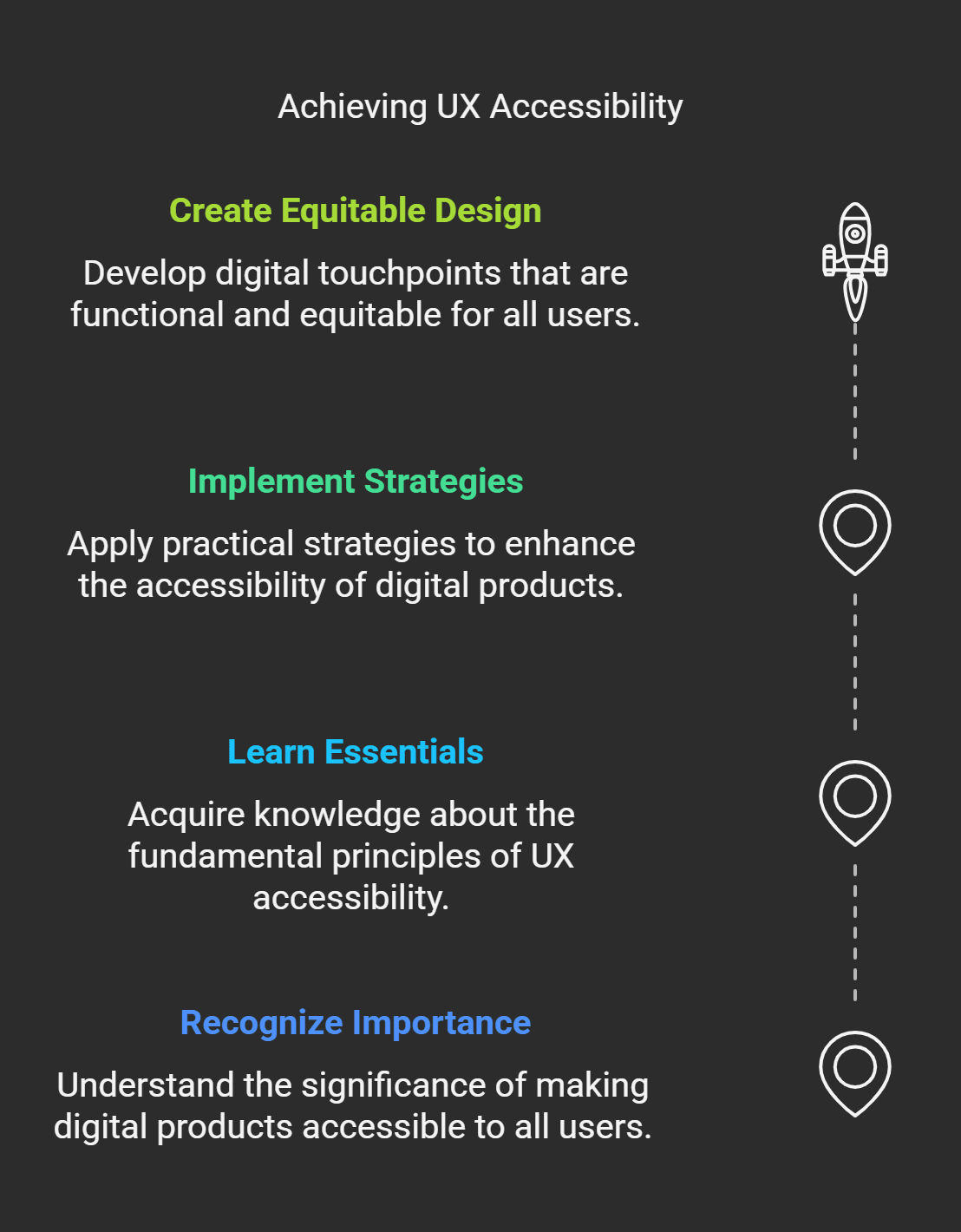
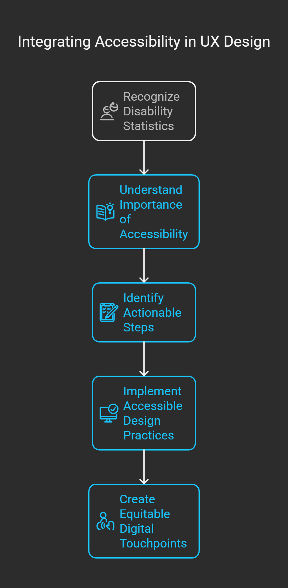
In this guide, I will explain all the essentials of UX design accessibility. From understanding its significance to taking actionable steps, we’ll discuss how you can build functional and equitable digital touchpoints. So, whether you are new to accessibility or just looking for ways to make your approach more effective, this article is for you.
Understanding Accessibility in UX Design
I’ll admit when I heard accessibility in UX design, my mind went straight to wheelchair ramps and elevators you know, physical stuff. It wasn’t until I did some work on a project for an app for seniors that I understood how much further accessibility reaches and how important it is if you’re designing anything digital.
You are the designer, making your sites accessible to your users. And when I say everyone, I’m talking about people with visual impairments, hearing issues, motor skill challenges, cognitive disabilities, you name it. This was overwhelming at first. How do you even start to account for all these needs? It’s not nearly as scary as it seems if you unpack it.
Let me tell you about an early failure of mine. So, we are building this super slick dashboard for a client we thought we nailed. Clean fonts, cool colours, intuitive navigation or so we thought. Then, when we were testing, it was pointed out that our fancy light grey text on a white background was practically unreadable for people with low vision. Talk about a wake-up call. That mistake proved two big lessons to me, contrast matters, and user testing is not optional.
So here’s what I’ve learned since. Before you do, there are a few golden rules to remember. For instance, make sure to always use high-contrast colour combinations. Black typing on a white page may be uninspiring, but it gets the job done. Also, you can’t use colour alone to communicate info like using red for errors without any other signal. Screen readers won’t catch that, and neither will users with colour blindness.
Ensure interactive pay-offs are large enough to click. Think about buttons that are 48x48 pixels or more significant. Believe me, no one wants to squint and struggle simply so that you can hit “submit.” Oh, and captions. Adding captions to videos isn’t just suitable for people who are deaf or hard of hearing, it's also good for anybody watching at a noisy coffee shop.
Now, let’s pause for a moment to discuss tools. WAVE (Web Accessibility Evaluation Tool) is an excellent browser extension that scans your site for potential accessibility issues and flags them. It’s sort of like having a second set of eyes. Tools, such as ARIA labels (Accessible Rich Internet Applications), are the lifesavers for screen reader users. They provide context for interactive elements, such as drop-down menus or sliders.
Accessibility isn’t just about checking boxes for compliance; it’s about empathy. It’s the question, “Would my grandma be able to use this?” or “What if someone only had one hand? These subtle perspective shifts lead to significant behaviour change not just for users but also for your brand. Inclusive design fosters trust, loyalty, and better SEO rankings.
Once you start doing it, it becomes second nature. Also, did you know your work helps more people than you thought possible? That feels pretty sweet.
The Importance of Accessibility in UX Design for Designers
You know, I used to think accessibility was one of those “nice-to-have” things in UX design, something you sort of slap on at the end if you have time and budget. I was more wrong than I could ever have imagined. I didn’t truly grasp that accessibility isn’t just important, it's essential until I stumbled into a meeting with a client who lacked low vision.
He walked me through a day in his life when it came to apps and websites that weren’t designed with him in mind. He described hiking to zoom in on tiny buttons or watch as screen readers struggled over poorly labelled links. Honestly, it hit me hard. I was creating things I thought were hip and contemporary, but I was really excluding users. That moment transformed everything for me.
Let’s be honest for a second, accessibility matters because exclusion sucks for everyone involved. Picture this, you dedicate yourself to making something great, only to discover a segment of your audience can’t even use it. Not cool, right? But aside from the moral argument which is enormous, there’s also a business case to be made here. Did you know that 15% of the population in the world lives with some disability? That’s over a billion people. It’s leaving money and possible superfans on the table and ignoring their needs.
Another point is that accessible design is often better for all users than without, not just for people with disabilities.Take captions on videos, for example. Yes, they’re essential for those who are deaf or hard of hearing, but they’re also clutch when you’re watching something in the gym or trying to keep the kids asleep. The same holds true for clear navigation menus that meet everyone’s needs, whether the user has cognitive challenges or is simply an easily distracted multitasker.
But let’s discuss SEO for a hot second because we’re all secretly obsessed with moving up in Google rankings. Dubble helps you serve up accessible sites that search engines love. Why? This is partly because accessibility practices like proper heading structures, alt text for images, and descriptive link labels make content easier to crawl and index. Reduced effort, better visibility. It’s essentially a twofer, I suppose.
Another lesson that I learned the hard way is lawsuits. Yeah, I said it. Firms that neglect accessibility standards, mainly where legislation such as the ADA (Americans with Disabilities Act) exists in numerous markets, can have significant legal ramifications. I had to scramble to fix one of my older projects to comply with all the new rules because it got flagged, which was no fun.
Fundamentally, though, accessibility is a form of respect. It’s signalling, “Hey, we notice that you’re here, and your experience has value.” And that mindset honestly changed how you think about design. You notice small trappings, like making sure forms are easy to fill out or avoiding jargon that might baffle non-native speakers. These minor changes become enormous wins for users, businesses, and society.
So yeah, accessibility is essential. A lot. And as soon as you start to see it as an opportunity and not a drag, it’s less about checking boxes and more about making magic happen. And your work could make someone’s life just that little bit easier? That’s worth every extra minute spent fine-tuning contrast ratios or testing keyboard navigation.
The Essential Principles of Accessible UX Design
Well, let’s get into the nitty-gritty of accessible UX design. If you are anything like I was when I started, you may be wondering where to start. There’s a lot to unpack here, but fret not I’m going to serve it up in bite-sized pieces. These core tenets have served as my guiding stars over the years, and they can help you create experiences that everybody can use.
Now, perceivable content comes first. It’s all about ensuring users can feel what’s on the screen. Sounds obvious, right? But believe me, this one is easy to screw up. For example, I once created a website with beautiful pastel colour schemes until someone told me the text was invisible to people with colorblindness. The lesson is always to ensure enough contrast between text and background. WebAIM’s Contrast Checker and other tools like it are lifesavers for this. And don’t forget about alt text for images, either. It’s not only for SEO it also provides context for screen readers so that visually impaired readers aren’t left to guess.
Next up operable interfaces. You don’t want people on your site or in your app to feel like throwing their devices across the room, so this might mean that people should be able to navigate across your site in plain English. Keyboard navigation is a huge one here. Remember that some users navigate exclusively with keyboards instead of mice, so build tabbing priority into all interactive elements (buttons, dropdowns, etc.). But don’t forget focus indicators. Those little outlines that appear around clickable items? They’re essential for communicating where the user is on the page. You might think removing them “cleans it up,” but this is a usability nightmare.
Then, we have understandable content, which is precisely that. Could you keep it simple and to the point? Do not use jargon unless essential, and if you use technical terms, clarify them. For example, one of my blog posts was full of industry jargon because I thought it sounded brilliant. Half of my audience didn't know what I was talking about. Consistency is king. Consistency with design language and patterns helps users not get lost or confused.
And last but certainly not least robustness. This one trips people up reasonably often because it's a little technical. Your design should be friendly enough to work with different devices, browsers, and assistive technologies. Consider that you're in trouble if your flashy animations bring down someone's screen reader. Use standard HTML and CSS as much as possible, and ensure you highlight on multiple platforms. Trust that in the future, you will appreciate the work you're doing now.
Oh, and bonus wisdom nugget, accessibility is not a one-and-done. It's an ongoing process. Technology changes, user needs change, and new tools constantly appear. Stay inquisitive, be agile, and learn. And that's how you expand not only as a designer but also as a human who honestly wants to create inclusive experiences.
So, OK, these principles may sound a little overwhelming at first blush, but they're just a bunch of common sense sprinkled with empathy. And the truth is, once you start to apply them, you'll also notice something neat, your designs won't only become more accessible they will improve overall.
Resources and Tools for Accessible Design Building

Let's talk about tools and resources, shall we? Because if you're venturing into accessible design, you need accompaniment on your journey. I know I am sitting in front of a blank screen, questioning how I'm supposed to ensure my design works for everyone. You do not need to do it all from the beginning. There are tons of tools that can save your sanity and your deadlines. Let me take you through the ones that have become my lifesavers.
Colour contrast checkers first in line these tiny jewels are complete life savers. Remember when I said I messed up a design with unreadable pastel text? That wouldn't be a thing if I'd checked with something like WebAIM Contrast Checker or Contrast Ratio before. Both are free and dead simple to use, and they immediately confirm whether your colour combinations comply with accessibility standards. Input your hex codes and boom you know if you need to adjust stuff.
Then there's WAVE (Web Accessibility Evaluation Tool). If you have not heard of this browser extension, drop what you're doing and download it right now. Seriously. WAVE scans your site and points out possible accessibility problems for example, missing alt text, empty buttons or poorly structured headings. It's far from perfect (nothing is), but it sets you up with a baseline of what to look for so you can spot issues before they blow up in your face.
I still rely on Tab Key Navigation Tester or tabbing through my designs by hand to test the keyboard nav. I know it sounds low-tech, but trust me it's eye-opening. From there, you soon learn what is simply inaccessible without a mouse and where focus indicators are likely absent. Related to focus indicators, Focus Indicator is a valid Chrome extension that helps you when testing to help you better see focus indicators.
Let's talk about screen readers because they are an absolute must-test tool. NVDA: NonVisual Desktop Access (Ivi Dynamic: Free): NVDA is a great screen reader for Windows users and is completely free. VoiceOver (companies now have platforms): Apple has introduced VoiceOver, and it's already preinstalled on every Mac. Testing your content using these tools helps see how visually impaired users access it.
Pro Tip: Do not skip this step; it is humbling and enlightening in equal measure.
Oh, and here's a tool I wish I had known earlier, Axe DevTools. This is used as a plugin directly within Chrome or Firefox and runs checks for automated accessibility tests on your site. The best part? It also details why those issues are important and offers solutions. It's as if you have a mini accessibility specialist seated beside you.
And you can't discuss any toolkit without mentioning ARIA (Accessible Rich Internet Applications) roles and attributes. Although ARIA is not a "tool" as such, learning to use it correctly can raise the level of your designs. Just be careful ARIA, when misused, can do more harm than good. Only stick to the basics unless you do know what you are doing.
Finally, get the WCAG (Web Content Accessibility Guidelines) bookmarked. They're kind of like the Bible of accessibility standards. Sure, they're dense and dry but crammed with actionable advice. Combine them with resources such as the A11Y Project, which simplifies complex subjects into bite-sized portions, and you're gold.
So, building accessible designs does not mean spilling the beans. Rely on these tools they'll navigate, teach you, and sometimes remind you of things you forgot. Knowing you have backup makes the effort seem less intimidating. And hey, you'll get better at them the more you use them. Soon enough, making things accessible won't feel like added work; it'll just be part of how you roll.
Jumpstart Your Web Accessibility with User Testing
It's all good; let's talk about UX testing for accessibility. But if you've never done it before, don't worry I had no idea what I was doing. Honestly, I thought I could just design something, run it through a couple of automated tools, and then call it a day. It does not do the trick. And real humans find things algorithms will never detect. So here's how I figured out how to do it correctly. Believe me, it's worth every minute.
The first step is finding your way to the right participants. This is crucial. Nobody off the street or in your offices will offer meaningful feedback. Ensure a wide range of users with various disabilities visual, auditory, motor, cognitive, etc. For instance, one of my early tests included someone who uses a screen reader daily. Seeing them haul tourney through my design, I realized the issues I hadn't even thought of, unlabeled buttons and tab orders that made no sense.
Pro tip: Work with local disability organizations or online communities to source testers they are often more than willing to help.
After you've assembled your group, identify clear objectives for the test. What do you want to understand? Do you test your text to see if someone with low vision can read it? Or check to see if someone with mobility challenges could fill out a form using a keyboard. Be specific. Ambiguous goals produce ambiguous outcomes, and no one wants that. I once ran a test without a clear goal and ended up with mixed feedback that wasn't useful for fixing anything.
Now to the actual test process. Fall back on a simple, structured routine. Give participants tasks like “Find the contact page” or “Buy an item. Then, sit back not literally you’ll be taking notes and watch how they interact with your design. Don’t guide them. Let them struggle if they have a hard time. It's how you’ll find actual pain points. And if you can, record the sessions. There’s nothing worse than missing a critical moment because you were busy scribbling notes.
That’s where it gets emotional. Watching somebody wrestle with your work can be brutal. One of the testers seemed so frustrated that a dropdown menu popped up and immediately closed before they could select anything. It felt like a slap, but it also made me get to work on fixing the bug as soon as possible. That’s the power of testing with users; it transforms abstract problems into human experiences.
Afterwards, review the feedback and list fixes organized by impact. Not everything will be a quick win, and that’s fine. Begin with the big stuff, the obstacles that prevent users from completing tasks altogether. They’ll just put more minor tweaks in later. Oh, and don’t forget to appreciate your testers. They’re offering valuable insights, so a bit of appreciation goes a long way.
Finally, iterate and retest. All accessibility is not one-and-done. Finding and fixing issues is terrific, but you won’t know if your fixes have worked until you have tested again. Round and round, but with each round, you grow a little stronger and a little more inclusive.
User testing for accessibility is always about empathy. It’s walking in someone else’s shoes and understanding their experience. Sure, it requires effort, but the dividends are enormous not only for your users but also for you as a designer. Knowing that you’ve made something that works for everybody? That’s a win worth chasing.
Some Common Accessibility Issues and Fixes
Did you know there will be accessibility challenges like those gremlins always there to ruin your party? You feel like you have everything under control, and then boom. Someone points out your brilliantly designed form, a nightmare for keyboard-only users. I’ve been there, trust me. But the good news is that most of these challenges have solutions if you know where to find them. Let’s break it down.
Colour contrast is one of the biggest hurdles I’ve had to overcome. It’s easy to get swept up with specific trending palettes, but low contrast can render text unreadable for those with visual disabilities. I used to spend hours perfecting this soft grey-on-white combo, only to find out later that it was invisible in bright light. The fix? Stick with high-contrast combinations like black on white or dark blue on light yellow. Contrast Checker or similar tools can help you meet WCAG standards without sacrificing styling entirely.
And then there’s keyboard navigation. I was stumping this one early because I didn’t even think about how someone might use my site without a mouse. Well, it turns out that not providing focus indicators or being unable to tape into interactive elements is a surefire way to irritate a person. The solution? Keyboard access, ensure that every clickable widget (buttons, links, dropdowns, etc.) can be accessed via the keyboard and always provide a visible focus indicator. Testing this manually and tabbing through the interface is a fast way to surface the apparent problems.
Another common challenge is alt text for images. It sounds simple enough, but I’ve noticed many designers omit it entirely or write vague descriptions like “image123. jpg.” You see, alt text is not filler, it is critical information for users who use screen readers. Instead of “picture of a dog,” use descriptive phrases like “golden retriever playing fetch in a park.” Specificity matters. If an image is decorative, code it so screen readers will skip it.
Now, content that includes videos. Videos with no captions or transcripts are useless for people who are deaf or hard of hearing. I learned this hard as I posted a tutorial video and got the feedback that it was inaccessible. At first, adding captions called for a tedious process, but tools such as Otter. AI, or the auto-caption feature from YouTube (with edits), made the process much smoother.
Bonus: Captions can also help viewers in noisy environments or those watching without sound.
Here’s another business curveball complex. It is hard for everyone, but even more for users with cognitive disabilities, to fill long and crowded forms with vague labels or error messages. Simplify wherever possible. Use clear instructions, group related fields together, and provide real-time validation so users know immediately if they’ve made a mistake. Instead of “Invalid input,” for instance, write “Please enter a valid email address.”
And finally, check that your consistent navigation is to all links. Have you ever accessed a website where the menu moves on every page? Super annoying, right? And now, imagine how much more maddening that is for someone who uses patterns to orient themselves. This problem can be solved by keeping your menus, buttons, and other interactive elements consistent across your site, and helps all users.
The reality is that accessibility needs aren’t impossible to achieve; it just takes a change of approach. It becomes clear after you start thinking through how different people interact with your designs and whom you are designing for. And look, addressing these issues doesn’t just make things more accessible it makes things better for everyone. So the next time you get stuck, breathe, grit your teeth, and remind yourself that every problem is an opportunity to learn and improve.
Accessible UX Design and Future Trends
Okay, let’s take a quick jaunt to the future 2025 and beyond, to be precise. If you’re anything like me, you get excited about what’s next on the horizon of design trends. The future’s bright for accessible UX. We’re not just talking about tech that includes people with disabilities; we’re talking about tech that enables people with disabilities in ways that we’re just beginning to dream of. But before we get starry-eyed, let’s look at some significant trends I’ve been watching.
What did they discover, first up? AI-powered accessibility tools. Artificial intelligence is no longer just a sci-fi movie plot, it's revolutionizing how we think about accessibility. You can even compare this with voice recognition, which is trained to accommodate multiple speech styles and accents. Or AI-fueled image recognition that creates hyper-accurate alt text for complex images. One of my favourite examples.
Techniques that are capable of generating live caption transcriptions in real time. Imagine going to a virtual conference where the words of every speaker are translated in real-time into several languages and captioned for attendees who may be hearing impaired. It’s not science fiction; it’s happening today, and it’s only going to improve.
Next, we will plunge into inclusive AR/VR experiences. Augmented reality (AR) and virtual reality (VR) are booming, but they’ve traditionally been rather exclusionary. That’s changing fast. Researchers are experimenting with haptic feedback systems that let users touch virtual objects visually impaired users to feel through vibrations or textures. And VR environments are being created with settings that can be adjusted for motion sensitivity so that people who suffer from nausea aren’t locked out of immersive experiences. I’m telling you, this stuff feels like magic, but it comes out of thoughtful, inclusive design principles.
Another trend that I’m excited about? User-centred accessibility features. Imagine rather than trying to force users to conform to your interface, your interface conforms to them. Apps and websites will offer customizable modes tailored to individual needs, high-contrast themes, simplified layouts, or even gamified tutorials for users who may need extra guidance. Some are already tinkering with this, but in 2025, it’ll probably be the norm. It’s about time we should be designing for humans, not averages.
And here’s one that has me stoked wearable accessibility tech. Wearable devices like smart glasses that offer live navigation instructions to blind people or gloves that turn signing into speech are getting smarter every day. These innovations are not just creating better digital interactions but making life better in the real world. As designers, our challenge will be to incorporate these seamlessly into experiences in ways we can only imagine.
Of course, all of this doesn’t happen without ethics in mind. You know the saying that with great power comes great responsibility. As high-tech accessibility grows, we must address data privacy issues and algorithmic bias. Facial recognition tools have exhibited racial biases in the past; for instance how do we ensure that doesn’t extend into accessibility? Features? That’s where designers, artists, and marginalized communities must collaborate.
Then again, there is also the increased focus on universal design education. The opportunities aren't without their challenges, but I believe in 2025, accessibility won't just be a secondary concern; it will be integrated into every design program. More universities and boot camps are already teaching accessibility as a core skill so that the next generation of designers will automatically have inclusion at the top of their minds. And frankly, that makes me hopeful. The more people who know why accessibility is necessary, the closer we get to a world where no one is left behind.
So if that future of accessible UX design sounds at least decent to you, well, buddy, you're in luck. Everything from more intelligent AI to inclusive AR/VR experiences seems possible. But it still comes down to the same thing, finding solutions that work for all, regardless of ability. And if that isn't something to race toward, I don't know what is.
Final Thought's
Accessibility is not a checkbox, it's a state of mind. When you learn about making UX designs more accessible, you're empowering yourself to help build digital spaces that are open to all, regardless of ability. A thread, people should not be discriminated against. So, what are you waiting for? Audit your projects, play around with new tools, and harness accessibility as a superpower to level up your work. Join the cause we can create a more inclusive future, one pixel at a time.
.svg)
.svg)
.svg)
.svg)