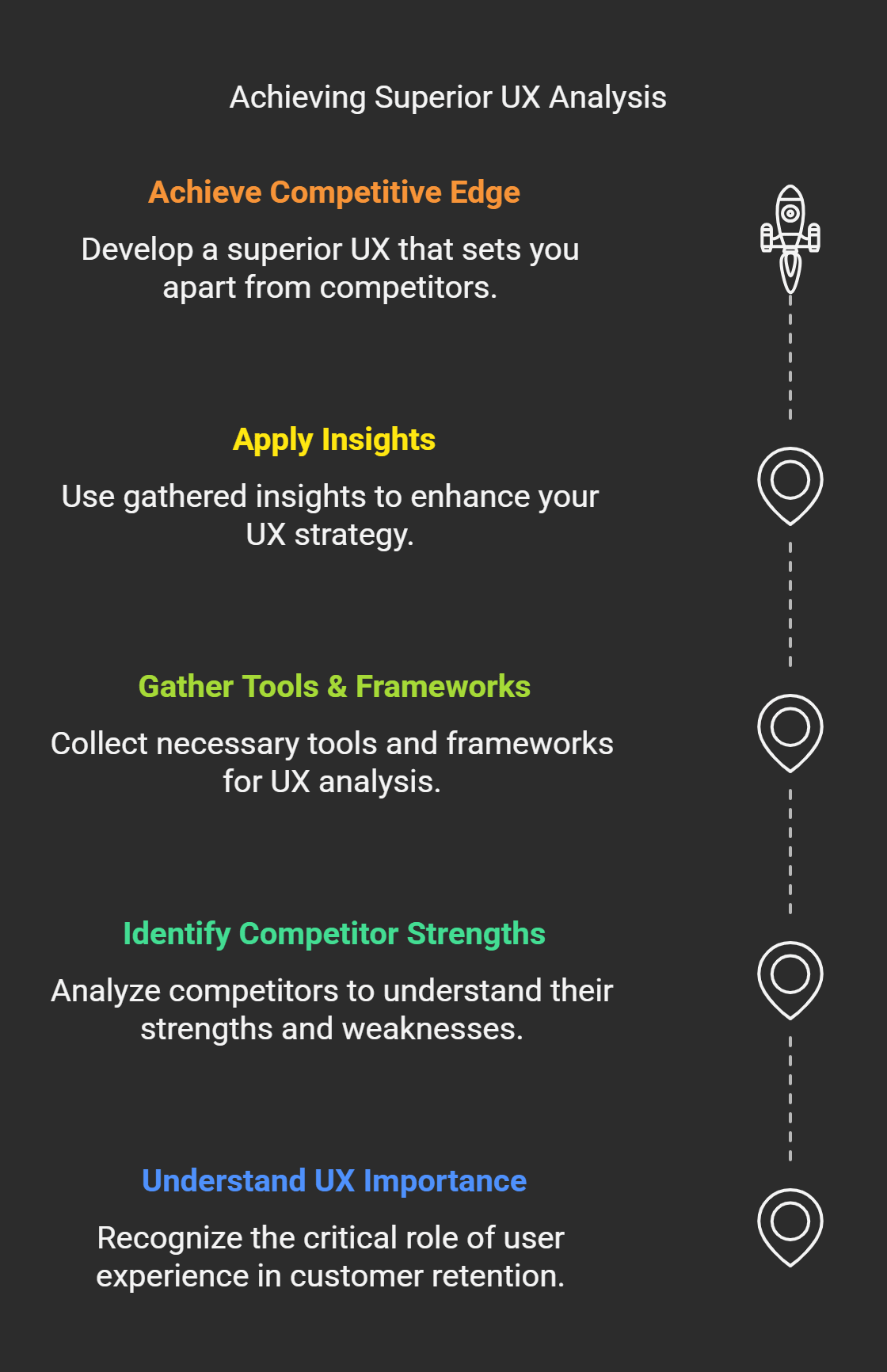
Did you know that 88% of online consumers will likely return to a website after a bad experience? That’s no lie UX is no longer a buzzword; it’s the crux of customer retention and satisfaction. But here’s the best part, knowing the competitor’s strengths and weaknesses can give you a leg up on creating a better user experience.
In this guide, I will explain everything you need to know to execute a successful UX competitive analysis in 2025. Whether you’re a seasoned UX designer or still in the early stages of learning, we will provide the tools, frameworks, and insights to get ahead of your competitors.
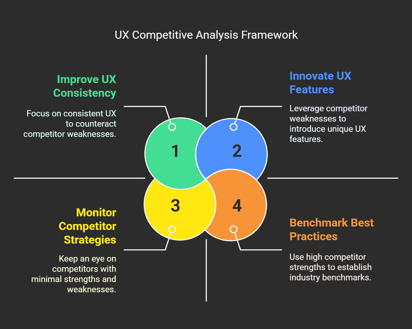
Understanding UX Competitive Analysis
A couple of years ago, I was busy working on this project for an e-commerce site, and there was nothing to write home about, just your average everyday online store. We believed we had nailed the design clean layout, intuitive navigation, and jazz. But then, a strange thing happened. Our bounce rates were huge. People would land on the site, look around at one thing, and bounce out quicker than it takes to say, “Add to cart.” to say the least, that was frustrating.
That’s when one of my team members suggested a UX competitive analysis. Honestly? I didn’t even know what that was at first. I thought it was some corporate buzzword that wouldn’t change anything.
So, here’s the scoop, UX competitive analysis is like spying on your competitors but in an above-board way. You’re not hacking into their systems or anything shady like that (duh). Instead, you’re learning how they do user experience the good, the bad, and the ugly. Consider it as getting the notes from the cool kids in the class so you can pass the test independently.
While doing our little investigation, we spotted that one of the competitors had a very smooth checkout process. Like, three clicks tops, and you’re done. Ours, measurement-wise, was like completing tax forms. No wonder people bailed. Just that little insight helped us iterate on our flow and inspire us. Conversions increased by 20%. Not too shabby, right?
Okay, now let’s unpack that some more because knowing what UX competitive analysis is isn’t enough you need to understand why it matters. At its core, it’s about finding deficiencies in your offering and searching for ways to differentiate yourself. Perhaps your competition has amazing visuals but poor mobile responsiveness. Or possibly their search function sucks. These are some things you could capitalize on.
One mistake I made early on? Only the people who matter. Don’t get me wrong, they're essential. But now and then, smaller competitors have hidden gems worth stealing borrowing inspiration from. For example, this underdog brand had a weird loading animation when checking out. So, it wasn’t revolutionary, but the customers ate it up. Those small touches can make a big difference.
If you’re unsure where to start, here’s a simple tip, choose 3-5 direct competitors and research deeply. Look at stuff like:
How easy is it to use their site?
What are the significant pain points users complain about in reviews?
What do they offer that you don’t?
Don’t skip visual records tools like Hotjar or Crazy Egg let them show you how real humans are interacting with those sites. Believe me, heatmaps give you X-ray super-glasses.
The bottom line is that UX competitive analysis isn’t an exercise in imitation; it’s an exercise in education. You want to borrow ideas but change them up so they’re tailored for your specific audience because no two businesses are the same. And, if you need more encouragement, every expert started as a rookie who didn’t know jack. So, give yourself a break and move on.
By now, you hopefully have a better understanding of what the heck UX competitive analysis is and, more importantly, why it’s a total game-changer. Ready to give it a shot?
The Importance of UX Competitive Analysis

I know design, as they say. In the good old days, I believed creating a nice-looking website was sufficient. I realized how clueless I wasn’t until I started this one project (a fitness app). Yes, it looked good, but users were bouncing off faster than I could say “user experience.” That’s when I went in on competitive analysis, which changed everything.
Fast forward to the present day, and UX competitive analysis is no longer optional; it is a must, particularly by 2025, when expectations of users are sky-high. People want more than just functionality; they want smooth, seamless, intuitive, delightful experiences. What if your site or app doesn’t deliver? They’ll find someone else who does in seconds. And believe me, there is always someone else.
Here’s the thing, though competition isn’t stopping. It’s heating up. Experts predict that by 2025, over 80% of consumers will leave a brand after a couple of poor experiences. You can no longer afford to wing it. A robust UX competitive analysis allows you to see what’s successful for others that you can replicate and what isn’t that you can steer clear of.
My fitness app debacle. They not only nail aesthetics, but their micro-interactions are on point, like their animation during the transition and personalized recommendations based on user behavior. In the meantime, my app felt clunky because I had not taken care of these small details.
Takeaway: The little things often create the most significant impact.
Next, let’s discuss relevance. Technology evolves quickly, right? Last week’s success may fail to fly this year. For example, voice interfaces, or AI-driven personalization will be table stakes in many industries. And if you’re not tracking what your competitors are doing in these areas, you could fall behind. Believe me, I missed the boat on mobile-first design once, and it cost me a lot. Don’t let me get ahead of the curve.
Another reason to do this? Data cold, hard data. Competitor analysis provides insights into usability metrics such as task completion rates, bounce rates, and session duration. These stats aren’t just numbers, they're gold baths to improve your own product. I once discovered a competitor’s checkout process was 30% faster than mine.
And here’s something else, competitive analysis isn’t about ripping off what seems to work. Nope. It’s about finding gaps. Your competitor might have an excellent feature, but they might also suck at accessibility. Boom, that's your moment to shine. Or perhaps they crush it on desktop but haven’t gone mobile yet. Do you see what I’m getting at?
I won’t lie to you; as you can imagine, a UX competitive analysis takes some time. But look at it this way, do you want to spend hours on the front end figuring out what works or waste months tuning a product no one uses? Exactly. And if it takes too much of your time, tools like Hotjar and Crazy Egg make it easier to gain insights without going insane.
So yes, if you want to thrive in 2025, don’t miss this step.
How to Conduct a UX Competitive Analysis

The thing is software UX competitive analysis sounds a lot more terrifying than it is. I recall the first time I had one. Honestly, it was for this small e-commerce project I did years ago. I didn't know what the heck I was doing. "It's not that these companies are doing anything particularly insightful," I had realized my boss said. "Figure out why our site sucks compared to theirs." Talk about pressure. But after stumbling through it and messing up plenty along the way I found out how robust this process can be. So this is the step-by-step way I do it now.
First step, Find your key competitors. This should be obvious, but believe it or not, it's easy to get distracted. I used to waste so much time analyzing l random sites that aren't competitors. Pick 3-5 rockstars and newbies in your area dominating. For instance, if you're creating an app for meal planning, research what apps like Mealime or Paprika do. Note their URLs, download their apps and bookmark them all.
Now that you have your list, start analyzing its navigation and usability. I'm always starting here because, let's be honest, if users can't find what they need quickly, they bounce faster than you can say, "UX fails." Note how intuitive their menus may be. Is the checkout page too many clicks away? Do dropdowns make sense? Once, I discovered a competitor whose search bar failed half the time. Like, seriously? This kind of stuff is gold for your design improvements.
Next, explore their visual design and aesthetics. Now, I’m not saying to steal their color scheme or fonts (that’s tacky), but are their visuals leading their user experience? Are all pages consistent with one another? Is the layout cluttered or clean? Some time ago, I saw a competitor implement micro-interactions, those little animations that happen when you click on a button, and it made a world of difference in how the user engaged. This made me propose adding these touches to our product. Can you imagine? We saw a jump in retention rates by 15%.
But then the fun begins, content strategy evaluation. Look at their copy; is it clear and valuable, or does it read like corporate bullshit? Be mindful of the calls to action (CTAs). Are they compelling enough? I did notice a competitor with a CTA (yes, you read that right) that said, “Click here.” Boring, right? We changed ours to action-based, like “Start Your Free Trial Today,” and conversions soared almost immediately.
Mobile responsiveness is also a must, and don’t forget about that. Indeed, more people are browsing on their mobile devices than ever. Check their site on various devices. Does it load fast? Can you read the text without zooming in? If you can’t, write that down. It's a gap you can fill.
And finally, putting together everything in one place. Use whatever tools are available spreadsheets, mind maps, whatever works. We want to understand clearly where they shine and where they stumble. Oh, and one other pro tip, note why specific features work or don’t work. And that context will save you hours in brainstorming sessions.
Ultimately, conducting a UX competitive analysis is more about building yourself up than tearing others down at the end of the day. All it requires is effort, but the insights you derive from it are worth all that extra time. And if I could do it, so can everybody else.
Frameworks & Tools for UX Competitive Analysis
I was lost when I first performed a UX competitive analysis. I mean, lost like, I’m drowning in a sea of tabs lost. I didn’t know what tools to use or how to even structure my findings. It did not end well. But gradually, I learned what works and what does not. And now? Let’s say I have a few tricks to save you from making the same rookie mistakes as I did.
If you don’t use Hotjar, you’re seriously missing out. This tool is like X-ray vision on your competitors’ websites. You can view heat maps that show where users click, scroll, or get stuck. I once used Hotjar on a competitor’s site and saw their CTA button was a mile below the fold. No wonder they were sinking in conversion rates. It inspired me to elevate our CTA and boom we saw a 15% increase in sign-ups. What is the moral of the story? Heatmaps are gold.
Then there’s Crazy Egg, like Hotjar but with fabulous additions, such as A/B testing overlays. The first was a test I specifically recall running between two versions of a landing page based on a competitor’s design. And it turns out that adding a couple of social proof badges made all the difference. People tend to trust other people. So don’t dismiss the significance of those little “10k customers served” icons. Crazy Egg helped me confirm that hunch before we rolled it out entirely.
Now, frameworks, let's talk because they are freaking game changers. I must have consulted the SWOT analysis framework more than anything else. It's simple, but it is one of the most valuable Strengths, Weaknesses, Opportunities, Threats. Take a SaaS platform I just evaluated. For instance, I noticed their strength was killer visuals, but what about their weakness? Mobile responsiveness is atrocious. That gave us a chance to concentrate on optimizing our mobile experience. We supplanted them for about 10% of their traffic within three months. Not too shabby, right?
Another popular model is heart metrics Happiness, Engagement, Adoption, Retention, and Task Success. This one is useful if you want to analyze user behavior more closely. When I was once investigating a competitor's app, I noticed their retention wasn't excellent. Why? The onboarding process was like doing a tax return. This is something you learn, simple and intuitive. We redesigned ours from that insight, and you know what? Twenty percent reduction in our churn rate.
Oh, and let's not forget Google Analysis. Yes, yes, it's essential, but listen to me. GA also enables you to compare against competitors, tracking bounce rates and session durations. If your competitor's bounce rate is through the roof, their content will not likely hit the mark. Use that information to refine and sharpen your strategy. Just be sure you compare apples to apples industry benchmarks count here.
Finally, don’t underestimate good spreadsheets. No joke, an Excel sheet (or even a Google Sheet) is all you need to keep everything covered neatly. Features, usability scores, accessibility checks, you name it columns. Okay, it’s some manual work, but nobody ever complained about thoroughness, right?
There is no dearth of tools and frameworks to help you crush your UX competitive analysis. Choose what works for you, Hotjar for heatmaps, SWOT for structure, or HEART for human-centric insights. Believe me, no sooner will you hit your groove than it will be less homework and more detective work. And does anyone not enjoy a good mystery?
So grab these tools, roll up your sleeves, and start sleuthing.
Things Not to Do In A UX Competitive Analysis

Oof, it really can be a minefield if you don’t approach this correctly, believe me. I’ve been there, trust me. Early in my career, I thought I was some UX Sherlock Holmes. With spreadsheets and screenshots, I went on an all-out assault to analyze competitors’ websites. It didn’t end well. It turns out that it's not just a matter of calling what’s good or bad. So here are the major mistakes I made and you hopefully won’t have to repeat them.
First of all, the biggest mistake is working on the surface. Sure, aesthetics matter, but they’re only part of the equation. I once spent hours debating about a competitor’s splash of orange seriously, who uses orange? At the same time, they ignored how intuitively they navigated. The truth is, if you have a clunky interface, beautiful graphics will not save your skin. Instead, look at usability metrics. How easily can users complete tasks? Are there distinct calls to action? These functional aspects are the ones that often define user experiences.
Ignoring smaller competitors. You might think, “Why bother with those little guys when the major players are at the culture-creation wheel?” Well, here’s the thing, innovation is sometimes born in unlikely places. I passed on a small startup a couple of years ago because its site wasn’t as shiny as the big players in the space. They also had this nifty little “sustainability rating” filter that users could use to sort through products. It later became a thing other companies implemented, never under the dogs.
And then there’s the age-old mistake of focusing on quantitative data alone. Numbers are fantastic, but they don’t tell the complete story. I was so fixated on bounce rates and session durations that I missed obvious problems in user feedback forums. People said,“I can’t find the checkout button.” How did I miss that?
The takeaway: Qualitative insights matter. Interview real users, read reviews, and listen to social media buzz. It’s messy, of course, but it’s also G.O.L.D.
The last pitfall I’ll mention is improperly documenting your findings. Previously, I scrawled notes on random sticky pads, and that was that. Bad idea. However, critical insights are missed, and trends remain undiscovered without a systematic approach. I use tools like Miro or Trello to visualize all of this. It makes opportunities even easier to see.
Here’s the deal, if you skip these (all too common) traps, you’ll be lightyears ahead. Focus on function, not flash, pay attention to all competitors (big and small), balance data with human stories, and stay organized. Trust me it’s worth it. Your future self will be so grateful.
Applying the Learnings from Your UX Competitive Analysis
Okay, you’ve done the hard part, you've analyzed your competitors’ user experiences, took notes on what they’re doing right (and wrong), and now you’re just sitting here like, “Alright, cool. What am I supposed to do with all of this?” Believe me, I have been there more times than I care to mention. Let me share how those insights translated into actionable steps with real impact.
Now, coming back to where I started, I will talk about my experience of working on redesigning an e-commerce checkout flow. As I delved into the sites of our top three competitors, a shocking realization dawned on me, two had one-click purchasing capabilities, whereas we were still sending users through four separate pages. Talk about frustrating. However, rather than simply stealing their method, we found that insight to be a helpful inspiration. We removed part of the process and set it down to two clicks, which is secure. The result? A 25% bump in conversions.
The thing to note is that implementing insights doesn’t mean replicating all of your competitors’ activities. It seeks opportunities to innovate or improve based on your learning. So, for example, perhaps you realize that one competitor has killer visuals but isn’t using CTAs (calls-to-action) very effectively. That is your opportunity to double down on CTAs without compromising aesthetics. You aren’t inventing the wheel here; you’re adjusting it so it rolls more smoothly for your audience.
So, when you are ready to start prioritizing, start by asking yourself, What tweaks will help with business goals and user satisfaction the most? If across-the-board accessibility is a weak spot and trust me, it often makes your website more inclusive before anything else. You can audit your current setup with tools like WAVE or Axe. Next up, once you get the basics down, work on polishing aspects such as micro-interactions or personalized recommendations. Those tiny details might seem insignificant, but do they compound.
One mistake I made in the early days was trying to do it all at once. Don’t be like me. Create a roadmap instead. Categorize improvements into phases, short-term wins (broken links), medium-term projects (revising navigation menus), and long-term work (complete rewrites of workflows). This makes things manageable and allows you to test and iterate.
And don’t forget to bring in other teams. Marketing, sales, and even customer support all interact with users in different ways and can provide insights. Once, while interacting with our support team, I identified that we were not solving a common pain point during onboarding. Addressing that one thing alone lowered churn by 15%. What is the moral of the story? Collaboration pays off.
And finally, measure the shit out of everything. Use tools like Google Analytics or Hotjar to see how users react to your updates. Are bounce rates dropping? Has your visit time increased? Those metrics will show you if you’re going in the right direction. And you know what, if something flops, whatever. Experiment with it, adjust it and give it another shot.
At some point, leveraging UX competitive analysis knowledge is not about perfection but incremental advances. Use what you know, add a little creativity, and keep moving.
Examples of Successful UX Competitive Analysis

Competitive analysis isn’t just some tedious best practice exercise because someone told you to. Oh no. If done correctly, it can be a game changer. I did so for the first time when I dove into one of these for a project early in my UX designer career. It was a combination of overwhelming and realization. But I was sold once I realized how much insight we got from seeing what other people were doing and not doing. So, let’s break down some real-world examples of companies that nailed it with competitive UX analysis.
Airbnb: Competitors’ Flaws Become Strengths
So here’s the scenario you’re trying to book a vacation rental online. You visit a competitor site, and wham. The filters are clunky, the photos are low-res, and half the listings seem sketchy. Frustrating, right? Airbnb took on that excruciating point when they got going. They didn’t just imitate their rivals; they studied them.
They found out that most of the platforms had a horrible search. It was hard to filter listings, and trust signals were nearly absent. So what did they do? They created an intuitive filtering system that allows users to discover precisely what they need in moments. Not to mention, they included verified reviews, along with high-quality images for credibility. And guess what? That minor adjustment allowed them to soar past their competitors.
Amazon: Anatomy of a Clean Navigation Structure
Amazon is the granddaddy of e-commerce now, but even they weren’t blameless. Yet back in the day, their site was like walking blindfolded through a maze. Other retailers have cleaner interfaces, less cumbersome checkout processes, and better product recommendations. Did Amazon panic? Nope. They were Tsuda's competitors and learned what worked.
One of the things they did well was making navigation simple without dumbing it down. They rolled out features like “Buy Now” buttons and predictive searches informed by user behavior. These little adjustments quickened and smoothed the process of shopping. In other words if there’s a key takeaway here, it’s this, never discount the effectiveness of simplifying things.
Slack: Creating Memorable Micro Interactions to Stand Out
Here’s another incredible story. Slack launched into a saturated market of chat apps and collaboration tools. But at first glance, you’d ask, “How can they even stand out?” Well, they did this by paying attention to the small details the things most people don’t notice. Their team compared its competitors like Microsoft Teams and Google Chat and concluded that although the functionality was solid, the overall experience was kind of meh.
So Slack reared back and swung hard on micro-interactions. Things like animated loading screens, cute error messages, and integrations that just worked became their essence. Users enjoyed it because it was new and interesting. The moral of the story? Don't ignore the small stuff. These little touches can help a lot with brand perception from the user side.
My Own Oops Moment
To be honest, I make mistakes all the time, too. I was working on a redesign for a client in the fitness niche. I got so caught up examining shiny presentations from peers that I completely ignored research usability testing. It turned out that all those fancy animations made the site slow, and users hated it. We had to throw away weeks of work and start from scratch.
What did I learn? Ideally, strike a balance between aesthetics and functionality. Use competitive analysis to guide you, not dictate every decision. No matter what, you keep your users front and center.
Key Takeaways:
Analyze and study competitors' faults and leverage them.
Keep it simple, complicated tools are for experts. (You know, like Amazon did.)
Often, the small stuff, like micro-interactions, makes you unique.
Striking a balance between inspiration from competition and original ideas.
This means that competitive analysis is about learning, not imitation. Use it wisely because you'll create experiences that resonate genuinely with your audience. Your future self will thank you for doing it today, I promise.
End Note
Conducting a UX competitive analysis is not just to keep pace it is to stay ahead. By knowing what is and isn't working for competitors, you can create a user experience that stands out from the rest of the competition in 2025.
Note: You never copy; you take inspiration.
And now you are eager to improve your UX skills? Start with one competitor today and watch how micro insights exercise macro victories. And make sure to refer back to this guide whenever you could use a little inspiration or guidance as you go along.
.svg)
.svg)
.svg)
.svg)