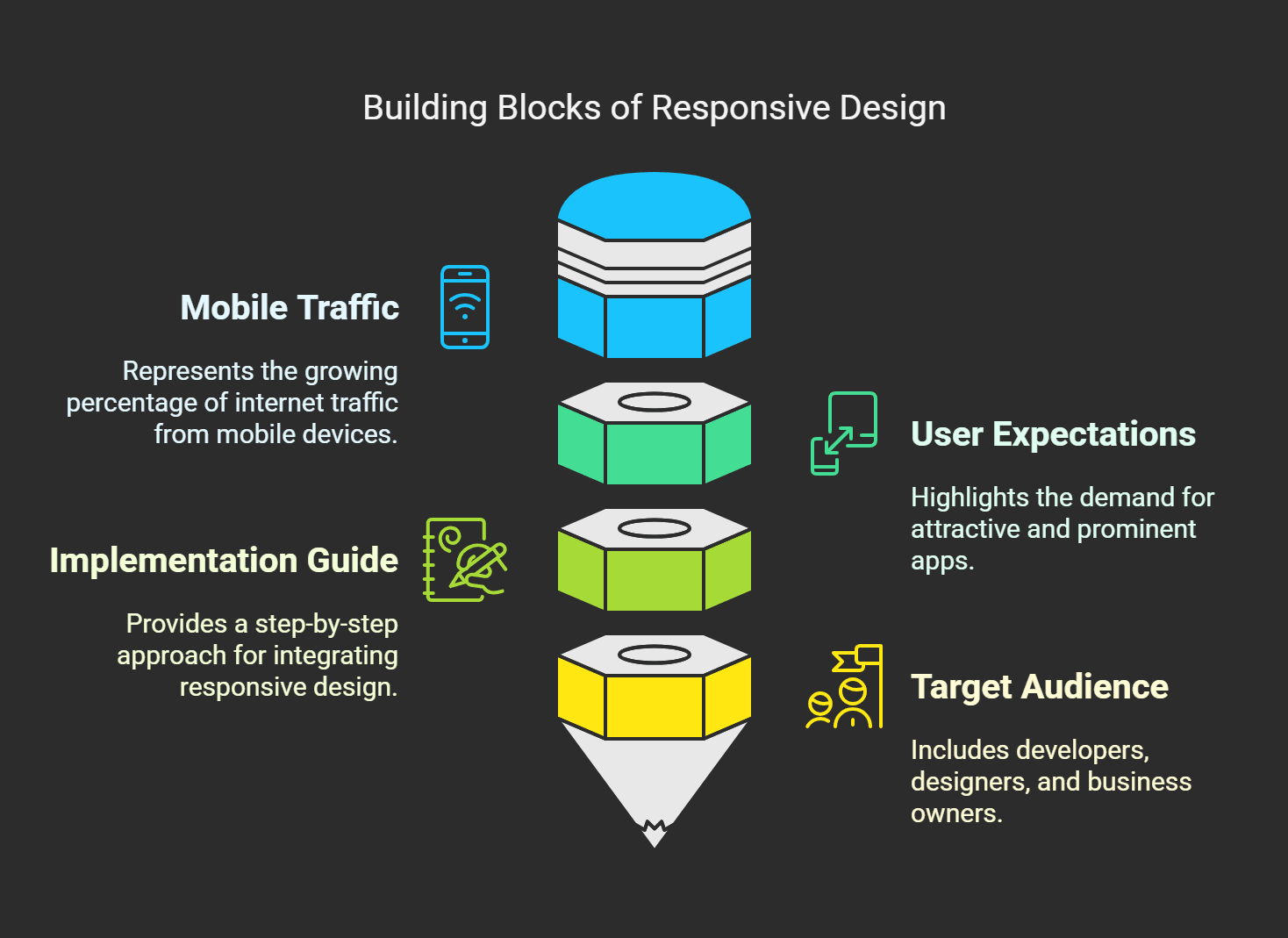
Over 60% of internet traffic now comes from mobile devices. The great news is that people are not just investing their time in fixing their devices to run their apps; they want more, they want apps that are attractive and more prominent. Then, in 2025, responsive design will not be a trend; it will be a necessity.
Here, I am going to guide you step-by-step through everything you need to know about implementing responsive design concepts to create a powerful and user-friendly mobile app. So, whether you are a developer, designer, or business owner, this article will prepare you with the practical takeaways necessary to make your app easier to use and drive engagement. Let’s get into it.
The Basics of Responsive Design for Mobile Apps

When I first started playing around with app design, back when flip phones were the cool thing to have, I thought that making an app look good was all there was to it. Skip ahead a couple of years, and I discovered the hard way that mobile design is much more than aesthetics. It’s about the layout and structure of the design across all device types. That’s when responsive design kicks in.
So, what do we mean by responsive design for mobile apps? So, if you’ve been working hard on building your app with fancy buttons, animations, and cool features. You check it on your phone, and it looks great. But then someone attempts to run it on their tablet or worse, an older device and it all crumbles. But the buttons are too small, text overlaps, and half the screen is empty. Frustrating, right? Responsive design fixes that mess your app adapts seamlessly to any screen size and orientation.
What’s the deal, responsive design isn’t a solitary exercise; it’s a mix of techniques. To begin with, there are fluid grids. This is how they guide us invisible rulers that help position elements on-screen. You don’t use fixed widths (300 pixels); you give them percentages to stretch or shrink. When I switched to percentages, I promised my layouts would stop looking like an abstract Picasso painting.
Another major part of the puzzle? Media queries. These bits of code essentially indicate to your app, “Hey, if the screen width is below X, do Y.” Sounds simple, but did they save me a ton of trouble for hours? I forgot to add media queries for landscape mode once, and people kept complaining they couldn’t read the text.
And don’t get me started on images. I uploaded big files as everyone used to do because, “High resolution looks better.” Well? They made the app incredibly slow. Well, I optimize images and scale them properly from now on. Then tools like SVG became a lifesaver; they're small and look crisp at any screen resolution.
Oh, and here’s a little pro tip, the importance of a touch-friendly interface is something you just don’t want to ignore. Buttons must be a minimum of 48x48 pixels so they can easily be tapped with fingers. Once, I created a far too-small button, and users had to zoom in to use it. Talk about embarrassing.
Responsive design is empathy at its heart. You’re not building for yourself; you’re building for every last person who will ever use your app on a budget phone or the latest iPhone. And to be honest, once you get it, it’s pretty rewarding. Your app will be available, usable, and even delightful.
So yes, responsive design is more than a buzzword, it's a game-changer. If you want to build mobile apps people love, get started with it now.
Why Responsive Design Is Important in 2025

Well, let me tell you I thought responsive design was the reality back when it was one of those conference phrases you know, synergy, disruption. Only after my little catastrophe did I understand how essential it truly is.
A few years ago, I did a project for a client who needed an app that worked explicitly on iPhones. Easy enough, right? And then we built the thing, tested it on some devices and were done. It turned out that half of their users were using Androids of all shapes and sizes from the tiny to the huge. Complaints began pouring in faster than you can say, user experience. The buttons were small, the text was truncated, and the images don’t even get me started on images that looked stretched and tacky. That’s when I learned the hard way, If your app isn’t responsive, you tell half your audience they don’t count.
Fast forward to today, and the situation just got worse or better, depending on how you look at it. More than 72% of internet users are expected to access the web purely through their mobile devices by 2025. Crazy stat, huh? And here’s another kicker, Google uses mobile-first indexing. They won’t bother about the pages ranking on the search engine result pages (SERPs), and if your site or app isn’t congenial on all screens, you may as well say adios to those delectable SEO rankings.
But wait, it's not all bad news here. It wasn't until I started setting my sights on the principles of responsive design that things changed. One app will be the e-commerce app I worked on, but we built up fluid grids and flexible layouts. Customers then could shop seamlessly whether they were on their phone, tablet, or desktop in one fell swoop. Sales went up by 30%. Coincidence? Nope. Just some good old responsive magic.
But here's the thing, it's not just about hammering stuff into small spaces. It's about delivering a seamless, no-frustration experience. Consider, nobody wants to pinch and zoom to read microscopic text or tap the wrong button by mistake because it's squeezed next to five others. Good, responsive design keeps your users happy and happy users tend to hang around longer.
Now, let's discuss practical tips. To start, always use media queries. They save you tons of time when adding and adjusting styles based on the viewport size. Secondly, have a hierarchy of contents. Everything else, and how users consume it, should be secondary, regardless of the device at hand. And don't ever count testing out. BrowserStack and similar tools are probably worth each penny because they allow you to see how your app performs on hundreds of devices.
Last point before I am done, accessibility is more important than ever. In 2025, apps should work for everyone, not just those who buy the newest and greatest. Using scalable fonts and high-contrast colors makes a difference for the visually impaired. And it demonstrates your care, which builds trust. Nothing is better than knowing your work is helping someone get through life a little easier.
So yes, responsive design is no longer an option, it's a must. Believe me, I've been there, done that, got the T-shirt. Just don't repeat the errors I made. Think mobile-first today, and experience your app flourishing tomorrow.
Essential Rules of Mobile App Responsive Design
At first, reactive home design was like solving a Rubik's cube blindfolded. How do you make something cool on an iPhone SE and a Galaxy Fold? It seemed impossible. But after years of experimenting plus more than a few late-night hack sessions I finally figured it out. And believe me, when you optimize these principles, your mobile apps will feel smoother than butter on toast.
To start, fluid grids. This was one of those aha moments for me. At the beginning of my career, I was building fixed-width layouts because, you know, they were working fine until they weren't. One day, I released an update to my app, only to discover that users complained that half the buttons on their tablets were cut off. That's when I found fluid grids making each element stretch or shrink depending on the screen size. Work in percentages rather than pixels. For instance, let's say you have a sidebar that occupies 25% of the screen it'll do this regardless of whether the device size changes.
And then there are scalable images and media queries, which spared me a lot of trouble. Playing to the old-school side, I was still using high-res photos, thinking, "Bigger is better, right? Wrong. Those beauties would make you load a web page slower than you can say "4G," so now I always optimize images in several resolutions and sizes through tools like TinyPNG or Squoosh. No, media queries save our lives. They allow you to adjust styles depending on screen width. For instance, if someone's looking at your app on a phone, the font increases; on a tablet, it scales back down. You know, simple stuff, but highly effective.
Oh, and don’t even get me started on touch-friendly interfaces. I remember designing this beautiful button layout, which was sleek and minimalistic. People could not touch anything without touching three other buttons by accident. It follows that tiny touch targets are set up for failure. I now follow the rule of thumb, buttons should be at least 48x48 pixels. Large enough for thumbs, small enough to not take up space. Works every time.
Typography and spacing. There’s nothing worse than straining to read text packed together like sardines. I made a series of mistakes early on. After that, though, I’ve sworn by consistent line heights and padding rules. General tip, keep line height at 1.5x for better readability. Also, keep contrast in mind. Dark text on light backgrounds or the other way around isn’t just stylish; it’s also accessible.
Finally, always bear this in mind for cross-platform compatibility. Android vs iOS can sometimes feel like cheering on two rival sports teams, right? But that’s the thing, test, test, and test. Use emulators, borrow friends’ devices, do what you must. Nothing employs the sound of the amateur hour like an app that runs perfectly on one platform but is in complete disarray on the next.
So yes, responsive design is not easy, but it’s well worth it. Once you know these principles, you’ll understand why this is such a game-changer. Consume and develop, trust me, you won’t regret putting in the work.
Hand-picked Tools and Frameworks to have Responsive Mobile Apps

Here is a little thing for you. When I started dabbling in mobile app development, I thought responsive design was just a thing web developers worried about. Flash forward several months, and I was faced with my app on the screen of an old iPhone 4 (don’t ask why I still owned one) appearing as if a Picasso painting had gone terrifyingly awry. Buttons were overlapping, text was spilling off the edges, and don’t get me started on how tiny everything felt. It wasn’t pretty.
That’s when I understood tools and frameworks aren’t optional, they're your best friend in this game. You can work some of everything from the ground up, but let me tell you, it’s not worth the headache unless you have exponentially more time than I do. So here’s what I figured out after trial and error and much Googling.
Flutter: The New Kid in Town
I’ll be the first to admit I was initially skeptical about Flutter. I mean, is Google backing it? That sounds great, but can it be delivered? Well, it turns out it works well. Its write once, run anywhere ethos sealed the deal for me. Do you know how painful it is to fine-tune the iOS and Android layout? With Flutter, you don’t need to. Its widget-based system allows you to create responsive interfaces across all devices.
But here's the big but there’s a steep learning curve if you’re new to Dart, the programming language. I spent several hours debugging layout problems because I didn’t quite understand how widgets were nested inside one another.
Pro tip: Start small. Before tackling anything too complicated, build a simple calculator app.
React Native: Tried and True
If you’ve done anything with JavaScript, React Native is more than likely, your home planet. When I switched over, it was as if someone had just thrown me the life raft amidst a raging coding storm after struggling with native Swift and Kotlin. It comes with such an insane community support library or plugin for nearly anything you might need. Need animations? Done. Looking to add push notifications?
The downside? Performance isn’t necessarily as smooth as native apps, mainly if you aim for lower-end devices. There was this one project I can tell you going to the end of the world and back to figure out where the scrolling lag was until I optimized every component. The lesson learned is that tuning the performance is hard, even with good tools.
Ionic: For Hybrid App Lovers
Ionic, however, is ideal for developing a hybrid app quickly if you have limited resources. It works with the web, using HTML, CSS, and JavaScript, which makes it beginner-friendly. I worked on a prototype for a client with Ionic back in the day, and they loved how fast we could iterate. Also, it works well with Angular and Vue. You're money if you're already a pro at those frameworks.
But don't anticipate a significant performance gain right away. If your app is heavy on integrated phone features like GPS or utilizing camera access, you could face some bumps in the road. If it wasn't for my friend who tried building a fitness tracker with Ionic and sucked so badly at it, I tried React Native halfway there.
Design Tools: The Best Figma and Adobe XD Prototypes in Each Category
But before you jump into any framework, do yourself a favor and arrange things first. It can never be overemphasized how prototyping saves a lot of time. Figma was my tool of choice because it was collaborative and browser-based. Remember that login screen disaster I mentioned earlier? Yes, that would not have occurred had I appropriately mocked that up.
Adobe XD is also decent, as long as you're less concerned with real-time collaboration than visual polish. Although both tools are quite different, one thing that I like about both of them is that they simulate responsiveness. You can preview how your design looks on various screen sizes without writing a single line of code. That's a game-changer.
Testing Tools: Never Skip This Step
Finally, never underestimate the role of testing tools. I used BrowserStack so many times that it saved my bacon. Manually testing dozens of devices? No thanks. These platforms allow you to view your app on practically any device setup. And a responsive app? It's just pure magic for live tweaking of breakpoints.
Choosing the right tools for your needs depends on your goals and skill levels. But whatever you choose, remember that responsive design is about more than making things look good, it's about experiences people love. Take it from someone who has been there and you'll be thankful later.
Guidelines for Creating Responsive Designs
I will tell you that responsive design has never been my jam. Way back in the day I’m talking about pre-real mobile app days. That was my belief about creating something “responsive,” it simply meant that you squished everything down until it fit on a mobile screen. It doesn’t work like that. My first attempt? A disaster. Buttons were small and hard to tap, text was truncated, and don’t get me started on how the images looked like pixelated blobs. It was so bad that users emailed (yes, emailed) to say they couldn’t use the app.
Oh well, live and learn, I guess. Eventually, though, I learned some tricks that made all the difference. And now, here I am, prepared to tell you the things I’ve learned. So, settle into your favorite chair with a cup of coffee, and let’s look at some best practices for implementing responsive design without driving you or your users crazy.
Content hierarchy before anything else. This is huge. When I overhauled that terrible app, I saw that I was bombarding users with too many things simultaneously. The home screen contained buttons, banners, forms, and works. It was overwhelming. What worked was sitting down and asking, “What does the user need to see at first?” Once I rumbled with that, I broke things apart and reassembled them to lead our eyes instinctively. For instance, front and center on the page is the most critical call-to-action, and secondary information is tucked away behind menus. Believe me, happy users are without the clutter.
Now, onto breakpoints. Essentially, these are the sweet spots where your layout will adapt to different screen sizes. Initially, I only employed one or two breakpoints simply because I didn't believe I could need more. As it turns out, there's a lot of variability between devices. That's just for the phones and they come in everything from tiny budget models to gigantic phablets. So I started cramming in additional breakpoints 320px, 480px, 768px, and so on and suddenly, my designs would look crisp regardless of the device.
Pro tip: Test this breakpoint religiously. Test your design's performance on different devices using tools like BrowserStack or Responsively App.
Another game-changer? Optimizing loading times. Slow apps are a buzzkill. I remember a project where images would take so much time to load. Users hated it. To remedy the situation, I reduced the size of every image file and added lazy loading, ensuring images load only as they approach visibility on-screen. Boom speed boost! And don't forget to minify CSS and JavaScript files. Every little bit helps.
Let's also give a shout-out to touch-friendly interfaces. I also made buttons far too small early on like ant-sized small buttons. Some people would try tapping them and end up opening something else entirely. Frustrating! Now, I keep to a minimum button size of 48x48 pixels. That may seem large, but believe me thumbs everywhere will appreciate it.
Good luck, and last but not least, do not forget usability testing. But, seriously, nothing is better than actual feedback. I've launched an update where I thought I'd nailed the design, only to discover that half the features weren't intuitive later. Embarrassing? Yes. But it taught me to engage real users early and often. How someone interacts with your app can expose you to problems you'd never discover if you use it yourself.
So there you have it, a bit of hard-won wisdom on responsive design. You'd be golden if you kept it simple and fast and answered the user's need; take it from someone who went through the wringer.
Barriers to Responsive Design Approach for Mobile Apps
Well, let me tell you, discovering how to implement responsive design was like walking into the jungle. There were so many moving parts literally and figuratively that it made my head spin. I remember working on this app project many years ago (all right, maybe more than I’d like to admit). It looked magnificent on my iPhone 12 screen. Precise, concise edges, smooth animations, you name it.
Then someone ran it on an older Android device. Let's say the layout was more sleek and less hot. Buttons would overlap, the text would vanish off the screen, and images would stretch as if they were trying out for a circus act. That’s when I realized responsive design is not just make-things-look-good design; it’s also to solve the problem before it becomes a problem design.
One of the biggest hurdles? Device fragmentation. Then you have phones with small screens, giant tablets, clickable gadgets, and everything. And don’t even get me started on resolutions. Some devices are HD, some Full HD, and then there’s one floaty phone from 2015 still hanging around with god knows what resolution. Believe me when I tell you that accounting for these variables can be like herding cats. My advice? Identify which devices your key audience uses most often. Use tools like Google Analytics or Firebase to determine the most essential devices. Once you understand that, target your testing efforts there first. If only 5% of your users have a device, there is no point in sweating over every single device.
Performance optimization is a whole other challenge. Yes, your app may have the most stunning and jaw-dropping visuals, but if it takes a millennium to load, everyone and their dog will bounce before you can say responsive design. Early in my development career, I included high-res background images on an app because, you know, it looked great on my fancy MacBook. But guess what? Images over slower networks took years to load. Users hated it. All in all, compress before bed. TinyPNG or ImageOptim were my best friends after that fiasco. Oh, and lazy loading? Load only what’s necessary upfront; the rest can be deferred.
Touchscreen functionality is a whole different animal. Have you ever touched a button and missed it, and it took you somewhere else? Yeah, we’ve all been there. It turns out buttons need to be 48x48 pixels or better to be usable by your thumbs. Who knew? Not until I saw user after user flounder in test sessions. Seeing actual people use your app is enlightening and, at times, painful. But it’s worth it. Test touch targets early and ensure clickable elements aren’t packed like sardines.
Finally, debugging responsive layouts is a pain. If CSS were a moody teenager, it would often refuse to comply with your requests without explanation. More times than I can count, media queries saved my sanity. They allow you to adjust styles based on screen size, orientation, or pixel density. Just remember, make your code modular. If it breaks, you’ll be thankful later that you don’t have to sift through spaghetti code to fix it.
At its core, responsive design is as much about solving a problem as being a creative endeavor. The secret is simple patience, persistence, and the willingness to learn from mistakes. Because let me tell you, you are going to fuck it up on the road. But every hiccup shows you something new, and you’ll get it down pat sooner or later.
Responsive Design Trends to Watch Out for Mobile Apps

Sometimes, design was something quickly that I could not keep up with. Do you remember when we had to be concerned only with ensuring our websites looked good on a desktop and were unique on an iPhone? Yeah, those were simpler times. But now? Maybe that’s the case oh man, there’s some new gadget, some trend, every year that turns everything on end. And truthfully, as a veteran app designer, I’ve learned to accept the chaos.
Take foldable phones, for instance. But when they first came out, I was like, This has gotta be a gimmick, right? Wrong! As it turns out, these dual-screen devices are pretty cool and they’re challenging designers to consider how layouts function. Imagine that your app works perfectly on a small screen, and then the user unfolds their phone into tablet mode. However, your layout could look like a hot mess without planning for that transition. Trust me, I’ve been there. Once, I hit the “release” button on an update without testing it on the foldable, and let’s say my inbox was not pleased when it was time to deploy.
But this is where it gets exciting AI and machine learning are getting more involved in responsive design. Imagine this, AI algorithms dynamically adjust your app’s layout according to user behavior instead of manually coding breakpoints and resizing elements. It could also tweak font sizes or spacing so reading is more straightforward, for example, if anyone likes dark mode late at night. Sounds like science fiction, but believe me, it’s closer than it seems. A friend of mine is at a startup doing just that, and the demos he’s shown me were mind-blowing.
Something else I'm watching in particular? Voice interfaces. More people are using voice commands to navigate apps particularly while multitasking. So, what does that mean for designers like us? Okay, but buttons and menus must accommodate hands-free navigation. For example, clear audio feedback is game-changing when someone's voice selects something. I once created an e-commerce app that was not voice accessible. Guess what? Voice user sales plummeted.
And please don't get me started on gesture-based navigation. Swiping left, pinching to zoom it's all second nature now. But creating gestures is not as simple as it seems. You've got to consider people accidentally tapping things, people with weird hands trying to do things, or people with very different ways of engaging with screens. No, I've burned hours of my life optimizing swipe actions so they feel right.
One more trend I'd like to highlight is personalization. Users want apps to learn preferences on their own. Personalization is key, whether adapting text size for aging users or providing custom content recommendations. It's not just about looking good anymore; it's about making the experience feel intuitive and human.
These are many of the reasons why the future of responsive design is crazy, exciting, and kind of rad. My advice? Be curious, be adaptive, and keep on testing. Because when it comes to tech, the one thing I know for sure is that change is the only constant.
Final Thoughts
Responsive design is no longer a luxury by 2025, it will be a cornerstone of any successful mobile app strategy. With the concepts, tools, and best practices presented in this guide, you can design apps with attractive look-and-feel and excellent user experiences.
To enhance your mobile app's story, implement these techniques today, and remember to test all devices thoroughly.
.svg)
.svg)
.svg)
.svg)