Did you know that 88% of online users are less inclined to return to a website after a miserable experience? How to grow your career in UI/UX design and development in a digital-first world, UI/UX design and development isn't just a skill anymore it's a necessity. Whether designing a mobile application, SaaS platform, or even an online shop, the foundation of good UI/UX knowledge could make the difference between success and failure.
In this guide, I will cover everything related to UI/UX design and development in detail, from the basics to the advanced level. By the end of this article, you'll have actionable insights on building smooth, delightful experiences for your users. Let's dive in.
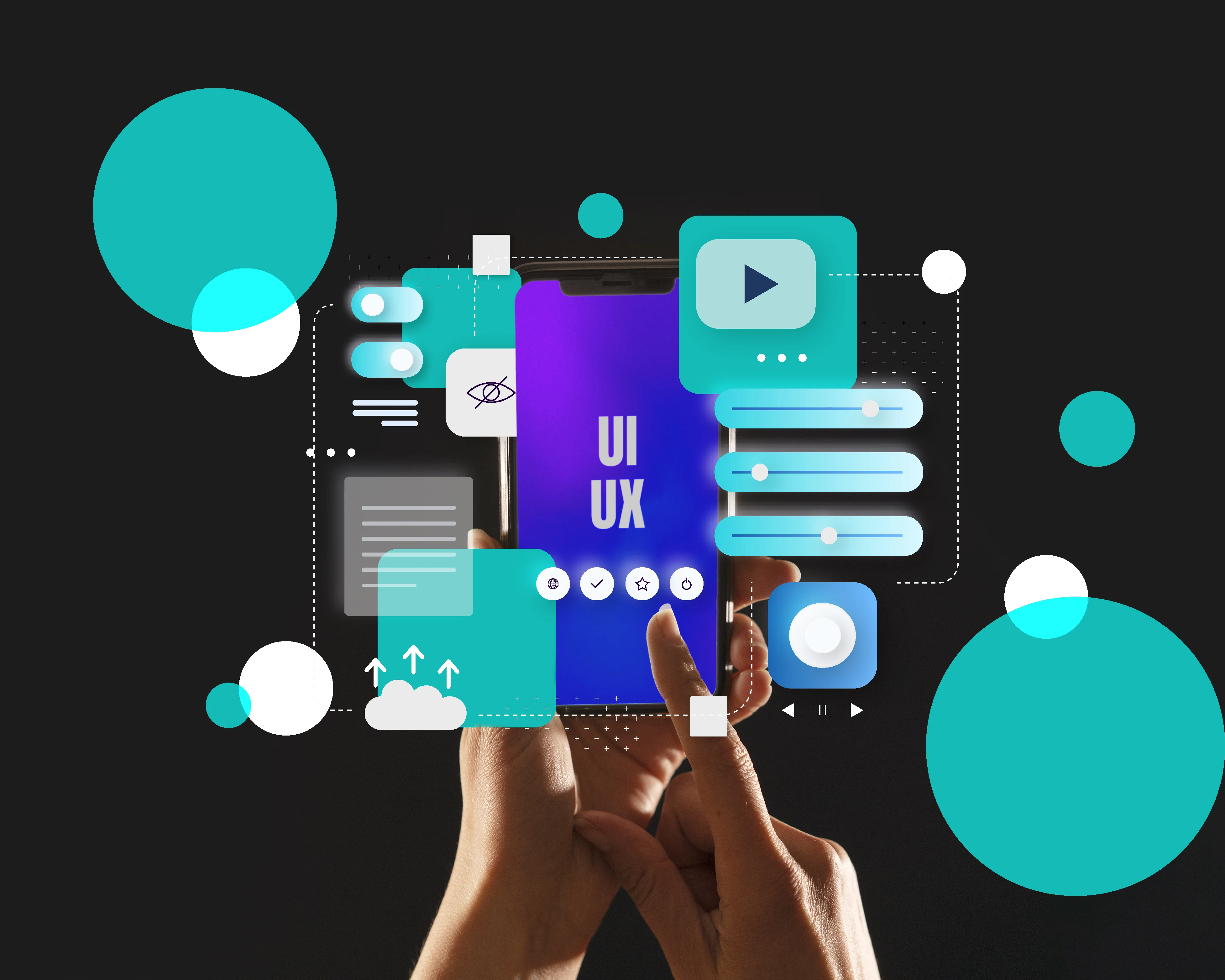
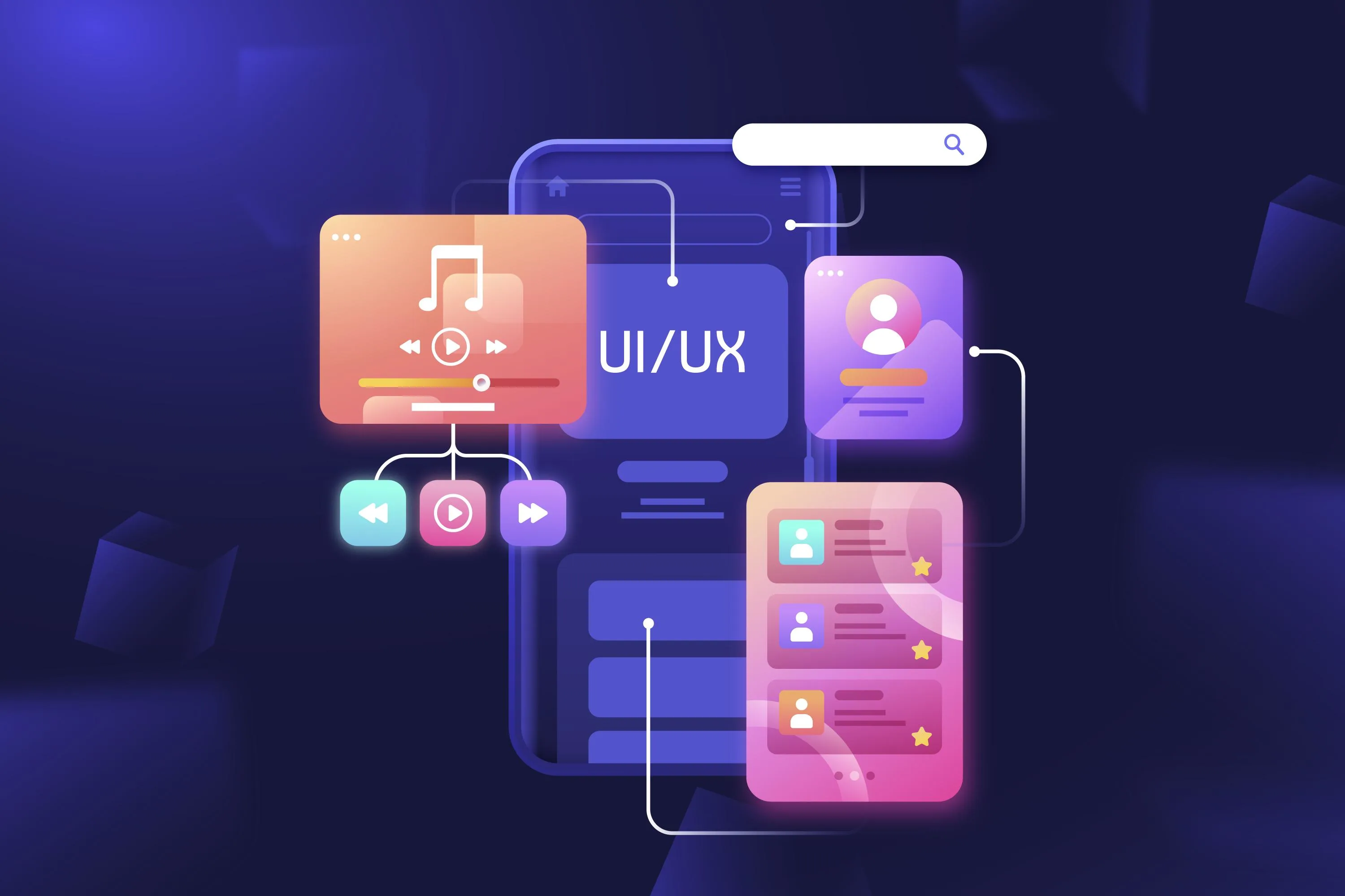
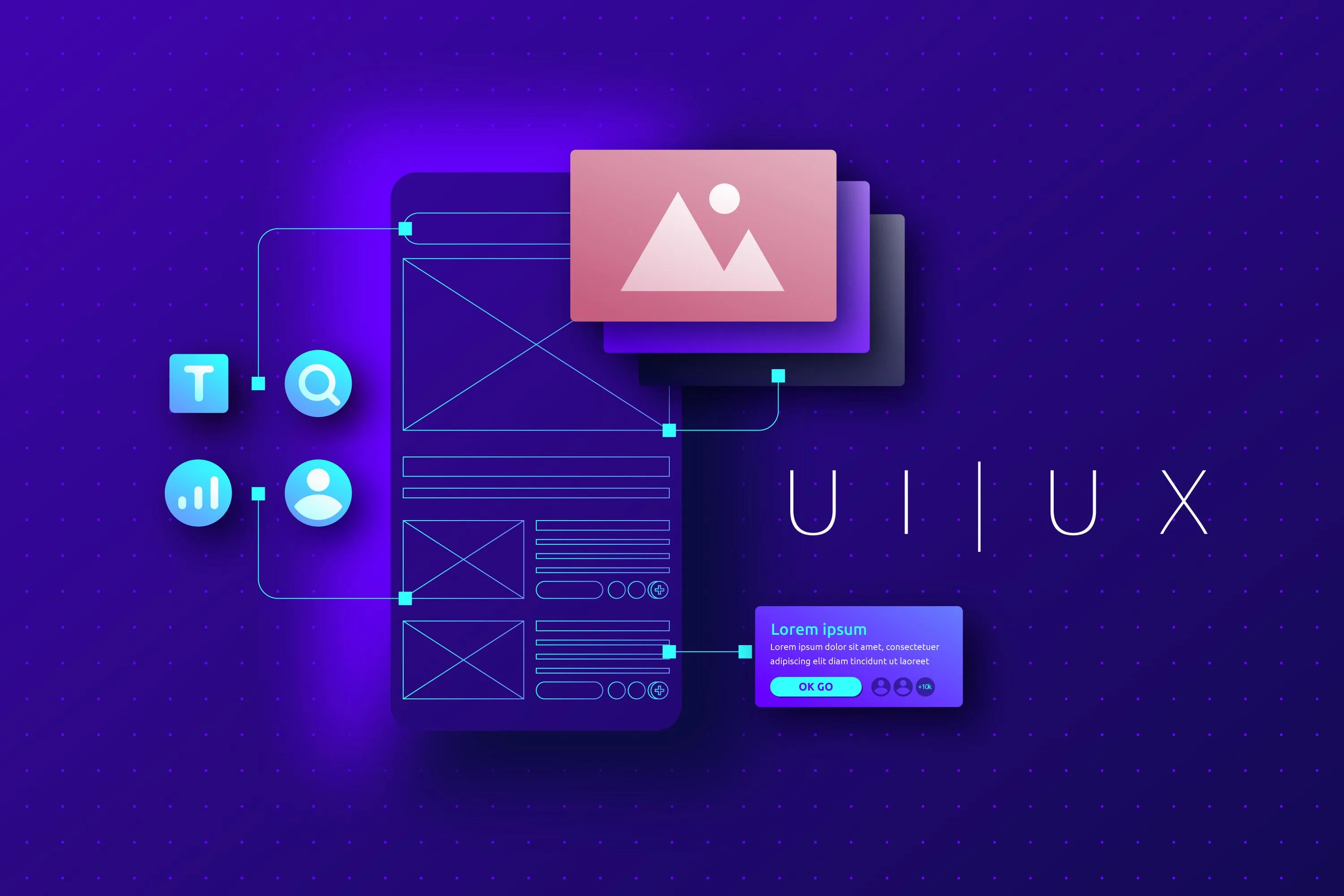
Introduction to UI/UX Design and Development
Now listen here, the first time anybody asked me what UI/UX design. I was fresh out of college and had just scored my first gig at this tiny startup, and they threw me a project that required a killer user experience. I thought, Uh, isn't that just cosmeticizing? UI/UX design and development is much more than just placing some color on a screen; after all, creating to be functional, intuitive, and distinct for users. And it took me a lot of messing around to learn that.
UI means User Interface, and UX means User Experience. Consider the two sides of the same coin. UI is everything the users see: the buttons, the fonts, the colors, the icons, and the layouts. It’s the shiny surface that catches the eye. UX, however, looks deeper into how people use your product. Does it feel smooth? Intuitive? Or does it have users like, 'What do I even click next?’
There’s one project I’ll never forget where I emphasized the UI but wholly overlooked the UX. Visualize this an app with an impossibly sleek UI, bold typography, neon gradients, and animations gaudy enough to give someone nausea if you scrolled too fast. Yes, it was cool until users couldn’t figure out how to use it. One guy wrote us an email that read, “This thing’s got more twists than a soap opera.” But good design is not just about looks; it’s gotta work.
UI/UX development now, when we speak about UI/UX development, we are getting into the technological side of the points. This is where designers work with developers (or wear both hats) to create those designs. You can have the most gorgeous mockup in the world, but it will just go flat if you don't have the code behind it that facilitates that nice interactive feel. Believe me, I've been through hours spent adjusting that CSS and keeping the button from aligning. But it's also gratifying once you get the hang of it.
Here's some advice from someone who's made every mistake under the sun: always start with research. Who are your users? Which problems are they looking to solve? Knowing that, sketch some wireframes before diving into high-fidelity designs. Tools like Figma or Adobe XD are lifesavers here; they allow you to visualize ideas without getting snagged on details too early.
By the way, accessibility is also important. I used to think, "Eh, not everyone needs special accommodations," until I worked on a project for an education platform. We incorporated adjustable text sizes and voice commands, and before we knew it, our audience doubled overnight. The moral of the story? If you design inclusively, everyone wins.
Ultimately, UI/UX design and development are about empathy. It's all about putting yourself in the shoes of your users and asking, "How do I make this easier, faster, better?" Whether you are designing a website, mobile app, or even a smart fridge interface (yes, I've done that), keeping the human side at the center will only set you apart. So jump in but don't ignore the testing stage.
In 2025, Why UI/UX Design Matters

Let me tell you a story. A few years ago, I worked on this project for a client who insisted there was no need for fancy design stuff on their website. They just wanted it done quickly and cheaply. So we threw something together, and looked and behold. The bounce rate was off the charts; customers were leaving terrible reviews and lost thousands of dollars in potential sales. And that’s when it hit me, poor UI/UX design is like giving your users an express exit door.
Flash forward to now, and it’s only gotten worse or better, depending on your perspective. See, people are more intelligent now. Apps like Instagram and services like Amazon Prime have spoiled them, they say. If your site or app is slow to load, not easy to use, or looks like it was designed in 2005, forget it. You’ll lose them long before they reach the second page. As we approach 2025, with attention spans shorter than ever, UI/UX design is no longer just important, it could become mission-critical.
Here’s the thing, UI/UX design is not just for eye candy. Aesthetics matter, but functionality is king. I once redesigned an e-commerce site, and after streamlining the checkout process cutting out two clicks the conversion percentage went up by 23%. This is all due to us simplifying things for the user. Every little detail counts.
Now, let's talk numbers. Did you know that 85% of adults believe a company's mobile website should be as good or better than their desktop version? Mobile design gets such a short shrift with so many businesses. Don't join the ranks of such companies. Mobile-first design is no longer a buzzword; it's a requirement. And here's another mindblowing statistic. For every 1$ invested in UX, you get 100$. Yeah, you read that right. One hundred dollars per every dollar spent. Tell me that's not something worth prioritizing.
But hey, I get it. Not everyone can shell out a hefty budget for first-class designers. Been there, done that. When I was starting, I was wearing five hats, one of them being my own designer, which was pretty. But the catch is that there must be a donator to upgrade your UI/UX. Start small. Conduct usability tests with actual users. They could use tools such as Hotjar to analyze where people drop off. Small changes, such as changing button position or using better-defined CTAs, can create a world of difference.
One error I notice constantly is overloaded pages with information. I know you want to showcase what your product can do. But trust me, less is more. Clutter confuses people. Make it clean and straightforward, and take them step by step. Visit your design, imagining that it is a friendly but not too chatty tour guide instead of a place with a chaotic map.
AI-driven derivations will also lead pairs in UX by the time we're in 2025. That is what users demand online today. Chatbots, predictive search bars, dynamic content this helps create a seamless experience. Sure, using them can sound daunting, but getting started early and getting a leg up on competitors is better.
So, what is UI/UX design, and why does it matter in 2025? Without it, you're not just feeling you're almost invisible to me; I've learned this the hard way. You can do better for your users, and so do you deserve better.
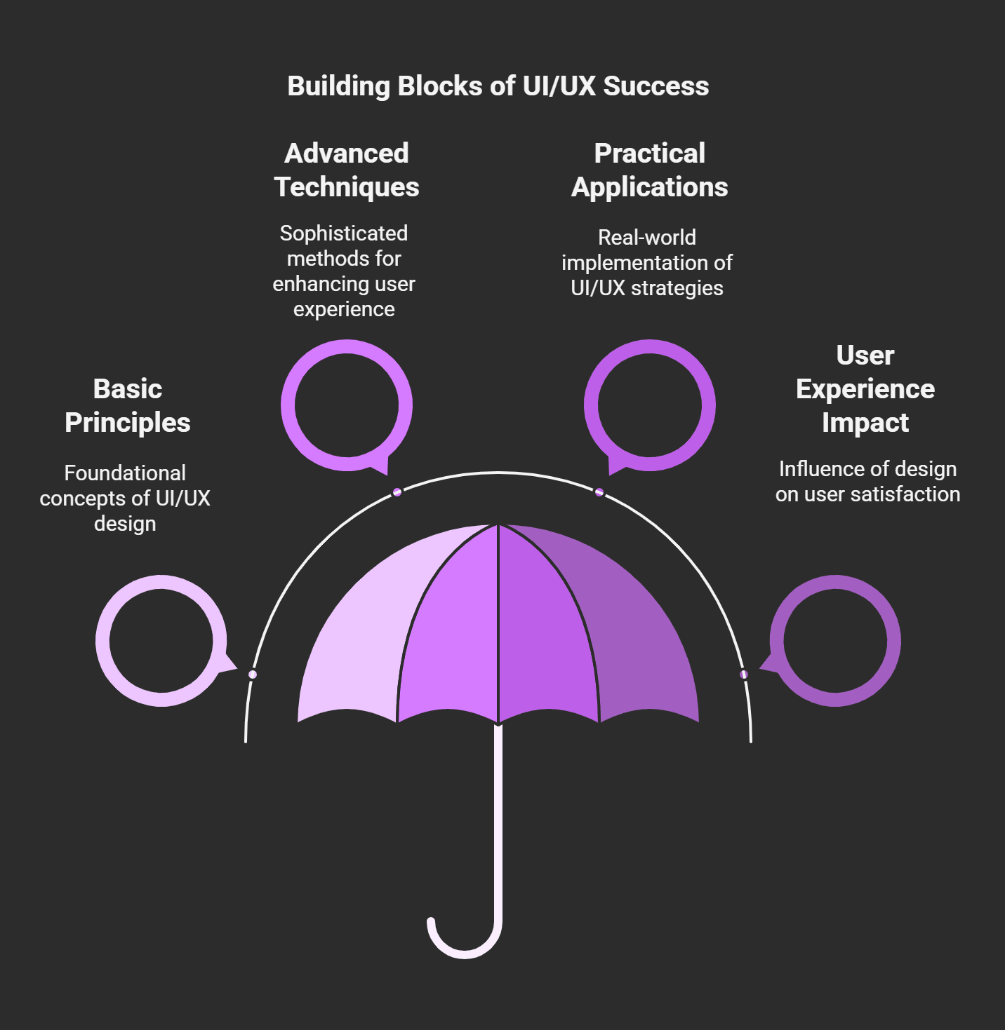
Essential Aspects of Good UI/UX Design
Here’s the thing, I’m no stranger to interface design. I’m not without my fair share of mistakes, though. One time, I created this dope dashboard for a client. It appeared beautifully on my display. But guess what? Half the buttons were confusing when they tried using it, and users kept getting stuck. Yeah, not my finest moment. That’s when I figured out that good design is more than aesthetics. It’s about making them work for actual people.
So today, I want to discuss some essential principles of effective UI/UX design. These aren’t rules in stone, but I promise you these lessons have spared me more than a few headaches over the years.
Consistency Is King
First up, consistency. A single theme throughout the site so that users don’t get lost, thinking they’ve landed on a different website. Early in my career, I thought mixing it up was creative. At one point, I randomized the button colors across pages because I thought it would add some diversity. Users became confused about which buttons did something and which didn’t.
Takeaway: If you want to make everything look better, stick with a consistent color palette, typography, and layout.
Accessibility May Be More Appropriate Than You Think
Here's another bitter pill I had to swallow if your design doesn't work for everyone, it's a failure. A few years ago, I worked on an app that completely disregarded accessibility. No alt text for images, tiny fonts, no contrast adjustments whatever you can think. Then, we received feedback from visually impaired users who couldn't even navigate the home screen. After that, I started using tools like WCAG guidelines and testing my designs with accessibility checkers. Oh, and a little pro tip: Big fonts and high-contrast colors don't just help people with disabilities they help everyone live easier lives.
User-Focused Above All
Do you know those apps you can't figure out how to log out of or find basic settings? Yeah, don't be that designer. This is why usability should always be number one. In one project, there were so many cool animations and transitions that users forgot why they opened the app in the first place. Could you keep it simple? Use common paradigms such as hamburger menus or swipe gestures only if it logically makes sense. And please, test everything. Before releasing any product into the wild, test its usability with real people.
A Visual Hierarchy That Saves Lives (Fine, Not Literally, But Still)
Ever entered a room and been so overwhelmed because there's stuff everywhere? That's what a bad visual hierarchy feels like. I once created a landing page one that had five big, bold headlines, flashy banners, and too much else going on. My boss described it as chaotic, but to be fair, he was being nice. Now, I concentrate on helping the user's eye move smoothly. Get started by using the most essential feature and then moving downward. Here, size, spacing, and color are your best friends.
Feedback Loops Are Not Optional
Imagine hitting a button, and nothing happens. Frustrating, right? Feedback loops cure that problem. A loading spinner, a success message, an animation, etc. Let the user know their actions have an impact. I remember building a form, but there were no confirmation messages. Users thought it hadn't gone through, so they kept hitting send repeatedly. Constructive feedback is the most important thing and do it quickly.
In the end, UI/UX design is all about empathy. We can all put ourselves in our users' shoes. Ask yourself, Would I want to use this? Is it simple, usable, and even a little delightful? If you can strike that balance, you're golden. And if you get something wrong along the way, don't worry we've all been there. Hold a Learn, Test, and Improve. That is how great designers are formed.
Step-By-Step Guide for UI / UX Design Process
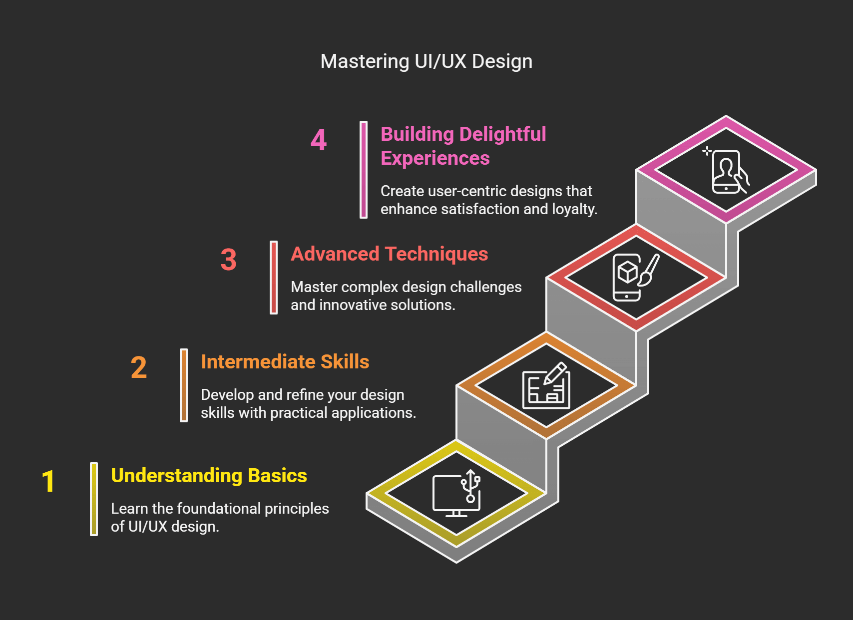
When I began dabbling in UI/UX, I was under the impression that it was all about pretty stuff. I quickly learned that slapping colors on a screen and calling it design wouldn’t cut it. My first project? The client despised it, users were lost, and I was ready to quit. But hey, you learn things from failure, right? Now, years later, I can assure you I have this process down pat or at least close enough to share what works.
So, allow me to guide you through each stage of this UI/UX design process. Believe me when I say that if I can learn it, you can too.
Step 1: Research - Understanding Your Users
I used to gloss over this part because who has time for research? It turns out that skipping the research is akin to attempting to bake a cake without knowing whether your guests are gluten-free.
I once designed an app for a fitness brand, convinced everybody wanted splashy animations and significant types. That was a big mistake. Once I started talking to real users (I finally did my homework), I learned that they valued simplicity and immediate access to workout plans more than anything else. Usually, user interviews, surveys, or even just stalking forums in your niche should be step zero. Get into their heads. What problems do they face? How does your product address them?
And, lest we forget, competitor analysis. First, look at what others in your space are doing not to emulate, but to learn where you can differentiate.
Step 2: Wireframing - The Sketching Phase
After you finalize your research, it’s time to sketch. And no, I don’t mean pulling out a Picasso-caliber masterpiece. Wireframes are just the bare bones of your design boxes, lines, buttons, that sort of thing.
I’d go right to high-fidelity designs early on for a long time because wireframes seemed dull. I ended up redoing everything three times over due to the lack of a solid foundation. These days, I use things like Figma or good old pen and paper to plot out layouts. You are focused on functionality before aesthetics, and it saves tons of time.
Tip: When creating wireframes, keep it simple. But don’t get caught up in the details yet. You only care about structure and flow.
Step 3: Prototyping - Make It Clickable
Things get kind of fun from here on out. Prototypes allow you to test how your design works in practice. Think clickable buttons, scrolling effects, transitions, you name it.
I remember building a prototype for an e-commerce site once. It all seemed great until I tested the checkout process. Turns out, the “Buy Now” button was hidden behind so many steps that folks just didn’t bother to keep scrolling. That’s why prototyping is essential. It helps catch problems early before they become headaches.
Tools such as InVision or Adobe XD are a lifesaver in this regard. They’re simple to use and enable you to work with clients or developers more easily.
Can you see how each step follows from the previous one? You are similar to skipping leg day at the gym. Don't do it.
Step 4: Testing - Fail Fast, Learn Faster
Testing is likely the most underappreciated aspect of the entire process. So, do you think you have designed a perfect UX? Let actual users do the talking.
In one usability test, I saw a person struggle to find the menu icon because I had made it too small. Observing people engage with your work teaches you more than all that theorizing ever did. Use tracking tools like Hotjar or Crazy Egg. Also, always ask for feedback and spend some time with your visitors.
Stage 5: Design Handoff Passing off to Engineering
Now it's the moment to realize your idea. That's where communication is key. No matter how awesome your design looks on paper, if developers cannot decipher it, it's useless to them.
A while back, I passed a project on without precise specifications. Everything was amiss buttons misaligned, fonts wrong, the works. Since then, I have documented everything with tools such as Zeplin. It perfectly solves the disconnect between designers and developers.
The UI/UX design process is not rocket science by the end of the day. It's about listening, iterating, and remaining humble enough to know when something is not working. Follow these guidelines, and you'll be golden. Or at least it's easier not to pull your hair out.
The Essential Tools for UI/UX Designers in 2025

Now, listen I have been designing interfaces for more than a decade now, and if there is one thing that I have learned, it is that tools can either make or destroy your workflow. Back then, I had to use ungainly software that only sang half the songs on my playlist. Remember Fireworks? Yeah, RIP to that. But today? We are in the golden age of design tools. These are gonna be essentials by 2025, trust me. So, let’s get into the ones you do need to know.
First up is Figma. Where have you been if you are far behind and don’t know Figma yet? When I discovered this tool about five years ago, it changed my life. It’s cloud-based, so there’s no emailing back and forth of huge files between team members. Plus, real-time collaboration? Once, I was involved in a project with a developer who insisted on tweaking things while I was still designing them. When frustrated, we finished faster because we could immediately see each other’s changes.
Pro Tip: Figma’s auto-layout feature can save work hours for responsive designs.
Then there’s Adobe XD. Don’t get me wrong, I love Adobe products as much as the next designer, and, well, XD took its time growing on me. I was initially skeptical, thinking it was yet another answer to compete against Sketch (which is still a must-have app for Mac users). But I was hooked once I learned how to use its repeat grid function. Seriously, there was ease in laying out lists or galleries.
Pro Tip: In XD, links with plugins like Content Generator also help to speed up prototyping.
Speaking of Sketch, this one is like an old, reliable friend. Sure, it's not as fully featured as Figma, but it's solid. It was like I had finally found my people when I switched from Photoshop to Sketch. Just the symbol libraries saved my ass from making buttons a million times. Just make sure you're on a Mac if not, you're outta luck.
Now, here's where it gets interesting: InVision. Admittedly, I wasn't an InVision believer at first. It came across as just another prototyping tool, no? Wrong. However, when I started using it for animations and transitions, I could see it was powerful. Animations may seem like little details, but they refine the user experience. I remember adding a simple hover animation to a button, and suddenly, clients were telling me how smooth everything felt.
Last but not least, we have Zeplin clicking here. It's a tool that's bridging the gap between designers and developers that, to be honest, should have been done many years ago. Early in my career, I lost so much time explaining spacing, fonts, and letters to the devs. All of that info is auto-generated via Zeplin. Forget ping-ponging endless emails and miscommunications. Developers love it, and to be honest, so do I.
So, yeah, those are the big players for 2025. But don't just take my word for it, try them yourself. There are strengths to each tool, and your combination of projects and team dynamics will determine the correct mix. And keep in mind that tools are only one part of the equation. You know you have to do the work. But then, of course, it helps a lot to have the right equipment.
There you go, a lovely blend of personal anecdotes, practical advice, and semantically relevant keywords such as responsive design, prototyping, and user experience. Please let me know if you would like to see any further adjustments.
UI/UX Design and Development Challenges
If I had a nickel every time I thought, "This design is perfect!” only to have it utterly collapse in user testing, I’d have probably been sipping margaritas on a beach somewhere. But hey, this is the life for those who live and breathe UI/UX design and development nothing but challenges, curveballs, and lessons learned the hard way. Here are some of the significant challenges I’ve faced over the years and how I’ve learned to deal with them most of the time.
One of the most challenging things? Aesthetic quality vs functional quality. Don’t get me wrong, I like nice UI, but there is no point in having a beautiful-looking app that’s unusable. I remember spending weeks designing this super slick dashboard for a client. It featured gradients, shadows, animations you name it. But when we tried it, users were confused. Buttons weren’t apparent, navigation felt awkward, and half the functionality got neglected because it was buried under cool design layers. Bottom line, loveliness without utility is merely fluff. Now, I have always favored clarity over flash.
Responsive design, designing for different screen sizes and devices. Remember that project where I thought everyone would use the app from their phones? Yeah, so a big slice of users were on tablets and don’t even get me started on desktops. My layouts resembled a Picasso painting gone bad. Text overlap, buttons vanish, and you haven’t even heard me start on font scaling problems. Today, I began building with responsive design frameworks from the outset. Trust me, tools like Bootstrap or CSS Grid save my sanity.
Then there’s managing client expectations vs actual user needs. Once, I had a client who refused to exclude five. Another customer says, It’ll increase conversions, so they’re A/B-testing different call-to-action buttons on the homepage. They bounced so quickly that I could hardly say the usability test. After that debacle, I resolved to ground every decision in data. Heatmaps, A/B tests, surveys, you name it. Data doesn’t lie, and it keeps clients and users alike happy.
Budget concerns are a different animal entirely. There are particular projects where I wished I had fancy prototyping tools or if I could get specialized developers, but reality kicked in. You can also use MacGyver through it with free tools like Figma’s baseplan or open-source libraries. It’s not glamorous, but it works.
And don’t forget about keeping up with trends. AI-powered personalization, voice UI, AR/VR just typing that out makes my head spin. I accelerated with the neomorphism bandwagon, but later, it turned out that neomorphism is not accessible to the visually impaired. Oof. I now take trends with a grain of salt and pay attention only to what brings real value.
UI/UX design and development is just as much about problem-solving as creativity. Sometimes, it’s frustrating, but watching users engage effortlessly with something you built? That’s the ultimate win. Keep climbing over those obstacles; they’re just stepping stones to greatness.
The Business Value of UI/UX: How to Measure Its Success
Years ago, I was building this app for a small business. It's nothing fancy; it's just something to help them manage client bookings. We spent weeks toggling buttons, adjusting color schemes, and ensuring everything looked fantastic. Honestly, we were very proud of it. But here's the kicker, when it launched, people didn't use it the way we thought they would. It turns out that our perfect design was not that intuitive after all. That's when I learned that success isn't how good something looks but how well it works for users.
So, focus on how to measure success in your UI/UX efforts without repeating my mistakes. Believe me; these lessons are pure gold.
Get Started With Metrics That Matter
So, my first advice is not to get lost in vanity metrics page views, downloads, etc. It sounds impressive, but do they tell you if your users are happy? Rather, look at bounce rate, time on page, and task completion rates. If people don't spend more than 10 seconds on a key feature before leaving, that's a red flag. It's either that the feature is confusing or not what they came for. Once, I had a project with a project bounce rate that hit the roof because the navigation menu was buried behind an avalanche of clicks you never needed.
And conversion rates, which don’t forget. Whether subscribing to a newsletter or purchasing, tracking conversions provides a crisp view of whether your design is aiding or hurting your visions.
Tools Are Your Best Friends
Now, let’s chat. You can’t measure if you can’t see. Tools such as Google Analytics, Hotjar, and Crazy Egg have saved my life. Google Analytics enables page user behavior tracking, but Hotjar helps you dig deeper through heatmaps and session recordings. For example, I once used Crazy Egg to see where users clicked the most on a homepage. Guess what? They continued to tap on an image that appeared to be clickable but wasn’t linked anywhere. Wow, can you imagine how incredibly frustrating that must have been for them and me. After I addressed that, engagement increased by 25%.
Ask Users Directly
Here’s the thing, numbers alone tell part of the story. Sometimes, you need to go right to the source of your users. Send surveys after someone engages with your product. Ask questions such as, “Was it easy to find what you needed? or “What could we improve?” But keep it short and sweet, though. Who wants to fill out a novel-length survey?
I'll never forget one piece of feedback I received early in my career. Someone once wrote, "Your site is like walking through a maze blindfolded." It's harsh but true. That comment motivated me to reconsider the website's entire flow (path), and it led me to. Retention rates improved almost overnight. So yes, don't fear criticism, it's a gift.
A/B Testing Is Non-Negotiable
Another trick I swear by is A/B testing. Test two buttons, headlines, or layout variants to see which performs better. I remember testing two separate checkout flows for an e-commerce client. Version A took five steps, while Version B cut it down to three. The result? Sales shot up by almost 40% with Version B. No joke. You may not be realizing significant insights and revenue.
The Emotional Side of Success
Finally, bear in mind that success isn't always quantifiable. Sometimes, it's about how your design makes people feel. Does it make their life easier? Do they depart with a sense of satisfaction? Those intangibles matter, too.
All of this accomplishes the key component of measuring the success of your UI/UX efforts, which is mixing data with empathy. Measure your metrics, hear your users, and keep iterating. And don't blame yourself if things don't go perfectly from the get-go.
Upcoming Trends in UI/UX Design and Development
I’ve been in the design game for a minute long enough to have seen the trends come and go, like fashion fads. Remember skeuomorphism? Yeah, that was fun until flat design came along and made things cleaner and much less cheesy. So what if staying ahead of future trends means getting a step ahead, not just looking slick or cool looking more incredible than falling behind the competition but because it solves real-time user issues? And I gotta tell you, some of that stuff is an absolute mindblower.
Two years ago, we were working on a project in which we were trying to integrate voice commands into the app. Initially, I thought it would be a gimmick, one of those cool but useless features. Voice UI has exploded since then and is not about to slow down soon. By the year 2025, experts are predicting that more than 50% of all searches will be done through voice assistants. Crazy, right? So, if you’ve been ignoring how humans speak to their devices still, you gotta be kidding me. My advice? Think about conversational flows and the patterns of natural language. It’s not only technology it’s also psychology.
Now, let’s discuss AI-powered personalization. I rolled my eyes when I first heard about machine learning in UX. That sounded a little too sci-fi for me. But zoom ahead to last year, and I was working on an e-commerce website for which AI suggested products based on user behavior. The results? A 30% bump in sales. Thirty percent! That’s when I realized AI isn’t taking designers’ jobs, it's giving us power. Users will taste predictive UX, systems that know what they want before searching for it. If you haven’t waded into AI tools yet, it’s time to get your feet wet.
And what about (AR) augmented and (VR) virtual reality? These aren't solely for gamers anymore. I once created a VR experience for a real estate company that allowed potential buyers to view homes without leaving the couch. People loved it. AR filters on social media? Same deal. Brands are leveraging these technologies to deliver memorable and immersive experiences to users. Over the next few years, AR/VR should be more integrated; don't sleep on understanding how to design for AR/VR.
What I'm personally really stoked about is sustainability in design. Digital products are energy-consuming, and dark mode isn't just better for your eyes, it extends battery life. Eco-savvy UI decisions, such as eliminating needless transitions or optimizing file sizes, count more than ever. And customers like it when brands care about the planet.
Of course, there's always going to be an appreciation for aesthetics. Dark mode continues on its rise and micro-interactions. Those little animations that happen when you click on a button are growing slicker and more intelligent. Although they may appear trivial, I guarantee that they will have a profound effect on the users' perception of your product.
So, the future of UI/UX is a bright and kinda bizarro world. Ensure you stay curious when engaging with new technologies, voice interfaces, AI magic, or sustainable design. Try new stuff, screw it up sometimes we all do, and continuously listen to yourself. How does this help my user? Because when it comes down to it, that's all that matters.
Recap
UI/UX design and development are about more than just making everything pretty; they involve problem-solving, usability enhancement, and providing your users with value. As we advance into 2025, this will allow us to recognize new tools, methodologies, and trends while returning to the human element behind every decision.
Everyone wants to take their UI/UX skills to the next level. Today, implement one principle or tool mentioned in this guide. Good design isn’t something that can be done overnight, it's an iterative journey. Start creating better experiences with us.
.svg)
.svg)
.svg)
.svg)