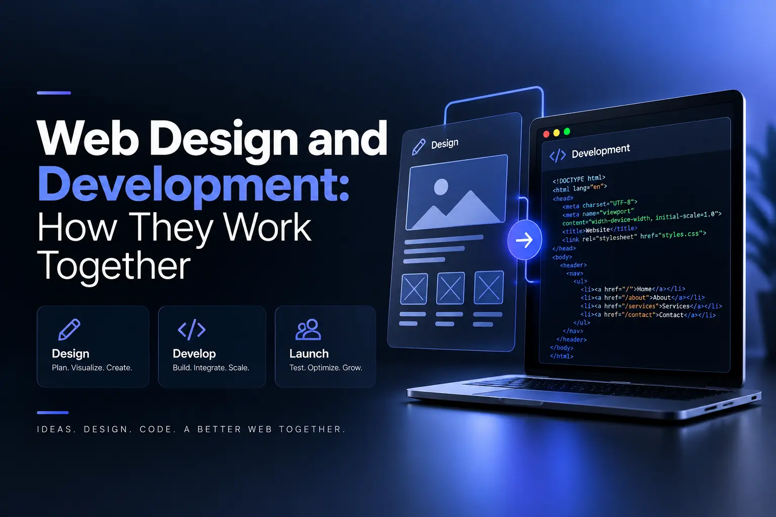
Responsive web design services adapt a website to different screen sizes, devices and orientations. It allows visitors to use the site comfortably across phones, tablets, laptops and desktop displays. They keep layouts, content and interactive elements usable as the available screen space changes.
Responsive web design also supports consistent navigation, readable content and accessible interactions across devices. Instead of separate desktop and mobile versions, one responsive website adjusts its layout through flexible grids, responsive images, adaptable typography and CSS media queries.
Responsive web design services typically include mobile-first layouts, touch-friendly navigation, responsive UI components, performance optimization and cross-device testing. Depending on the project, they may also cover accessibility improvements and responsive implementation for platforms such as WordPress, Shopify, Webflow or React.
Responsive web design works best alongside UX/UI design and front-end development, because screen adaptation must preserve the website’s core user journeys and conversion paths. A well-planned responsive site therefore maintains clear navigation, usable controls and consistent brand presentation across different viewport sizes.
What are responsive web design services?
Responsive web design services are professional services that adapt website layouts, content and interface elements to different screen sizes and devices. They use responsive techniques such as flexible grids, fluid images and CSS media queries so the same website remains usable across phones, tablets, laptops and desktop displays.
The core responsive web design services are listed below.
Responsive layout design: Responsive layout design adjusts page structures and components to available screen space while preserving content hierarchy and usability.
Mobile-first design: Mobile-first design prioritizes essential content and interactions on smaller screens before the layout expands for larger displays.
Responsive images and typography: Responsive images and typography scale or reflow content so visuals remain within their containers and text stays readable across viewports.
Responsive navigation: Responsive navigation adapts menus, controls and interactive elements for touch-based use on smaller screens.
Cross-device testing: Cross-device testing checks layouts, forms, typography and interactions across different browsers, screen sizes and operating systems.
Responsive performance optimization: Responsive performance optimization reduces unnecessary page weight through techniques such as image compression, lazy loading and efficient asset delivery.
Accessibility implementation: Accessibility implementation keeps responsive interfaces usable through readable text, logical headings, sufficient contrast, keyboard access and appropriate focus states.
What is responsive design in web design?
Responsive design in web design is an approach that makes a website adapt its layout, images, typography and navigation to different screen sizes and orientations. It allows one website to remain readable and usable across phones, tablets, laptops and desktop displays without separate mobile and desktop versions.
Responsive design uses fluid grids, flexible images and CSS media queries to adjust page elements as screen dimensions change. Fluid grids resize content according to available space, while flexible images scale within their containers to prevent overflow. CSS media queries apply different styles at defined breakpoints, allowing navigation, spacing and typography to reflow across devices.
Responsive design often follows a mobile-first approach, which prioritizes essential content and interactions on smaller screens before adapting the layout for larger displays. Using one URL and codebase also simplifies maintenance because businesses can manage one website instead of separate mobile and desktop versions.
Why is responsive web design important?
Responsive web design is important because it keeps a website usable across different devices, supports mobile search visibility, simplifies maintenance and allows pages to adapt to changing screen sizes. Instead of separate desktop and mobile versions, one responsive website can adjust its layout, content and controls to the available screen space.
The main reasons responsive web design is important are listed below.
Better user experience: Better user experience comes from readable text, accessible navigation and usable interactive elements across phones, tablets, laptops and desktop screens.
Mobile search visibility: Mobile search visibility benefits from a mobile-friendly layout because search engines use the mobile version of a website for indexing and ranking.
Simpler maintenance: Simpler maintenance results from one responsive website with a shared structure and codebase, allowing teams to update content and interface components without separate device-specific sites.
Consistent website structure: Consistent website structure keeps the same pages and content available across devices through one URL, which simplifies content management, internal linking and performance tracking.
Greater device adaptability: Greater device adaptability comes from flexible grids, responsive images and breakpoint-based styles that allow pages to reflow as screen dimensions change.
How is responsive web design delivered?
Responsive web design process delivery goes through a structured process that starts with planning, continues through responsive design and development, and ends with testing and ongoing refinement. This process ensures that layouts, content and interactive elements adapt correctly to different screen sizes while preserving usability and visual consistency.
The responsive web design process stages are listed below:
Strategy and planning: Strategy and planning define the website’s goals, target audience, key user tasks and responsive requirements before layout decisions begin.
Responsive wireframing and design: Responsive wireframing and design establish how navigation, content sections and interface components should reflow across different screen sizes.
Responsive development: Responsive development turns approved designs into working pages through flexible grids, CSS media queries, Flexbox, CSS Grid and responsive components.
Media and typography adaptation: Media and typography adaptation keeps images, videos and text within their containers while preserving readability across different viewports.
Performance optimization: Performance optimization improves page delivery through image compression, lazy loading and efficient front-end assets.
Cross-device testing: Cross-device testing checks layouts, forms, typography, touch interactions and browser behavior across different devices and screen sizes.
Launch and refinement: Launch and refinement use analytics, user feedback and ongoing updates to identify responsive issues and maintain compatibility as devices and browsers change.
How does responsive web design work?
Responsive web design works through flexible layouts, fluid media, and CSS media queries that adapt a page to the viewport. Relative units and CSS Grid or Flexbox let content resize and reflow, while breakpoint rules adjust layout, typography, spacing, and navigation for different screen conditions.
Relative units such as percentages, em, rem, vw, and vh replace many fixed pixel dimensions. CSS Flexbox and CSS Grid then control how elements distribute space, wrap, and reorganize as the viewport changes.
Media queries add another layer of control. CSS rules can respond to viewport width, resolution, and orientation, allowing layouts to change at selected breakpoints. Values such as 320px, 768px, and 1024px can serve as breakpoint examples, but the appropriate values depend on where the layout needs to change rather than on a fixed device list.
Flexible media prevents images and videos from breaking the layout. A rule such as max-width: 100% keeps an image within its containing element, while responsive image markup lets browsers select suitable image resources for different display conditions.
The result is one responsive layout system that can present the same site across phones, tablets, and desktops while preserving readable content, usable controls, and appropriate spacing.
How does responsive web design improve user experience?
Responsive web design improves user experience through content, navigation, and interactive elements on the visitor’s screen. Flexible layouts and typography keep text readable without excessive zooming, while responsive controls make navigation easier across phones, tablets, and desktops.
Readable layouts reduce the need for pinching, zooming, or horizontal scrolling on smaller screens. Flexible columns, scalable text and appropriately sized tap targets help visitors read content and interact with controls without fighting the layout.
Responsive navigation also changes how users move through a site. Mobile menus, reorganized links and touch-friendly buttons help visitors find information and complete actions on smaller screens.
Performance affects the experience as well. Optimized images and conditional loading can reduce the amount of content a mobile device needs to load, which can make pages more usable on slower connections.
Accessibility benefits from responsive layouts too. Flexible scaling and compatibility with screen readers help people with visual or motor impairments access content and controls across different devices.
A consistent responsive interface also lets visitors interact with the same site across phones, tablets and desktop screens without encountering a layout designed for only one device.
How does responsive web design affect SEO?
Responsive web design affects SEO through mobile-first indexing and consistent page access across devices. Google uses the mobile version of a site for indexing and search rankings. A responsive layout keeps core content, headings, metadata and internal links consistent across mobile and desktop pages.
A single responsive URL keeps SEO signals consolidated across devices. One URL reduces duplicate-content risks and keeps canonical tags, structured data and internal links aligned. External links also point to the same page address rather than separate mobile and desktop URLs.
User experience also affects organic search performance. Readable text, usable controls and fast page loads create a better mobile experience. These factors support user engagement and reduce frustration, while one responsive site makes technical SEO audits easier.
How does responsive web design improve website performance?
Responsive web design improves website performance through practices that reduce page weight and load time. Responsive images, fluid layouts and mobile-focused assets reduce the resources that mobile devices need to process. These practices also support faster pages on slower networks.
Responsive image markup delivers suitable image sizes for different devices. Modern formats such as WebP and AVIF reduce asset size. Lazy-load techniques and conditional asset delivery further limit unnecessary resource requests.
CSS and JavaScript can use minification and breakpoint-specific code to reduce unnecessary processing. A single set of URLs also supports efficient CDN delivery and consistent browser cache use. These practices reduce code overhead across responsive layouts.
Asset optimization improves time to interactive and page responsiveness on mobile devices. Faster pages reduce user frustration and support lower bounce rates. Responsive performance also helps pages meet established user-experience metrics and search performance thresholds.
How much do responsive web design services cost?
Responsive web design services typically cost $2,000–$50,000+ per website, based on project scope, complexity, site type and provider. Current source ranges vary. Small-business brochure sites often fall near $2,500–$10,000, while custom corporate, eCommerce and database-driven sites can reach $10,000–$75,000+.
The cost for responsive web design services are listed in the table below:
How long does responsive web design take?
Responsive web design projects typically take 4–12 weeks from kickoff to launch for small and mid-market business sites. Simple landing pages may take 1–3 weeks, while larger eCommerce sites and custom web applications may require 3–6+ months. Actual timelines vary by project scope and complexity.
The typical timelines for responsive web design projects are listed below.
How do you choose a responsive web design company?
Choose a responsive web design company through its mobile-first process, portfolio, technical expertise and post-launch support. Start with clear goals, budget and success metrics. Then compare agencies with recent work that matches your business needs.
A mobile-first process shows how an agency handles responsive layouts across devices. Check portfolio sites on phones and tablets for layout quality, page speed and navigation. Ask about breakpoints, browser support, Core Web Vitals, image optimization, caching and accessibility standards.
Agency support matters after the website launch. Ask who will manage updates, maintenance and technical issues. Confirm pricing, timelines and ownership of code, content and accounts before you select a provider.
What should you look for in a responsive web design company?
A responsive web design company needs a strong mobile-first process, technical expertise and proven project results. Review live portfolio sites on phones and tablets. Check layout quality, page speed, navigation and usability across different screen sizes.
The key qualities to look for in a responsive web design company are listed below.
Mobile-first approach: Mobile-first approach starts with small screens before desktop layouts. Ask about Core Web Vitals, image optimization and performance checks.
Accessibility and testing: Accessibility and testing cover WCAG guidelines and real iOS and Android devices. Check touch targets, forms and color contrast for usability.
SEO and content strategy: SEO and content strategy use semantic HTML, clear headings and clean URLs. Confirm that content supports search visibility and conversion goals.
Transparent process and ownership: Transparent process and ownership clarify discovery, design, development, QA and launch. Confirm project roles, revision rules and ownership of code, designs and content.
Post-launch support and analytics: Post-launch support and analytics cover analytics setup, redirects and maintenance. Confirm support for performance, security, browser updates and new devices.
What do responsive web design services include?
Responsive web design services cover strategy, UI/UX design, front-end development, CMS integration, performance, SEO, testing and launch support. These services create one website that adapts its layout, navigation and content across mobile, tablet and desktop screens.
The main services included in responsive web design are listed below.
Responsive UI/UX design: Responsive UI/UX design defines mobile-first layouts, navigation patterns and reusable components for different screen sizes and breakpoints.
Front-end development: Front-end development builds flexible HTML, CSS and JavaScript with fluid grids, Flexbox, CSS Grid, media queries and responsive images.
CMS integration: CMS integration connects platforms such as WordPress, Webflow or Shopify with responsive templates for content management.
Performance and SEO basics: Performance and SEO services cover image optimization, caching, minification, meta tags, semantic HTML, XML sitemaps and analytics setup.
Cross-device and cross-browser testing: Cross-device and cross-browser testing checks layouts, touch controls and performance across phones, tablets, desktops and major browsers.
Launch and handover: Launch and handover covers staging review, production deployment, basic CMS training, source files and project documentation.
What does responsive website design include?
Responsive website design includes mobile-first layouts, flexible grids, responsive typography and adaptive navigation for phones, tablets and desktops. It also covers component behavior, image handling and style guides that keep a website design consistent and usable across different screen sizes.
What does responsive website development include?
Responsive website development turns website design into flexible HTML, CSS and JavaScript with fluid grids, Flexbox, CSS Grid and media queries. It also covers CMS integration, responsive components, semantic markup and basic performance and SEO setup for reliable display across devices.
What does responsive website testing include?
Responsive website testing checks layouts, navigation, content, forms and interactive elements across devices, browsers and orientations. It verifies breakpoint behavior, horizontal overflow, text readability, touch targets, mobile performance and accessibility before launch.
What does responsive website optimization include?
Responsive website optimization covers image compression, responsive image sizes, modern formats, lazy loading and CSS and JavaScript minification for faster mobile pages. It also addresses Core Web Vitals, caching, CDN use and layout stability across devices and connection speeds.
.svg)
.svg)
.svg)
.svg)